Here is a sneak peek at one of the latest projects I have been involved in…
Can you guess? Can you guess? Click on the sneak to get all the details!
And stay tuned you will get a chance to win!
I wanted to hop on a give you all a catch up as to what has been going on and going up over the past week. To some extent I have been away from my computer so I have a few bits of info/art to share.
Here are some of the amazing articles that went up last week at Get It Scrapped!
Ideas and Angles for Scrapbooking Your Outdoor Travel and Outings, this layout is from our recent visit to Salida Colorado.
Double Up, this is an ongoing series at Get It Scrapped featuring ways to take a single page sketch and stretch it to two pages. I am loving how these photos from the Oregon coast turned out in this two page layout.
And here is my page from the article that went up today! Ideas For Oversized Embellishments on Your Scrapbook Pages.
To top is off I also had a new page added over at Easy Scrapbook Pages. I love how this mish mosh of papers worked so nicely for a mosaic base for Sara’s diving photos.
WOOSH! That is a lot of stuff going up and happening. I can see touching base once a week is not going to work regularly right now 🙂 I know there will be more popping up this week so I will keep on top of it, or at least try.
Hope you all had a marvelous Labor Day Weekend and had some great family time and/or play time with friends. I was lucky enough to have both! Thanks to my Scrappy freinds who all got together Friday night and my Mom and Dad who were with me for the entire week. Love you all!
Hugs!

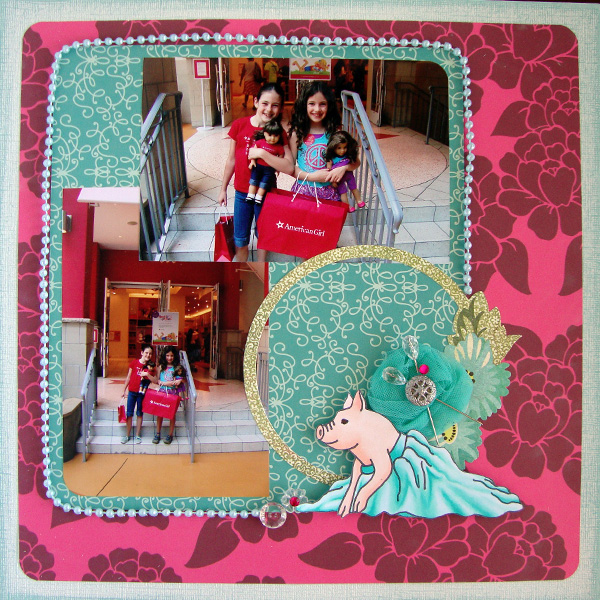
I have a brand new tutorial at Get It Scrapped. I had a special request for a tutorial on fabric folds so I created a cute little pig in a tutu to show you how. Check it out, so fun!

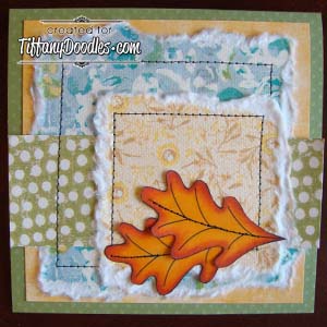
New tutorial over at Tiffany Doodles. I did some down and dirty coloring for some fall leaves. This is as easy as it get’s, check it out!
Another fun article over at Get It Scrapped to share. Today’s article feature embellished titles, ways to add a little zing to a title. I have a layout in the article that I added a lot of ZING to I had so much fun putting this one together!
Here is a close up of the title work. I painted the chipboard letters with gesso, doodled with a Copic Multiliner and added color with Copics.
On a separate note, with the girls back in school I am trying to spend a little crafty time every day so I have started doing a few card challenges again. Here is a quick one that I created for a challenge over at Twin Touch Markers & More Challenges. The requirements are food and shading. I used my Copic markers for this card since I only own 6 Twin Touch markers.
I used R20, R22, R24, R29, BG53 and BG57 to color in the cupcake from a sheet of doodled paper by Luxe. The background is created with Copic ink dripped on vellum and then dabbing blending solution over it with a cotton ball. the patterned paper is by Basic Grey and the cardstocks are both Bazzill. The felt flowers are from Queens and Co.
Thanks for stopping by today, HUGS!