 Welcome! If you are just visiting for fun you have stumbled on the Get It Scrapped Creative Team Blog Hop! If you are stopping by to check on the Copic Week at Creative Passion there is nothing new today but you can scroll down to see any of this past week’s posts.
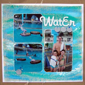
A favorite article of mine this past year at Get It Scrapped was Ideas For Painterly Techniques and Looks on Scrapbook Pages. Check out the article HERE. I love the variety of ways the creative Team members used paints on their pages, and really at heart I adore making a painty mess every now and again. Paint under my nails makes me smile. So I decided to add some paint on a layout of my own. I actually painted directly on canvas with acrylics and added it as my background layers. To me paint is such an amazing medium because I can match it to anything in my layout!
Water Fun | Supplies: cardstock; American Crafts and Kraft, canvas; Canvas Corp, chipboard letters; Creative Cafe, metal letters; Paperbilities, gems; Darice, acrylic; Liquitex, other; thread
Save 60% off the Masterful Scrapbook Design Issue – Art Journaling Looks
Join Guest teachers Tangie Baxter, Paula Gilarde, Julie Ann Shahin, DIna Wakley and Vicki Walters as they show you the new trend of bringing art journaling techniques and mixed media supplies onto scrapbook pages. This issue will show you the ins and outs of adding backgrounds, text, textures and more.
Use coupon code giscttsmh60p to grab this issue for 60% off through June 3rd.
**go HERE and just place this issue of Masterful Scrapbook Design in your cart and apply the coupon code above**
There”s more!
I also have the honor of sharing the work of one of my team mates. Welcome Deborah Wagner to Scrapweaver.com!
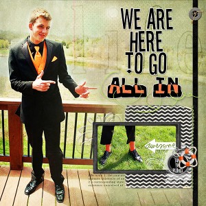
I love experimenting with color palettes so it is no surprise that my favorite GIS articles is “Color: psychological response” http://debbiehodge.com/?s=color+psychological+response&x=0&y=0. I was inspired by the emotions colors evoked on the pages without the viewer having to read a title or journaling. For my layout, I used black for a masculine, dramatic feel; and orange to add a cheerful, carefree attitude. Of course, my nephew helped me a great deal by wearing these fun colors to prom!
Go All In by Deborah Wagner. Supplies: Katie Pertiet – Atlantic Kit, Christmas Plaids No. 1, Anchors Away Kit, Paint Spots, Life Lines Kit, Matte Black Vintage Frames No. 4, Lens Flare No. 3, Blendable Photo Cards No. 4, Joulunaika Kit, Inked Twists No. 1, Sea Life Memories Kit, Assorted Messy Stitches No. 7, Color Challenge 4-14-12, Color Inspiration 11-14-10; Lynn Grieveson – Worn Page Edges, Blackett Hall Paper Pack; Ali Edwards – Arrow Sentiments Brushes & Stamps; Fonts – Submerged, Stereofidelic
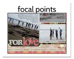
Save 60% off the Masterful Scrapbook Design Issue – Focal Points
Do you want to know how to use eye-catching techniques to draw the viewer into your layouts? Learn from Kelley Purkey, Betsy Sammarco, Noell Hyman, Drista Sahlin, and Celeste Smith how to create a focal point to tell your story, and make a well-designed page.
Use coupon code giscttsdw60p to grab this issue for 60% off through June 3rd.
**go HERE and just place this issue of Masterful Scrapbook Design in your cart and apply the coupon code above**
For more ideas and discounts from the Get It Scrapped Creative Team follow the links below along the rest of the blog hop.
Get It Scrapped
Amy Kingsford
Sue Althouse
Michelle Houghton and Deborah Wagner **You are here**
Marie-Pierre Capistran
Christy Strickler
Heather Awsumb
Michelle Hernandez
Lise Mariann Alsli
Alexis Aragona
Kristy T
Stefanie Semple
Audrey Tan
Sian Fair
Brenda Becknell
Carrie Arick
Kiki Kougioumtzi
Tara McKernin
Susanne Brauer
Marcia Fortunato
Katie Scott
Andrea
Rosann Santos-Elliott
Doris Sander
Celeste Smith



Michelle and Deborah, lovely pages and I am thrilled to be working with both of you again this year 🙂
It’s great to be on the team with you this year. I love your layout, the use of the silver discs, echoes the wooden circles from the photos with the addition of blue sparkly brads. Way to go!
You both have wonderfully distinct styles and these pages are great examples of that. Thank you thank your for your work at GIS.
Holy wowza, I love the painterly look on your background paper, Michelle–definitely evokes the same feel as the water in your photos 😀
Deborah, the black and orange is so dynamic and I LOVE your nephew’s cool photo 😀
Michelle – I adore that watercolour background! and Deborah, your layout is so fun and made me smile with that pic of the orange socks.
Awesome pages ladies!
Michelle really love your background (love paint mess too! lol!)
Deborah lovely details. really like how you placed the second photo!
Hi girls, I love your “two for the price of one” blog post. So much to enjoy! I’m looking forward to enjoying a lot more from both of you over the next year
Michelle and Deborah, love your pages. The backgrounds on both of them are beautiful, and I like the little inset photo on Deborah’s. So excited to be working alongside such talented ladies this year!
Wow, what fantastic pages! I’m thrilled to get to work with you both this year!!
I love the doodles on the blog sidebar! I am looking forward to working with you both! Here’s to another great year!
Both of you layouts are great. You really did the painterly effect very well. I am looking forward to working with both of you .
Lovely pages, both of you talented ladies! Looking forward to serving on the team with you!
Michelle, I love the painted canvas background; it looks perfect with your photos!
Deborah,love the way you did your title, and the close up photo of those orange socks, LOL!
Great examples, ladies! I’m looking forward to being on the team with you both!
So beautiful pages you have made, both of you. This hop is just so much fun. Looking forward to the next year learning to know you and your scrapbooking more. 🙂
Wonderful pages ladies. That painting really looks like it would have been loads of fun. I am looking forward to being on the team this year – which should be loads of fun as well.