There is a fun title technique being featured at Get It Scrapped today. Working with two different fonts in your title work. I love the variety of ways that the Creative Team came up with to showcase tow fonts! I had not thought of several of these options, just shows how I fall into a routine and can’t see outside my own little box. Here is the layout I came up with;
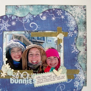
Snow Bunnies by Michelle Houghton | Suppies: cardstock; The Paper Company, patterned paper; Bo Bunny, Patterned paper die cut; Fancy Pants, die cuts and washi tape; SEI, chipboard and sticker letters; Doodlebug Designs Inc., fabric letters; American Crafts, ink; Tsukineko, Sharpie and Copic
I manipulated both of these fonts. The top “snow” is a sticker letter created by Doodlebug Designs that I added glitter to. The “bunnies” is a fabric Thicker made by American Crafts that I colored with my Copic markers to match the cool feel of the page. Nothing like a snow page in July to cool you off right? Of course I had to find an extra E for bunnies so I just used the number 3 and turned it upside down. this is one of those pages that just kind of fell together. The papers were ones that had been tucked into my stash for a long time waiting for the perfect photos and I really liked that I was able to pull products from a few different companies in to complete the look. Make sure to check the rest of the inspiration at Get It Scrapped HERE.
Hope everyone is continuing to enjoy there summers here in the US. We only have tree weeks left of summer vacation and then the girls are back to school! Hard to believe!
Happy Wednesday!


