I have two layouts post at Get It Scrapped in the past two days so i figured it was easiest to post them here together as well. The first is a layout inspired by Gallery walls. The ladies at Get It Scrapped collected a lovely collection of artfully arranged gallery walls on Pinterest and asked us to create a layout inspired by a gallery wall.
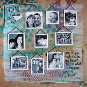
Home Is Where The Heart Is by Michelle Houghton | Supplies: cardstock; Kraft, spray mists; Adirondack, ink; Sharpie, gesso; Golden, embroidery floss; unknown
The base of this layout was created by using spray mists with stencils and then after it had dried using a dry brush with gesso over the page. Because the inks are water based I did get a little color pulling up into the gesso which I love. I then printed my photos at home after cropping them and turning them black and white. I printed them on matte photo paper so they stayed very contrasty and clean. When I trimmed them I purposefully left the white paper around the edge of the photo to create the look of frames. Each one of the photos got a embroidery floss hanger. I just poked a hole in each top corner and threaded the floss through, tying it in back. I had really tiny brads that look like screws so each photo was “hung” with a brad and then I added the journaling, title and doodles with my Sharpies.
Check out the rest of the Creative Team’s gallery walls HERE
Today’s article was featuring layouts using ombre to enhance the feel of the layout. Here is the layout I contributed:
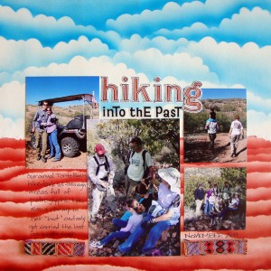
Hiking Into the Past by Michelle Houghton | Supplies: ink; Copic and Sharpie, sticker letters; Jenni Bowlin, cardstock, small sticker letters and trim unknown.
I am pretty excited about this layout, I love how the background turned out. I used Copic markers specifically B05, E07 and E09 to create the airbrushed ombre effect. I have a “cloud” scalloped stencil that I created just for this effect and then I tore a piece of cardstock for the layered red rock look that is so indicative of Arizona. After adding my photos and title, a portion of which were colored with my Copics to match I added journaling about our hike through petroglyphs and the fact that Lori completed all but the last 100 yards or so in a full boot because of her broken toe on the trip. She is the one on Dad’s shoulders in the upper right photo. The trim was an amazing find at the Creating Keepsakes Convention last year and sadly I do not know who made it but I knew it would be perfect for these layouts.
Check out all the amazing ombre effect from the Creative Team HERE
We are doing great here, girls are LOVING the start to their 3rd and 5th grade years. Oh and I have an 11 year old at my house YIKES how did that happen!? We are melting in temperatures hitting over 100 most late afternoons right now hoping the end is close.
Happy end of August to you all!


Both are great layouts, I love the attention and detail you used on both backgrounds!
Wow, you’ve knocked both of these out of the park. They are so different, yet engaging each in their own way. I’m especially blown away by your Copic work on the second one.