I completed a fun assignment that had me getting inky for Get It Scrapped. The Creative Team was asked to use patterned paper with a Bokeh pattern on it. I decided to create my own paper and used tracing and Copic Ink to create the effect.
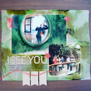 I See You by Michelle Houghton | Supplies: cardstock; Kraft, patterned paper, twine and sticker letters; American Crafts, burlap elements; Little Yellow Bicycle, ink; Copic and Sharpie, Washi tape; Scotch, other; tracing paper
The process was extremely easy to create the Bokeh print. I dripped 3 colors of Copic ink from the various ink refill bottles onto the tracing paper. As the ink bled it ran into the drips next to it, blending and filling the page. To finish I added a few drops of colorless blender solution which pushed the ink away from where it dropped and added some nice white areas.
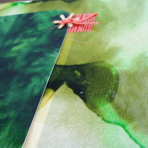
Here is a close-up of the effect
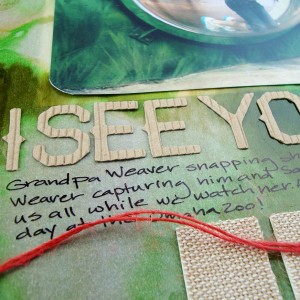
When I added my photos they blended in with the paper so well that I was loosing the edges a little. I decided to matte them but the mattes were too distinct and took away from the beautiful Bokeh paper so I slid the mattes under the Bokeh tracing paper and then sat the photos on top of them over the Bokeh paper. The effect is subtle and effective. I added some small touches of red Washi tape and twine to add contrast and highlight the red and orange that my Dad and Sara are wearing in the photos. I also used burlap banners and corrugated cardboard letters to add to the feel of the jungle page. Just a touch of journaling under the title finishes the layout off.
To see more of the wonderful layouts and inspiration by the Creative Team make sure to check out the article HERE
Now what I am sure you really tuned in for is an update on my Calvinball game 🙂 I am currently at 12.5 points. ( I have been awarding myself 1/2 points for my crafty endeavors. It is NEVER to late to join in the fun of a Calvinball match so come join us HERE!
Happy hump day all!



[…] Then I was featured in a little post at the Copic in the Craft Room Facebook page. You can check it out HERE. The work that was featured was the Bokeh technique that I used for a layout at Get It Scrapped. You can see that particular article HERE and If you want to see my post about how it was created check HERE. […]