Posted on 2 Comments

RubberMoon, Copic and Vellum

Happy Wednesday one and all and welcome RubberMoon fans!  I have another Copic and RubberMoon tutorial for you!  I am passionate about RubberMoon stamps, not only do I think the quality and artistry is top notch, the team and Quality of the people running RubberMoon just can not be beat!  I am also CRAZY passionate about Copic markers and the amazing versatility that these markers and inks have so when given a chance to share their abilities I try to give you the full view of what these products can do.

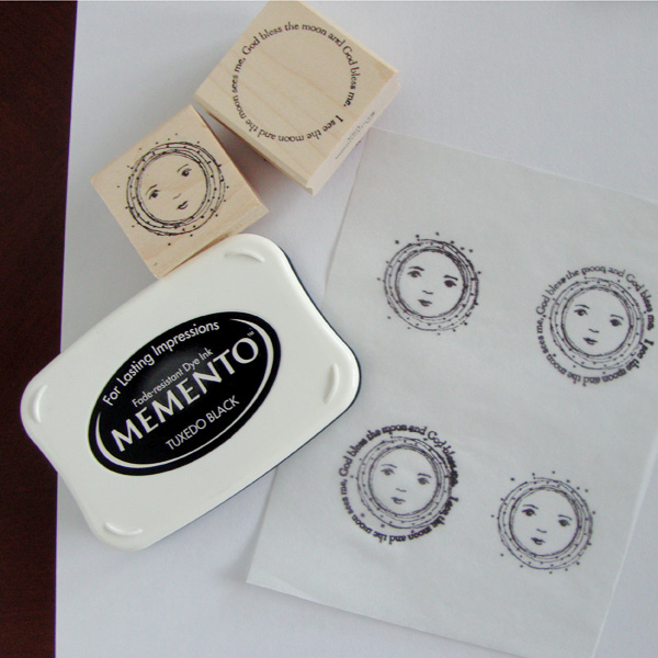
This week I have two beautiful stamps created by Kae Pea, See The Moon and New Moon. These two stamps are truly a favorite of mine not only because they are beautiful but because my family used to sing this song EVERY time we saw the moon when I was growing up.  Yes…EVERY time.  Come to think of it if any combination of us are together in one location and happen to see the moon together we often STILL will be heard singing this song.  So you can imagine there is a large portion of personal history and memory tied to an image like this.

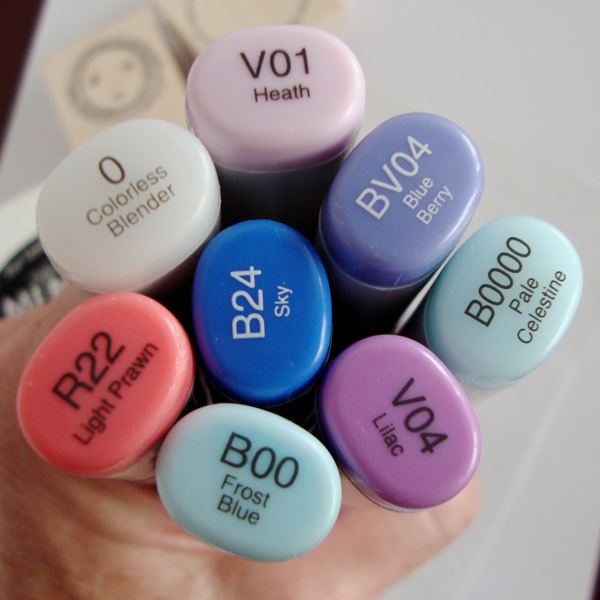
For coloring today I am sticking with my Copics but I wanted a much softer look, one that is more suited to the dreaminess of the image.  I could paint with the Copic inks, and I will show you that technique another day I promise, but for today I chose working on vellum or in this particular case on tracing paper.  You would get a very similar effect working on either, I just happened to have tracing paper within arms reach.  I am also using Memento ink in Tuxedo Black, and Copic markers B0000, B00, V01, BV04, B24 and R22.  (In the photo you also see V04 and my colorless blender that I did not end up using.)  For the card I used a small bit of watercolor paper, natural twine, blue burlap fabric and kraft cardstock.

RM moon 2

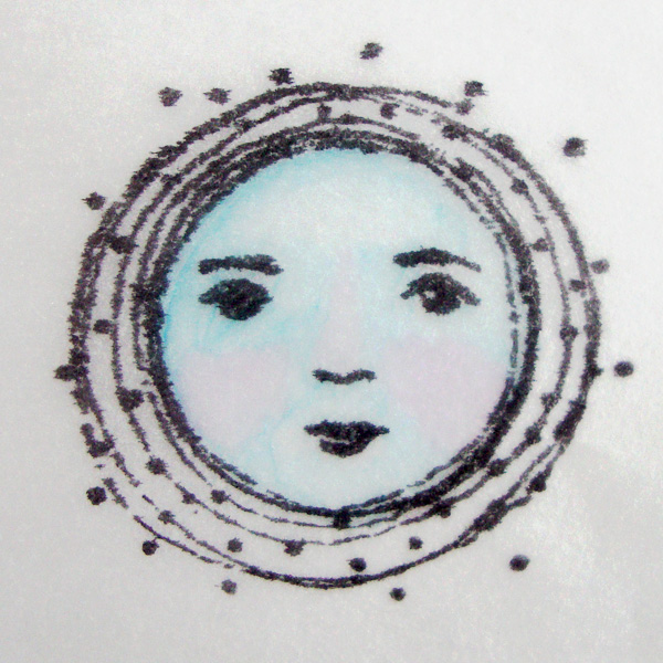
Step #1 – On your tracing paper or vellum stamp your moon image and on a few also stamp the words to the song.  I did not add them to all of mine since I was not sure exactly where I was going to end up with my project.


RM moon 1


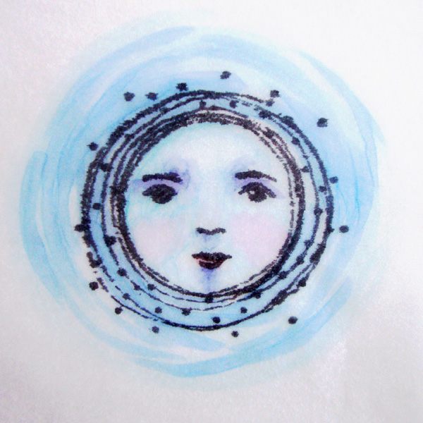
Step #2 – On the BACK SIDE of the tracing paper color in the entire moon face with B0000.  I am working on the back to soften the look of the Copics.  If you let the ink dry completely you will not have any issue with smearing even on the vellum or tracing paper if you choose to work on the stamped side of your work.  You will barely be able to see this layer but it is putting a wash over the entire face to help the next layers go on smoothly.

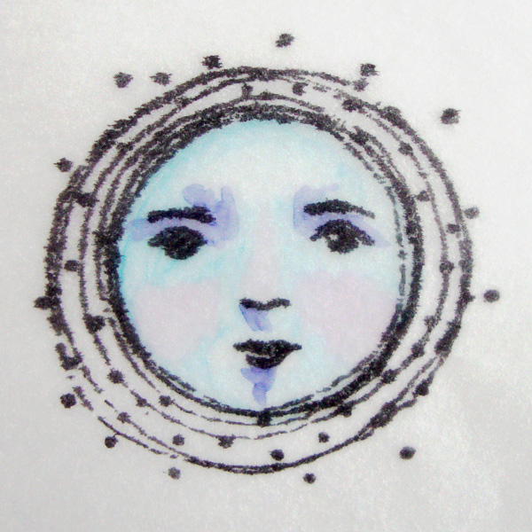
Step #3 – Using B00 go into the areas where you would like to add a little shading like under the brows, the nose the cheeks, chin and along side the nose.  This should blend fairly well as you go if you work quickly on top of the B0000.  You can always come back to soften the edges just slightly if you need to.

RM moon 3


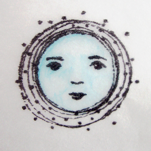
Step #4 – Add V01 into the cheeks and down the length of the nose.

RM moon 4

Step #5 – Use your BV04 to add your deepest shadows under the brow and small touches under the nose and bottom lip.

RM moon 5

Step #6 – Go back in with your B0000 to soften some of these edges.  They will not have perfectly smooth blends on the tracing paper or vellum but more of a painterly quality to them.  Also add R22 to the bottom lip.

RM moon 6

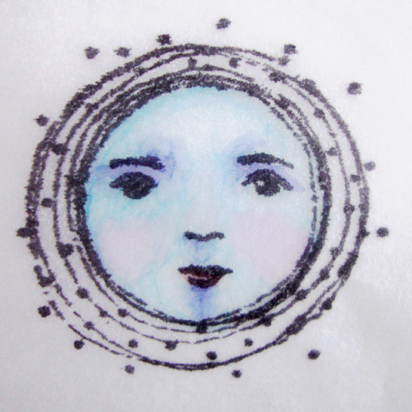
Step #7 – Using your B0000 go around the outer edge of the moon about 3/4 – 1″ again laying a base for the colors to come.

RM moon 7

Step #8 – Use both B24 and B00 to add streaking around the moon.

RM moon 8


Step #9 – Use your B000 to soften the streaking around the outer edge.

RM moon 9

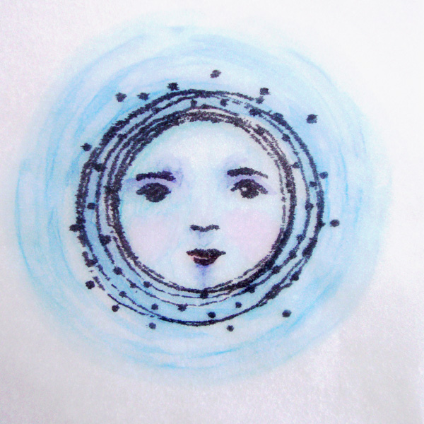
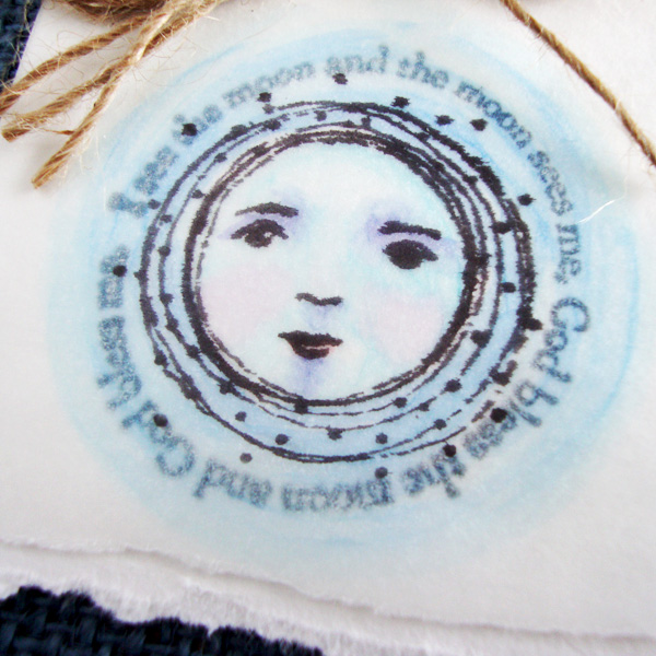
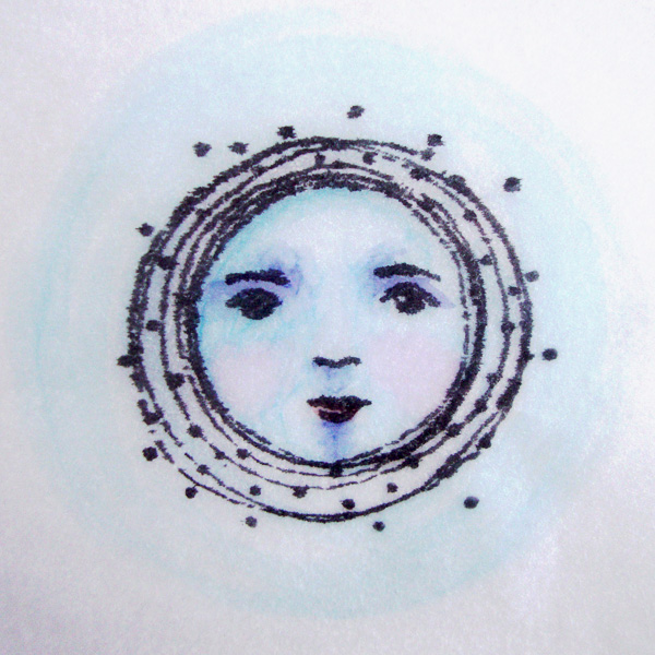
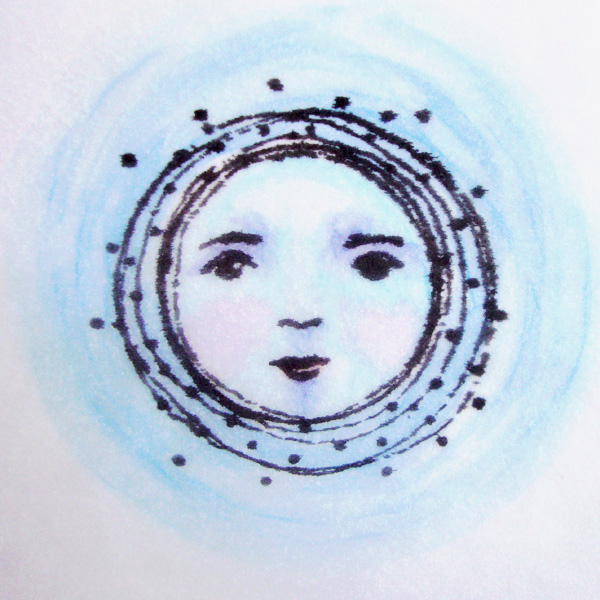
Hopefully you will be able to see a difference here, in real life there is a striking difference when I turn my image right side up again so I have the stamped image facing me.  The black becomes much more striking and the colors all soften one more step to a very watercolor look.

RM moon 10


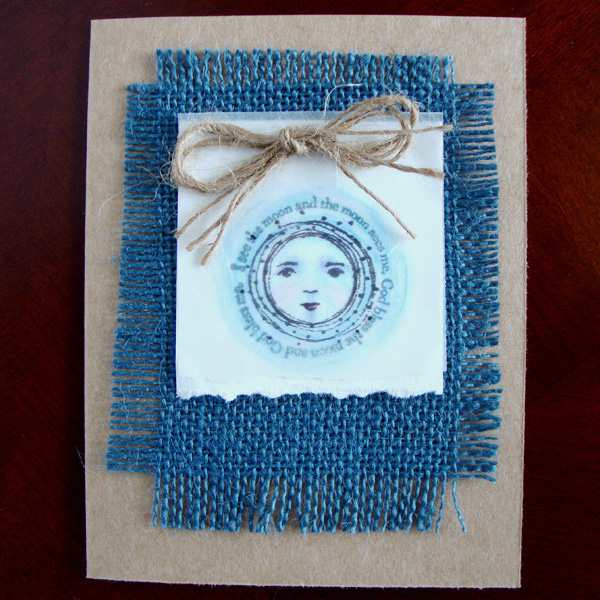
To finish I decided to stamp the words to the song onto a small piece of water color paper and then layer my colored image over the words so they show through.  I added a simple bow of tine and layered it on top of blue burlap and a kraft cardstock base.

RM moon 11

Thank you so much for stopping by my blog today!  I hope you will come back by again!  Next Wednesday I have a HUGE announcement that includes a prize giveaway, so you rely need to make it back!

Happy coloring!

Posted on

Making your own stamps at Get It Scrapped

Today at Get It Scrapped I have a brand new tutorial up sharing how to cut your own stamps.  It really is fairly easy and you can start with a kit or with things you already have around your own home.  I hope you will stop by HERE and learn how you can create your own stamps and add them onto you next scrapbook page!

stamp14


Together by Michelle Houghton | Supplies: patterned paper, trims, metal elements, flowers; SEI, wash tape; Bella Blvd., ink; Ranger and Zig

Christy Strickler also adds her amazing talents to this article as well.  Thank you so much Christy for sharing your talents!

CSFloat

Floating by Christy Strickle |Supplies Cardstock,Letters: Colorbok; Chipboard: Little Yellow Bicycle; Other; Mist, stamp, ink

Happy Monday!

Posted on 1 Comment

Color Story

I got to take part it a fun article at Get It Scrapped for this month;  “Push Your Color Story”.  We decided to take a closer look at the pattern of colors that we choose regularly and then PUSH them by either adding another color to the combination or slightly adjusting the colors themselves in value or tone to make them slightly different from your norm.

Looking back at many of my layouts I use a lot of color 🙂  It is actually hard to pick out color pairings that are favorites. I decided to explore two pairings that appear regularly in my work, purple with green and orange with blue.  I searched both on Pintrest and was amazed at the variety of variations of both combinations.  I decided to work with a pair of colors that almost combines the two together.  I found a photo featuring an indigo blue which has a bit of red in it leaning it a bit toward purple versus a royal or sky blue.  It was paired with a vivid orange.  I figured why not?  Here are my results:

Color Story

Under the Banyan Trees by Michelle Houghton | supplies: cardstock; The Paper Company, blue chevron and solid papers; Gina Miller – Seasalt, coral paper; Sara Gleason – The When, butterfly; Little Buterfly Wings – Do Not Disturb, button; Allison Pennington – I’ll Be There For You part 2, washi tape; Mainstays, twine and chipboard letters; American Crafts, feathers, flowers and vellum journaling tag; SEI

If you read the supply list you will note that there are SEVERAL digital products listed.  I did not have the colors I needed in my stash but was able to find what I needed in a couple digital kits.  I did pop the colors a little which obviously is one of the HUGE advantages of digital products.  BUT it is still me and my scissors and glue needed to do their share so I used the products I found, printed them then cut, popped up, added twine and glossy accents and finished it off with feathers, Washi tape, fabric flowers, sticker letters and even gesso and ink.  I enjoy dipping my toe in digital for the products but I am still a paper girl and can’t imagine a time when I won’t be.

There are three photos on the layout collaged together.  One large 5×7 that hold the image of our family and then 2 4×6 photos.  One horizontal image at the top right that is just of the tangled branches of the banyan trees and then a vertical shot of John and the girls wandering through the thick foliage.  The edges are a little hard to see with all the trees running into each other.

Here are a couple close ups of the page so you can see some of the digital and paper products combined:

blog for Color Story

blog 3


Fun to find a new combination of colors that I love!

Happy Wednesday!

Posted on

Additional photos for wing layout

I forgot to include the additional photos of my wing layout so thought I would add them now.  Here is a closer look at the wing before any layers end up on top of the inky layers.

wings blog1


Here is a tighter look at some of the doodling, notice there is an area that appears to be unfinished, I knew where my photo collage was going to sit so I gave my hand a break and did not cover the entire are with small doodles.

wings blog2


And here is a closer look at that gold butterfly and some details.

wings blog3

Thanks for taking a second peek at this layout.  It was a pleasure to create and to share!  Remember to peek at the other wing artist’s work at Get It Scrapped HERE.

Happy Thursday!

Posted on

Wings on Scrapbook Pages

Every time I do an artistic layout for Get It Scrapped I think this is it!  I think this might be my all time favorite!  SO then you ask why do you not just do these all the time?  Welllll time?  They do take a little more time or maybe a lot more time but boy are the end results worth it 🙂  In the midst of my tutorial at Rubbermoon and Copic Craft Room share that went up yesterday I also had a page posted at Get It Scrapped in an article about using wind details on your layouts.  It is a new trend in fashion to have magnified wing, like bird and butterfly, details creating pattern and texture into a fabric.  Being on top of current trends the Creative Team took the challenge to see if we could add these lovely looks onto our pages.  I would say the group was highly successful!  Here is my contribution.

Wings


She Has Wings by Michelle Houghton | supplies: cardstock; Colorbok, watercolor paper; Strathmore, spray ink; Ranger, ink pens; Sharpie and Faber-Castell, lettering; hand drawn cut with Brother Scan and Cut, sequins and butterfly; Jenni Bowlin

I have done the photo collaging technique before with the girls playing on the playground.  This time I was catching Sara in each position moving across the bars I was just so excited to have captured the one mid-flight!  The wing itself is a mish-mosh of mixed media.   I started with stencils and ink mists on watercolor paper.  Then I added a layer of gesso in certain areas (which I just realized I did not include in the supplies YIKES!) I painted over the bottom right circle and then gave the first outline of the wing in a broad brush stroke of gesso. The gesso re-liquifies ends up adding tints of the colors lying beneath into the gesso.  Lastly I divide up the sections and add detailed doodling into the wings.  The title was cut with my Scan and Cut, I scanned my handwriting and then cut it out of white cardstock and then to finish the layout added a sprinkling of gold sequins and the gorgeous gold butterfly.

To see the rest of the beautiful wing detail inspiration check out the full article HERE.

Hope everyones weather is smiling at them today!

Happy Wednesday!