I got to take part it a fun article at Get It Scrapped for this month; “Push Your Color Story”. We decided to take a closer look at the pattern of colors that we choose regularly and then PUSH them by either adding another color to the combination or slightly adjusting the colors themselves in value or tone to make them slightly different from your norm.
Looking back at many of my layouts I use a lot of color 🙂 It is actually hard to pick out color pairings that are favorites. I decided to explore two pairings that appear regularly in my work, purple with green and orange with blue. I searched both on Pintrest and was amazed at the variety of variations of both combinations. I decided to work with a pair of colors that almost combines the two together. I found a photo featuring an indigo blue which has a bit of red in it leaning it a bit toward purple versus a royal or sky blue. It was paired with a vivid orange. I figured why not? Here are my results:
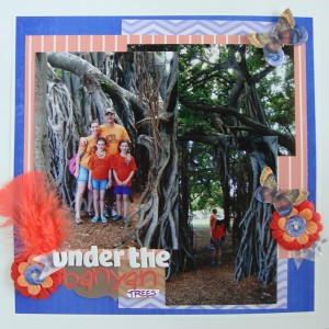
Under the Banyan Trees by Michelle Houghton | supplies: cardstock; The Paper Company, blue chevron and solid papers; Gina Miller – Seasalt, coral paper; Sara Gleason – The When, butterfly; Little Buterfly Wings – Do Not Disturb, button; Allison Pennington – I’ll Be There For You part 2, washi tape; Mainstays, twine and chipboard letters; American Crafts, feathers, flowers and vellum journaling tag; SEI
If you read the supply list you will note that there are SEVERAL digital products listed. I did not have the colors I needed in my stash but was able to find what I needed in a couple digital kits. I did pop the colors a little which obviously is one of the HUGE advantages of digital products. BUT it is still me and my scissors and glue needed to do their share so I used the products I found, printed them then cut, popped up, added twine and glossy accents and finished it off with feathers, Washi tape, fabric flowers, sticker letters and even gesso and ink. I enjoy dipping my toe in digital for the products but I am still a paper girl and can’t imagine a time when I won’t be.
There are three photos on the layout collaged together. One large 5×7 that hold the image of our family and then 2 4×6 photos. One horizontal image at the top right that is just of the tangled branches of the banyan trees and then a vertical shot of John and the girls wandering through the thick foliage. The edges are a little hard to see with all the trees running into each other.
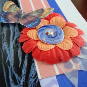
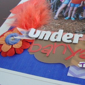
Here are a couple close ups of the page so you can see some of the digital and paper products combined:
Fun to find a new combination of colors that I love!
Happy Wednesday!



I just love how you have taken your copics and coloured in your world…thank you for reminding that these wonderful markers have a place everywhere and not just on card!!!