I feel like I fell off the face of the Earth! It has been a long trail, but I am back. So here is where I have been… October 19th through 24th I was in Eugene, Oregon with the fabulous Imagination International Inc./Copic team! I learned a lot and am all ready with a stomach full of butterflies for the 2015 teaching season to begin. Those of you who are Copic fans hopefully seen the line-up and locations for the season. There is more information coming ASAP so stay tuned! 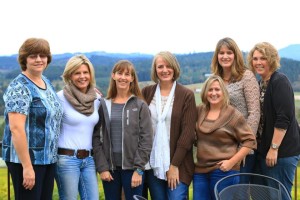 I returned home to see my Mom and Dad back to Washington and resettle my home. Sadly Lori came home mid-day Monday and did not return to school until Tuesday November 4th! Yes that is 6 days missed she was sick sick sick! Sara was in her first official play on October 28th. (She stole the show if you are wondering and that is not just Mom talking this girl has skills!) Halloween quickly followed, Sara had a party with new friends, she went as a biker girl. Lori did make a quick loop in the neighborhood, so she did not miss the festivities entirely.
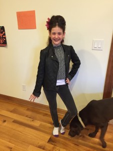
 This week almost feels back to normal, I am sitting watching both girls at gymnastics in what feels like forever! I am glad to be home, blessed that my family is feeling well at this moment and so excited for the upcoming months! Happy Friday!
Category: Family
Scrapping with Free Public Domain Images
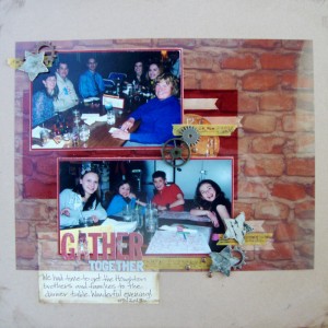
Here is my second layout that I created for Get It Scrapped this month. Everyone on the Creative Team used images they found on Public Domain sites and added them in unique ways onto their pages. All of the images that were used were specifically not designated as scrapbooking images but were used as such. Some created tags, embellishment and papers to layer on their pages. It is worth a peak at all the ideas and check out some of the images sources as well. To see the rest of the inspiration check HERE. This is the layout that I shared:
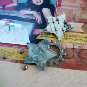
Gather Together by Michelle Houghton | supplies: paper and gears; Ranger, letters; Basic Grey, brads; Making Memories, stars; Prima, washi tape; Calallini & Co.
I had a great time surfing free photo sites. It is really important to make sure that when you use an image, photo or art work from on-line that you are allowed to use it! There are a lot of things out there that people share, but really have no intention of you coping and sharing yourself. On the other hand there are now A LOT of free public domain sites that collect images that are specifically put on line to be shared! I found this beautiful photo of a brick wall that I printed on a transparency and then altered into my page. I had a great time layering all my element over and under the transparency! It was so fun to see how placing things under the transparency in particular changed the color and feel of the page and elements.
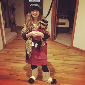
The other major project that happened for me this past week was a Halloween costume! Sadly, yes only one this year, so sad, my Sara is pulling her own together to dress up with friends. The times they are a changin’ and I am not sure I ma quite ready for it! Lori still let me create her a unique one of a kind look though. She is going as her American Girl Doll Rebecca and I have to say she is looking good! Right down to the boot covers that I created to look exactly like Rebecca’s! I will post a photo when we get her all “dolled” up, ha ha sorry couldn’t resist!
Happy Hump day!
Layout and life updates
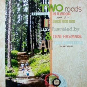
I have a new layout in an article over at Get It Scrapped and I LOVE it! This is a technique that I had not tried before and I am so glad I did! The article is about using photographs that are 6″ x 12″ on a layout. HERE
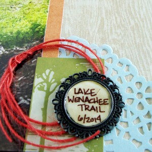
Lake Wenatchee Trail by Michelle Houghton | Supplies: wood grain paper and sticker letters; Basic Grey, orange patterned paper, green tag and doily; SEI, chipboard letters; Jilly Bean Soup, twine; American Crafts, ink; Zig and Ranger, metal charm; unknown
I am embarrassed to say there is a type-O in my remarks there. It says I used various “dots” which if you look at the layout I obviously did not, I used various “fonts”. The main reason I have not tried this before is the size of the photograph. I do not have a printer that will handle a 12″ photo. Solution I had two photos printed at my local shop as 11″ x 14″, ones I knew that I could crop 2″ of the 14″ length and 5″ of the 11″ width. Here is a close up of some details.
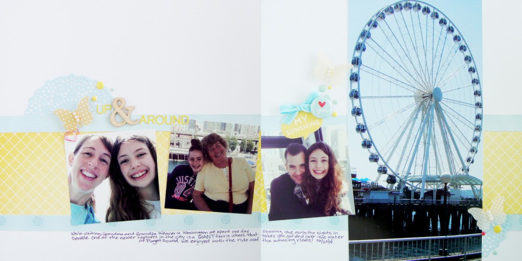
I also created a second layout using a 6″ x 12″ photo since I had 2 printed just in case and ended up loving this one equally as well.
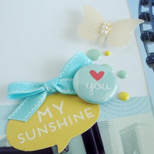
Up & Around by Michelle Houghton | supplies: cardstock; Colorbok, patterned paper; Crate Paper, wood veneer , heart clip, dots and flair: Freckled Fawn, butterflies;Jenni Bowlin, letters; Basic Grey, doily; SEI
This is one of those pages that fell together. I am so glad I printed both photos and was able to complete the two page layout as well.
In the Copic world we have added some of the last classes of the 2014 onto the schedule! You can chef them in the class listing, just click on the link over to the right. If you near any of these last stopping spots the classes are all spectacular an worth the time and effort.
On the family front the girls are loving school! Loving it! Sara happily reports she still has not gotten lost in the Middle School hallways and just this week beat ALL the girls and ALL but one boy in the pull up testing for PE. You go girl! Lori loves her class and teacher and is thriving in ELP she particularly loves this pull out time. She has become as veracious a reader as Sara and spends much time poring over the 3 to 4 books she likes to have going all at once.
Life here in Des Moines is cruising right along. We are praying for John’s sister Sheri as she is struggling mightily with her health again and we desire peace and comfort for her.
Happy Thursday all!
Colorado Beauty
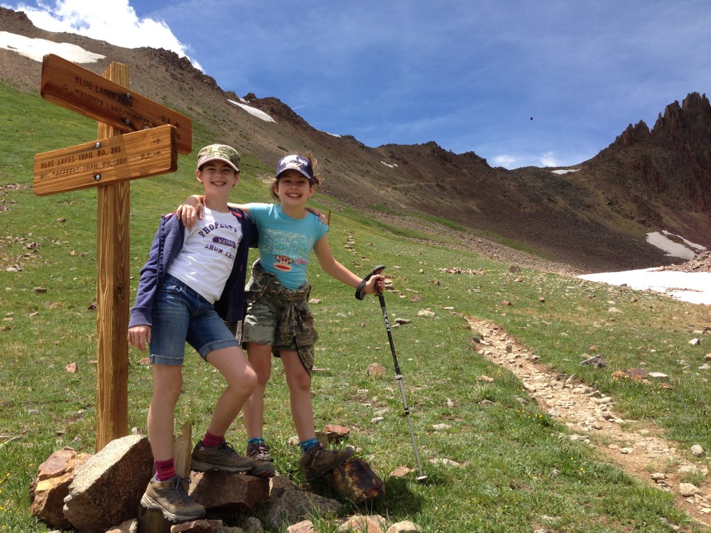
Here is our view from the top of Mt. Sneffels the girls, John and I hoofed it to the top and John did this panoramic shot of the view in ALL directions. It was amazing as you can see. If you look really close the girls and I are perched out on the rocks smack dab in the middle of the photo.
Yep the best to hikers around!
Happy weekend!
Back Again and Catching Up
Well we are back from our adventure in Colorado. I will try to upload a few photos and share later this week. Traveling trough some of the most beautiful country in the world in Jeeps and hiking produced more than a few amazing shots.
In the meantime while I was traipsing about I had layouts appear in 3 articles over at Get It Scrapped that I thought I would share quickly. The first posted before we left, but I just did not have the time to get my post together and share:
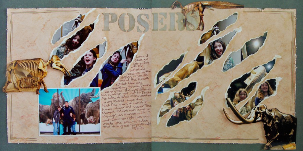
Posers by Michelle Houghton | Supplies: patterned paper; SEI, ink; Sharpie and Ranger, letters cut on a Brother Cut and Scan.
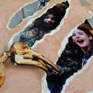
The article is all about Adding Layers Behind Cutaways. I decided to use photos from a museum visit and thought it my make a good connection to try to imitate what the saber tooth cat might do to my scrapbook paper. I laid my photos on top of my paper then marked not only the corners, but the diagonal lines where I wanted the “claw marks” to travel along. I did all of the marking very lightly in pencil so I be able to erase those later. Then I used a kraft knife to cut a line along my diagonals and tore the paper outward from those cuts by hand. I would hold the photos up underneath the tears periodically to make sure the holes were large enough to see the portions of the photos I wanted to feature. I then attached the photos to the back of the torn patterned paper and finished the layout. I have to say it was fun to see how the rest of the team tackled this particular assignment, I am thinking I will use one or two of their ideas on future layouts! Check out all the layouts HERE.
Next I created a layout for an article about 2 Page Layouts With a Cluster Foundation.
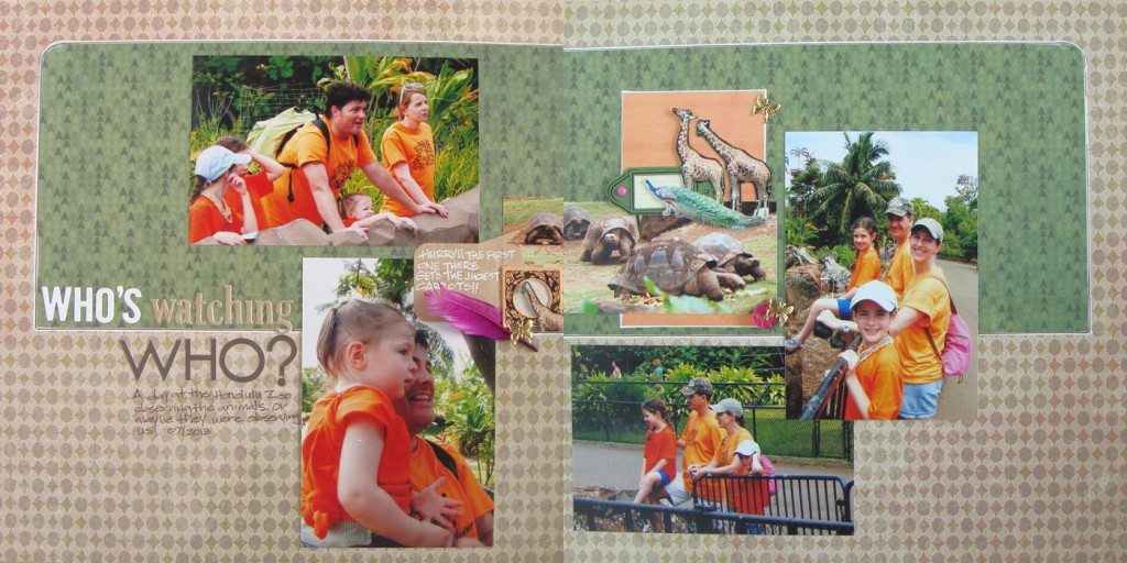
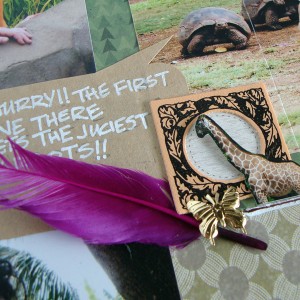
Who’s Watching Who by Michelle Houghton | Supplies: patterned paper, canvas tags, buttons, butterfly brads and feather; SEI, sticker letters Bella Blvd., ink; Sharpie, twine; American Crafts, kraft speech bubble; Maya Road
There is not much more to say about this layout then what I shared in the article, but I can tell you that I used 5 different animal photos in my central cluster. I love taking animal photos at the zoo and this is a great way to include a lot of them on a single layout, especially since we are zoo goers and end up with so many photos every year! Check out the beautiful pages from the other Creative Team members HERE.
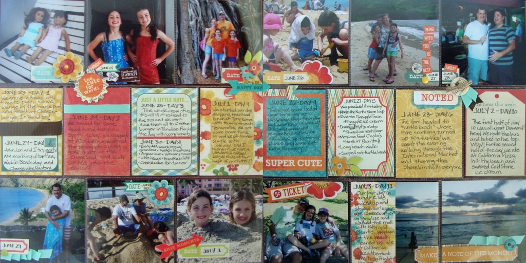
Lastly I did a layout using pocket pages encompassing our entire Hawaii trip last summer. I am a “newbie” at pocket pages and had so much fun putting this one together. It worked perfectly for this particular layout!
Hawaii by Michelle Houghton | Supplies: pocket pages; Project Life by Becky Higgins, patterned cards, stickers, chipboard and date tags; My Mind’s Eye, twine ; American Crafts, ribbon; unknown, ink; Sharpie
I used my “memory book” daughter Sara to help me as we travelled home from the trip to write a few notes on every day that we were in Hawaii. Between the two of us we managed to remember the primary events to all 11 days. I would recommend doing this during your trip or immediately afterward before you forget! Somehow I managed to NOT get my complete supply list in the article so I have added it here and I did add small sticker letters and numbers saying Hawaii 2013 on the brown ribbon in the very first journaling card slot. I loved the creative way the other team members tackled this assignment, you can see all of their work HERE.
Woosh! As always the list of things to catch up on upon coming home seems endless but I am getting there slowly but surely! I will post some photos of our trip later this week!
Happy scrapping and coloring to all!
