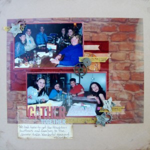
Here is my second layout that I created for Get It Scrapped this month. Everyone on the Creative Team used images they found on Public Domain sites and added them in unique ways onto their pages. All of the images that were used were specifically not designated as scrapbooking images but were used as such. Some created tags, embellishment and papers to layer on their pages. It is worth a peak at all the ideas and check out some of the images sources as well. To see the rest of the inspiration check HERE. This is the layout that I shared:
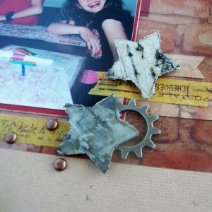
Gather Together by Michelle Houghton | supplies: paper and gears; Ranger, letters; Basic Grey, brads; Making Memories, stars; Prima, washi tape; Calallini & Co.
I had a great time surfing free photo sites. It is really important to make sure that when you use an image, photo or art work from on-line that you are allowed to use it! There are a lot of things out there that people share, but really have no intention of you coping and sharing yourself. On the other hand there are now A LOT of free public domain sites that collect images that are specifically put on line to be shared! I found this beautiful photo of a brick wall that I printed on a transparency and then altered into my page. I had a great time layering all my element over and under the transparency! It was so fun to see how placing things under the transparency in particular changed the color and feel of the page and elements.
The other major project that happened for me this past week was a Halloween costume! Sadly, yes only one this year, so sad, my Sara is pulling her own together to dress up with friends. The times they are a changin’ and I am not sure I ma quite ready for it! Lori still let me create her a unique one of a kind look though. She is going as her American Girl Doll Rebecca and I have to say she is looking good! Right down to the boot covers that I created to look exactly like Rebecca’s! I will post a photo when we get her all “dolled” up, ha ha sorry couldn’t resist!
Happy Hump day!


