I had two layouts in articles at Get It Scrapped this past week and I thought I better get caught up! I have been frantically coloring, coloring for the new 2015 classes for Copic! You will all love the new images and the classes that will be offered this year are going to be spectacular!
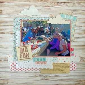
In the mean time I am still busy creating scrapbook pages for Get It Scrapped. One is editing photos that are not that great to use on your pages. The contributors all use different techniques to get their photos looking sharper, brighter and just better. Some of the techniques are on their phones or on editing programs on their computers but there are some helpful tips so make sure to check them out HERE. This is the layout that I shared:
Chow Down by Michelle Houghton | supplies: patterned paper and bingo card; Jenni Bowlin, patterned paper; Pink Paislee, doily and blue sticker letters; Freckled Fawn, wood veneer card and orange sticker letters; Basic Grey, wood veneer lettering; Studio Calico, clouds; October Afternoon
I loved this photo of all of us gathered around the table at Disney Land, but the back lighting washed out many of the precious faces. Using Photo Shop Elements I was able to get the faces at the back a little lighter. You can see the exact steps I took at Get It Scrapped. I had a great time layering all the pretty papers, doilies and embellishments on my page, lots of Jenni Bowlin kit supplies as well as Freckled Fawn.
I will have another layout to share later this week some come back for more and make sure to check out the Copic Classes that are left for the 2014 season, you have to grab them fast before they are gone, gone, gone!
Happy crafting!


