Posted on 1 Comment

We are up and running!

School has started here at our house and the girls are both loving their new classes.  Lori is in 4th grade this year and Sara is in 6th, which around here means middle school!  They are both having fun and were ready to go back so the world is a happy place!

image-3

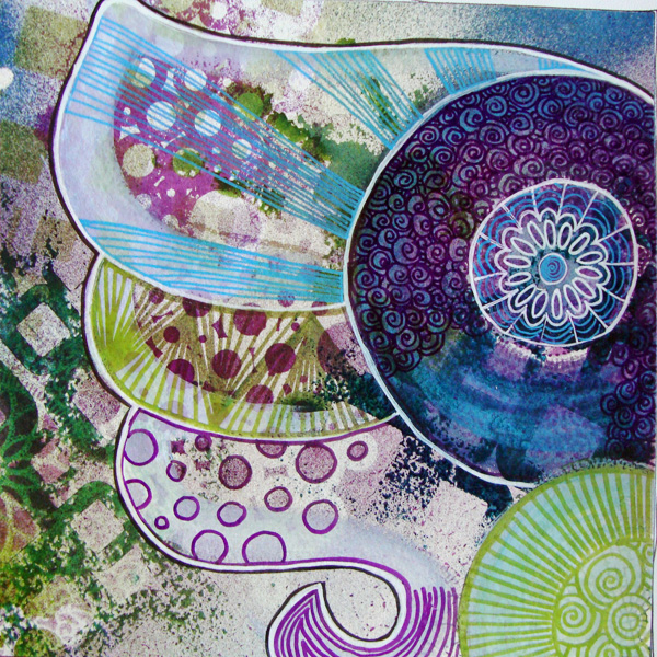
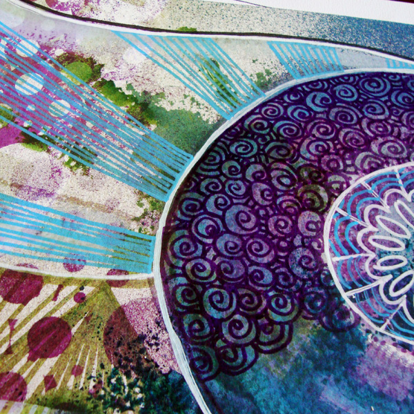
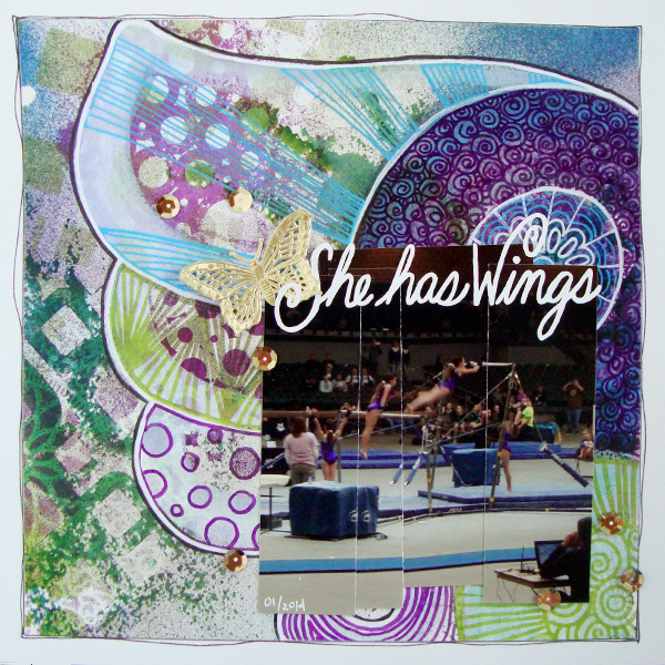
On Monday I got to share a layout at Get It Scrapped featuring a Venn Diagram.  If you are not sure what that is I’ll bet you will recognize it when you see it!  We learn all about them in early grade school as a way to organize stories and ideas.  Circles interlocking and overlapping showing how things interact.

Venn Diagram


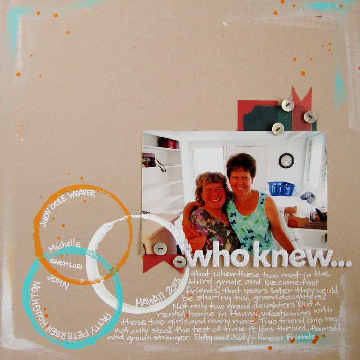
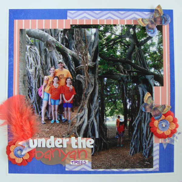
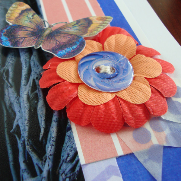
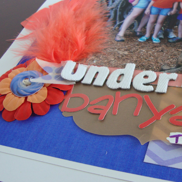
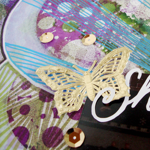
who knew…by Michelle Houghton | Supplies: cardstock; Tim Holtz by Ranger, acrylic paint; Dina Wakley by Ranger, fabric letters; Studio Calico by American Crafts, ink; Sharpie, vellum tags; SEI, buttons; an old favorite shirt

blog ven 1

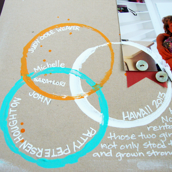
I have told tidbits of how John and I met through several layouts over time and this seemed like a great opportunity to share a little more.  I used acrylic paint and a cardboard ring to create my Venn Diagram and I love how loosey goosey it turned out and the fact that I could place it right on top of the photo as well was a bonus.  I just realized that in the photo the vellum tags do not look the same as in real life.  The big navy looking tag above the photo is actually a teal color that is similar in hue to the ring and both orange tags are considerably darker in the photo as well.  Hmmmm… not sure why that got thrown off so much but oh well.  I loved how the Creative Team explored different styles of diagrams and uses for them.  Take a peek at all the inspiration HERE

Get It Scrapped is currently running an amazing deal!  You can get a 25% off discount to the monthly subscription through next Friday HERE and check out this sneak peek at what is coming up in early September!

tn_gallery_67_474_256976

In the mean time I am crazy busy trying to catch up on the house design team and Copic work and writing a few new classes and a few appointments I was holding off to do.  It is all keeping me out of trouble that is for certain!

Happy Friday!


Posted on

Back Again and Catching Up

Well we are back from our adventure in Colorado.  I will try to upload a few photos and share later this week.  Traveling trough some of the most beautiful country in the world in Jeeps and hiking produced more than a few amazing shots.

In the meantime while I was traipsing about I had layouts appear in 3 articles over at Get It Scrapped that I thought I would share quickly.  The first posted before we left, but I just did not have the time to get my post together and share:

Cut Aways


Posers by Michelle Houghton | Supplies: patterned paper; SEI, ink; Sharpie and Ranger, letters cut on a Brother Cut and Scan.

blog 3

The article is all about Adding Layers Behind Cutaways.  I decided to use photos from a museum visit and thought it my make a good connection to try to imitate what the saber tooth cat might do to my scrapbook paper.  I laid my photos on top of my paper then marked not only the corners, but the diagonal lines where I wanted the “claw marks” to travel along.  I did all of the marking very lightly in pencil so I be able to erase those later.  Then I used a kraft knife to cut a line along my diagonals and tore the paper outward from those cuts by hand.  I would hold the photos up underneath the tears periodically to make sure the holes were large enough to see the portions of the photos I wanted to feature.  I then attached the photos to the back of the torn patterned paper and finished the layout.  I have to say it was fun to see how the rest of the team tackled this particular assignment, I am thinking I will use one or two of their ideas on future layouts!  Check out all the layouts HERE.

Next I created a layout for an article about 2 Page Layouts With a Cluster Foundation.

2 Page Cluster

Who’s Watching Who by Michelle Houghton | Supplies: patterned paper, canvas tags, buttons, butterfly brads and feather; SEI, sticker letters Bella Blvd., ink; Sharpie, twine; American Crafts, kraft speech bubble; Maya Road

blog 1

There is not much more to say about this layout then what I shared in the article, but I can tell you that I used 5 different animal photos in my central cluster.  I love taking animal photos at the zoo and this is a great way to include a lot of them on a single layout, especially since we are zoo goers and end up with so many photos every year!  Check out the beautiful pages from the other Creative Team members HERE.

Lastly I did a layout using pocket pages encompassing our entire Hawaii trip last summer.  I am a “newbie” at pocket pages and had so much fun putting this one together. It worked perfectly for this particular layout!

Vacation summery

Hawaii by Michelle Houghton | Supplies: pocket pages; Project Life by Becky Higgins, patterned cards, stickers, chipboard and date tags; My Mind’s Eye, twine ; American Crafts, ribbon; unknown, ink; Sharpie

I used my “memory book” daughter Sara to help me as we travelled home from the trip to write a few notes on every day that we were in Hawaii.  Between the two of us we managed to remember the primary events to all 11 days.  I would recommend doing this during your trip or immediately afterward before you forget!  Somehow I managed to NOT get my complete supply list in the article so I have added it here and I did add small sticker letters and numbers saying Hawaii 2013 on the brown ribbon in the very first journaling card slot.  I loved the creative way the other team members tackled this assignment, you can see all of their work HERE.

Woosh!  As always the list of things to catch up on upon coming home seems endless but I am getting there slowly but surely!  I will post some photos of our trip later this week!

Happy scrapping and coloring to all!

Posted on 1 Comment

Color Story

I got to take part it a fun article at Get It Scrapped for this month;  “Push Your Color Story”.  We decided to take a closer look at the pattern of colors that we choose regularly and then PUSH them by either adding another color to the combination or slightly adjusting the colors themselves in value or tone to make them slightly different from your norm.

Looking back at many of my layouts I use a lot of color 🙂  It is actually hard to pick out color pairings that are favorites. I decided to explore two pairings that appear regularly in my work, purple with green and orange with blue.  I searched both on Pintrest and was amazed at the variety of variations of both combinations.  I decided to work with a pair of colors that almost combines the two together.  I found a photo featuring an indigo blue which has a bit of red in it leaning it a bit toward purple versus a royal or sky blue.  It was paired with a vivid orange.  I figured why not?  Here are my results:

Color Story

Under the Banyan Trees by Michelle Houghton | supplies: cardstock; The Paper Company, blue chevron and solid papers; Gina Miller – Seasalt, coral paper; Sara Gleason – The When, butterfly; Little Buterfly Wings – Do Not Disturb, button; Allison Pennington – I’ll Be There For You part 2, washi tape; Mainstays, twine and chipboard letters; American Crafts, feathers, flowers and vellum journaling tag; SEI

If you read the supply list you will note that there are SEVERAL digital products listed.  I did not have the colors I needed in my stash but was able to find what I needed in a couple digital kits.  I did pop the colors a little which obviously is one of the HUGE advantages of digital products.  BUT it is still me and my scissors and glue needed to do their share so I used the products I found, printed them then cut, popped up, added twine and glossy accents and finished it off with feathers, Washi tape, fabric flowers, sticker letters and even gesso and ink.  I enjoy dipping my toe in digital for the products but I am still a paper girl and can’t imagine a time when I won’t be.

There are three photos on the layout collaged together.  One large 5×7 that hold the image of our family and then 2 4×6 photos.  One horizontal image at the top right that is just of the tangled branches of the banyan trees and then a vertical shot of John and the girls wandering through the thick foliage.  The edges are a little hard to see with all the trees running into each other.

Here are a couple close ups of the page so you can see some of the digital and paper products combined:

blog for Color Story

blog 3


Fun to find a new combination of colors that I love!

Happy Wednesday!

Posted on

Additional photos for wing layout

I forgot to include the additional photos of my wing layout so thought I would add them now.  Here is a closer look at the wing before any layers end up on top of the inky layers.

wings blog1


Here is a tighter look at some of the doodling, notice there is an area that appears to be unfinished, I knew where my photo collage was going to sit so I gave my hand a break and did not cover the entire are with small doodles.

wings blog2


And here is a closer look at that gold butterfly and some details.

wings blog3

Thanks for taking a second peek at this layout.  It was a pleasure to create and to share!  Remember to peek at the other wing artist’s work at Get It Scrapped HERE.

Happy Thursday!

Posted on

Wings on Scrapbook Pages

Every time I do an artistic layout for Get It Scrapped I think this is it!  I think this might be my all time favorite!  SO then you ask why do you not just do these all the time?  Welllll time?  They do take a little more time or maybe a lot more time but boy are the end results worth it 🙂  In the midst of my tutorial at Rubbermoon and Copic Craft Room share that went up yesterday I also had a page posted at Get It Scrapped in an article about using wind details on your layouts.  It is a new trend in fashion to have magnified wing, like bird and butterfly, details creating pattern and texture into a fabric.  Being on top of current trends the Creative Team took the challenge to see if we could add these lovely looks onto our pages.  I would say the group was highly successful!  Here is my contribution.

Wings


She Has Wings by Michelle Houghton | supplies: cardstock; Colorbok, watercolor paper; Strathmore, spray ink; Ranger, ink pens; Sharpie and Faber-Castell, lettering; hand drawn cut with Brother Scan and Cut, sequins and butterfly; Jenni Bowlin

I have done the photo collaging technique before with the girls playing on the playground.  This time I was catching Sara in each position moving across the bars I was just so excited to have captured the one mid-flight!  The wing itself is a mish-mosh of mixed media.   I started with stencils and ink mists on watercolor paper.  Then I added a layer of gesso in certain areas (which I just realized I did not include in the supplies YIKES!) I painted over the bottom right circle and then gave the first outline of the wing in a broad brush stroke of gesso. The gesso re-liquifies ends up adding tints of the colors lying beneath into the gesso.  Lastly I divide up the sections and add detailed doodling into the wings.  The title was cut with my Scan and Cut, I scanned my handwriting and then cut it out of white cardstock and then to finish the layout added a sprinkling of gold sequins and the gorgeous gold butterfly.

To see the rest of the beautiful wing detail inspiration check out the full article HERE.

Hope everyones weather is smiling at them today!

Happy Wednesday!