Posted on 1 Comment

Comics and Juvenile Prints

I seem to be in a pattern of having articles go up back to back at Get It Scrapped these days.  It certainly makes it easy for me to share here.  Here is a peek at some of the inspiration found the past week at Get It Scrapped:

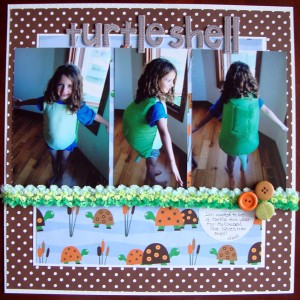
This layout was part of a very fun, kid friendly, set of inspiration all centered around using juvenile themed prints, you know the cutesy stuff!

blog turtle shell

Turtle Shell by Michelle Houghton | Supplies: cardstock; Bazzill Swiss Dots, chipboard letters; American Crafts, buttons; Buttons Galore, journal tag; Jenni Bowlin, patterned paper and trim unknown.

I do not often scrap with juvenile prints BUT when I saw this particular paper I knew it was a must, I even knew which photos I would most likely scrap with it.  I wish I still had the manufacturer to share but I lost it along the way.  The fiber was one of MANY that my friend Brenda and I collect when we shop at CKC in Kansas City each year.  We seem to be drawn to them and they are sold by the yard at many of the vendors.  The problem is none of them are marked with manufacturers.  They are already cut and hanging or thrown into big bins, all of which are tremendous fun to dig through :-).  The green button was already in my monster stash, it is the only one I had and has the perfect turtle shell texture to tie the whole thing together.   The “turtle shell” was a big deal in our house and is still being worn to this day so it deserved a special page all to itself.   Check out all the other fun, pages HERE

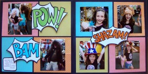
Today a new article about using a current trend of comic books and superheros in layouts was posted.  There are a whole heap of layouts and all were done so differently this is a really cool article with a ton of ideas to check out!  Here is the layout I completed for the assignment:

Comic Double Page

Pow Bam by Michelle Houghton | Supplies: cardstock; The Paper Company, patterned papers; American Crafts, SEI and Doodlebug Designs Inc., ink; Sharpie and Copic

I think you can tell I had a great time putting this layout together.  I had a pretty clear picture in my head of what I wanted to start; the black grid and the bold power words.  As I started pulling papers the layout just started falling together.  The words I created by hand.  I lightly sketched them in pencil, checking for size, filled them with bold Copic color and then used a Sharpie to create the thick outlines.  I fussy cut them out and added them to my layout with pop dots to “pop” them off the page even further.  Make sure to stop by to check out the other 13 layouts all with comic and superhero inspiration  HERE

I will have another post tomorrow!  I have my first photos for the September Photo a Day challenge ready to go!  I am excited that I will actually have photos of September this year!
Posted on 2 Comments

Ombre and Gallery Wall

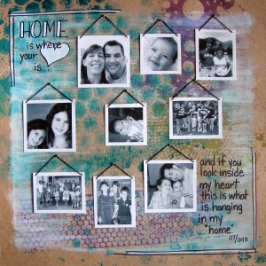
I have two layouts post at Get It Scrapped in the past two days so i figured it was easiest to post them here together as well.  The first is a layout inspired by Gallery walls.  The ladies at Get It Scrapped collected a lovely collection of artfully arranged gallery walls on Pinterest and asked us to create a layout inspired by a gallery wall.

Gallery

Home Is Where The Heart Is by Michelle Houghton | Supplies: cardstock; Kraft, spray mists; Adirondack, ink; Sharpie, gesso; Golden, embroidery floss; unknown

The base of this layout was created by using spray mists with stencils and then after it had dried using a dry brush with gesso over the page.  Because the inks are water based I did get a little color pulling up into the gesso which I love.  I then printed my photos at home after cropping them and turning them black and white.  I printed them on matte photo paper so they stayed very contrasty and clean.  When I trimmed them I purposefully left the white paper around the edge of the photo to create the look of frames.  Each one of the photos got a embroidery floss hanger.  I just poked a hole in each top corner and threaded the floss through, tying it in back.  I had really tiny brads that look like screws so each photo was “hung” with a brad and then I added the journaling, title and doodles with my Sharpies.

Check out the rest of the Creative Team’s gallery walls HERE

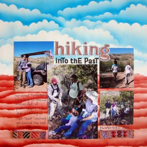
Today’s article was featuring layouts using ombre to enhance the feel of the layout.  Here is the layout I contributed:

Ombre

Hiking Into the Past by Michelle Houghton | Supplies: ink; Copic and Sharpie, sticker letters; Jenni Bowlin, cardstock, small sticker letters and trim unknown.

I am pretty excited about this layout, I love how the background turned out.  I used Copic markers specifically B05,  E07 and E09 to create the airbrushed ombre effect.  I have a “cloud” scalloped stencil that I created just for this effect and then I tore a piece of cardstock for the layered red rock look that is so indicative of Arizona. After adding my photos and title, a portion of which were colored with my Copics to match I added journaling about our hike through petroglyphs and the fact that Lori completed all but the last 100 yards or so in a full boot because of her broken toe on the trip.  She is the one on Dad’s shoulders in the upper right photo.  The trim was an amazing find at the Creating Keepsakes Convention last year and sadly I do not know who made it but I knew it would be perfect for these layouts.

Check out all the amazing ombre effect from the Creative Team HERE

We are doing great here, girls are LOVING the start to their 3rd and 5th grade years. Oh and I have an 11 year old at my house YIKES how did that happen!?  We are melting in temperatures hitting over 100 most late afternoons right now hoping the end is close.

Happy end of August to you all!

Posted on 1 Comment

Pinwheels

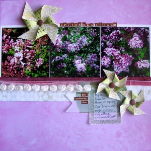
I shared an easy tutorial on how to make your own pinwheels at Get It Scrapped this week.  There is really nothing to them.  They are, as we like to say, easy peasy!

Here is the layout I created using my pinwheels:

pinwheel

Spring Has Sprung by Michelle Houghton | Supplies: cardstock; American Crafts, patterned papers, vellum tags and brads; SEI, ink; Sharpie, sticker letters and words; Cosma Cricket, trims; unknown

Click HERE to read about how to put these fun pinwheels together.

Click HERE to see more inspiration with pinwheels!

Also Amy Kingsford has been writing an amazing series about finding inspiration in your surroundings and all three articles are must read material.  Click HERE to read the third installment and get links to the first two.

Happy weekend all!

Posted on

Two Fonts

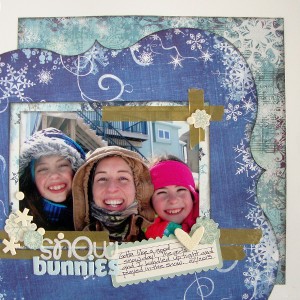
There is a fun title technique being featured at Get It Scrapped today.  Working with two different fonts in your title work.  I love the variety of ways that the Creative Team came up with to showcase tow fonts!  I had not thought of several of these options, just shows how I fall into a routine and can’t see outside my own little box.  Here is the layout I came up with;

Combining fonts in title

Snow Bunnies by Michelle Houghton | Suppies: cardstock; The Paper Company, patterned paper; Bo Bunny, Patterned paper die cut; Fancy Pants, die cuts and washi tape; SEI, chipboard and sticker letters; Doodlebug Designs Inc., fabric letters; American Crafts, ink; Tsukineko, Sharpie and Copic

I manipulated both of these fonts.  The top “snow” is a sticker letter created by Doodlebug Designs that I added glitter to.  The “bunnies” is a fabric Thicker made by American Crafts that I colored with my Copic markers to match the cool feel of the page.  Nothing like a snow page in July to cool you off right?  Of course I had to find an extra E for bunnies so I just used the number 3 and turned it upside down.  this is one of those pages that just kind of fell together.  The papers were ones that had been tucked into my stash for a long time waiting for the perfect photos and I really liked that I was able to pull products from a few different companies in to complete the look.  Make sure to check the rest of the inspiration at Get It Scrapped HERE.

Hope everyone is continuing to enjoy there summers here in the US.  We only have tree weeks left of summer vacation and then the girls are back to school!  Hard to believe!

Happy Wednesday!

Posted on

Welding paper for your crafts

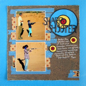
Today at Get It Scrapped there is an amazing article about welding on your layouts.  There is a slew of gorgeous examples of both digital and paper welding ideas.  Many are cut on electronic diecut machines, mine is hand cut and others are wonderful digital creations.

Weld

Sharp Shooter by Michelle Houghton | Supplies: cardstock; Bazzill, patterned paper; Basic Grey and American Crafts, washi tape; Queen and CO., ink; Sharpie and Signo, brads; unknown

The black lettering in the title for Sharp Shooter and the black rings of the target are all welded together, meaning they are cut out of one piece of paper.  Doing this by hand took a few tries as I was not completely sure on sizing and the color of  each of the parts so I made a couple rough drafts that did not get completely cut out to start.  One option even had “shooter” in a cursive script.  I cut that one all the way out and it just did not work so back to the drawing board. 🙂 These are the steps I used to get the finished title weld you see above.

1)  I used a ruler and gave myself some VERY light guide lines for the lettering.

2) Again with pencil I used block lettering to create the title, making sure all the letters were connecting side to side and that the top word connected once or twice to the bottom word.

3)  Still with pencil I traced 3 concentric circles that overlapped both words.  I was not worried too much about perfection on size or even spacing here, I really just eyeballed it.  It is OK to me if there are imperfections showing that it is hand made.

4) I used a thicker Sharpie marker to go over my title and the circles a few times making the lines quite a bit thicker.  I also went back in with a white Sharpie paint pen to ass highlights on the letters making them easier to read.

5) Now came the time consuming part, cutting it all out.  I always start with a pair of micro scissors and cut away as much as I can with those.  Then I break out an X-acto and cutting matte to finish the cutting.

6)  I started with my smallest circle and backed it with red cardstock then added yellow to the middle rind and blue to the outer ring.  I finished by hole punching the center of my target and roughing up the edges of the hole to show a direct hit by my “Sharp Shooter” daughters!

I also made the two smaller targets to help add balance to the layout and so it looks like Sara is getting a direct hit from her photo as well!

Make sure to stop by Get It Scrapped and see all the wonderful inspiration!  HERE

Happy Wednesday!