Posted on

Big Dots

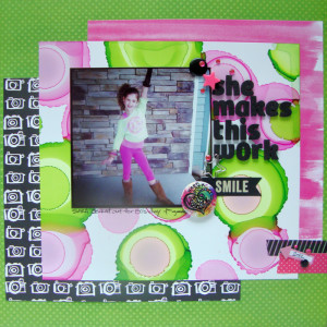
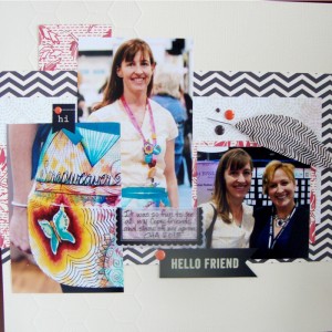
A fun crazy layout posted this week over at Get It Scrapped.  I had way too much fun with this one and it’s crazy color combination.  We were all working with big dots on our layouts.  Here is my page:

Big Dots

She Makes This Work by Michelle Houghton | Supplies: patterned paper; American Crafts Amy Tangerine and Bo Bunny, rhinestones; Kaiser Kraft, Washi tape; Bella Blvd. and Freckled Fawn, foam letters; American Crafts, star clip, arrow sticker and plastic star, Freckled Fawn, Smile banner; Pebbles, brads; SEI, flair; pin from Hard Rock Cafe, ink; Copic and Sharpie

I smile whenever I see this photo of Sara and when I discovered that I not only had not scrapped it, but neglected printing it I was shocked!  This is so Sara all sass and only she can look this good in a high side pony tail, neon pink and green with bangles and lace glove to top it off.  I am so glad I finally circled back around to the photo and love how the page finally pulled together.

I have used this particular technique before with Copic inks and thought it would really capture the bright crazy colors like nothing else would.  I used a glossy photo paper and then dripped 2-3 dots of Copic ink and let it spread.  I did find fairly quickly that I needed to wait for the ink to completely stop spreading before adding more ink.  My fist attempt was a page full of color.  For a comparison the pink dots that are smaller on the page are only a single drop of ink.  So two spread well beyond what I expected.

As always there is stunning inspiration over at Get It Scrapped, check out the article HERE.

Happy Crafting!
Posted on

Scrapping with Free Public Domain Images

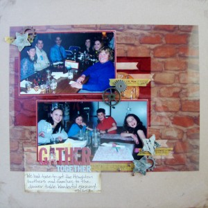
Here is my second layout that I created for Get It Scrapped this month.  Everyone on the Creative Team used images they found on Public Domain sites and added them in unique ways onto their pages.  All of the images that were used were specifically not designated as scrapbooking images but were used as such.  Some created tags, embellishment and papers to layer on their pages.  It is worth a peak at all the ideas and check out some of the images sources as well.  To see the rest of the inspiration check HERE.  This is the layout that I shared:

found image

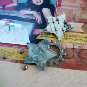
Gather Together by Michelle Houghton | supplies: paper and gears; Ranger, letters; Basic Grey, brads; Making Memories, stars; Prima, washi tape; Calallini & Co.

I had a great time surfing free photo sites.  It is really important to make sure that when you use an image, photo or art work from on-line that you are allowed to use it!  There are a lot of things out there that people share, but really have no intention of you coping and sharing yourself.  On the other hand there are now A LOT of free public domain sites that collect images that are specifically put on line to be shared!  I found this beautiful photo of a brick wall that I printed on a transparency and then altered into my page.  I had a great time layering all my element over and under the transparency!  It was so fun to see how placing things under the transparency in particular changed the color and feel of the page and elements.

blog detail found image

The other major project that happened for me this past week was a Halloween costume!  Sadly, yes only one this year, so sad, my Sara is pulling her own together to dress up with friends.  The times they are a changin’ and I am not sure I ma quite ready for it!  Lori still let me create her a unique one of a kind look though.  She is going as her American Girl Doll Rebecca and I have to say she is looking good!  Right down to the boot covers that I created to look exactly like Rebecca’s!  I will post a photo when we get her all “dolled” up, ha ha sorry couldn’t resist!

Happy Hump day!

Posted on

Editing poor photos at Get It Scrapped

I had two layouts in articles at Get It Scrapped this past week and I thought I better get caught up!  I have been frantically coloring, coloring for the new 2015 classes for Copic!  You will all love the new images and the classes that will be offered this year are going to be spectacular!

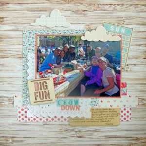
In the mean time I am still busy creating scrapbook pages for Get It Scrapped.  One is editing photos that are not that great to use on your pages.  The contributors all use different techniques to get their photos looking sharper, brighter and just better.  Some of the techniques are on their phones or on editing programs on their computers but there are some helpful tips so make sure to check them out HERE.  This is the layout that I shared:

photo editing


Chow Down by Michelle Houghton | supplies: patterned paper and bingo card; Jenni Bowlin, patterned paper; Pink Paislee, doily and blue sticker letters; Freckled Fawn, wood veneer card and orange sticker letters; Basic Grey, wood veneer lettering; Studio Calico, clouds; October Afternoon

I loved this photo of all of us gathered around the table at Disney Land, but the back lighting washed out many of the precious faces.  Using Photo Shop Elements I was able to get the faces at the back a little lighter.  You can see the exact steps I took at Get It Scrapped.  I had a great time layering all the pretty papers, doilies and embellishments on my page, lots of Jenni Bowlin kit supplies as well as Freckled Fawn.

I will have another layout to share later this week some come back for more and make sure to check out the Copic Classes that are left for the 2014 season, you have to grab them fast before they are gone, gone, gone!

Happy crafting!

Posted on 1 Comment

Last layouts from Las Vegas Crop

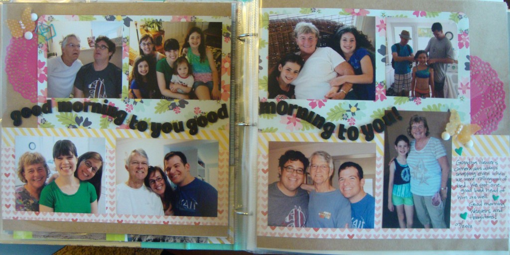
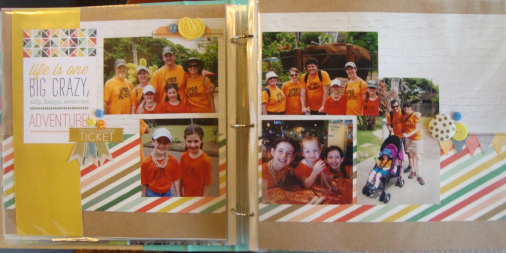
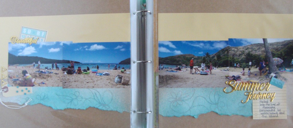
Here is my last batch of pages that I am sharing.  There were a few more, 6 to be exact, 3 pocket page pieces and 3 others but figured I would spare you some of the less exciting pages.  I am ready to move on to pages about the rest of 2013 and 2014!

blog 9

blog 10


blog 11

You can see how all of these are sitting in my scrapbook since I was too lazy to take them back out of the sleeves for photographing.  I was pleased with how all three of these two page layouts turned out.  It is nice to get a larger group of photos laid out and feel balanced.

Next onto some Copic play and next months tutorials and layouts!  Happy weekend to you!


Posted on

Tutorial at Get It Scrapped – Mono printing with a Geli Plate

This month’s tutorial is up at Get It Scrapped.  If you were not aware I have been doing monthly tutorials all related to adding artistic techniques onto your scrapbook pages.  This month I decided to break out a gift that I had not used yet, a Geli Plate that my super duper friend Tami Taylor gave me at least a year ago.  I just touched the tip of the iceberg in the tutorial so I will be back with more advanced techniques next month if all works out.  Here is another one of the layouts I completed in the tutorial.

geli10

You can find the full article at Get It Scrapped HERE.

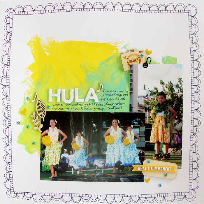
Here is the next round of layouts I created at last weekends crop!  I figure it is fun to share 🙂

blog 5 blog 6 blog 7 blog 8

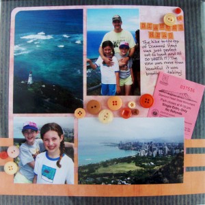
The bottom 2 pages you will note are NOT from our Hawaii trip!  Yeah that album/mountain of photos is complete!

Happy Scrappy day and weekend to you!  I will be continuing to add more pages over the next few days and some work I am doing with Copic markers for fun!