Posted on

Weaving Washi

I needed a short break from that whirlwind of posting through January and into February so i took the week off.  But my next media technique tutorial is up at Get It Scrapped and I wanted to share!  This month I was playing with Washi tape which is a good thing since I seem to be slightly addicted to it if you look at the pile that is growing in my drawer!  Check out the tutorial HERE

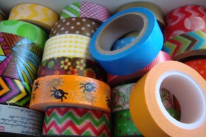
2014-01-29 15.16.12

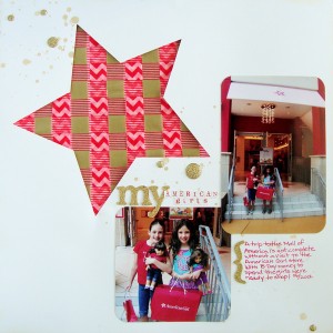
This is a small sampling of the growing stash.  Weaving Washi is fairly simple and can use up some of that stash.  I give step by steps for two different techniques.  Amy Kingsford created a layout using one of the techniques and I created a layout using the other:

12


My American Girls by Michelle Houghton |  supplies:  Washi tape; SEI and Queen and CO., glitter stickers and dots; SEI, spray mists; Heidi Swapp, ink; Sharpie, cardstock; American Crafts

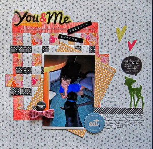
Then Christy Strickler shows off a whole new way to weave your Washi!  She posted the steps on her blog and you can see them HERE.

CSYouandMe

You and Me: Sneakin’ Snacks by Christy Strickler |Supplies Patterned Paper, Vellum Die Cuts,Flair: Studio Calico; Jewels: Hero Arts; Tape: Studio Calico, Freckled Fawn; Chipboard:Amy Tangerine; Bow Tie: Freckled Fawn; Other: Label Maker

I hope you all are having a great weekend.  We keep getting told it is going to warm up and then getting snowed on!  We had 3 more snows this past week.  All 3 were not on the weather radar until they basically hit.  I know, I live in Iowa, but I really could be done 🙂

Happy Saturday!
Posted on 2 Comments

Plaid and a painty peek!

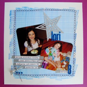
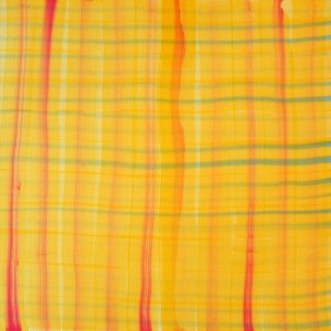
I have been getting inky and painty lately, come to think of it lots of my layouts recently have major portions to them that are in the artistic realm.  No real surprise I guess but they seem to gather in clumps 🙂  This week I am tackling plaid in my layout for Get It Scrapped and my first instinct was to create my own. I love using a wide Copic marker to create my own plaid pattern.  This particular plaid turned out very subtle and suited the layout just right.

plaid


Lori 8 by Michelle Houghton | Supplies: cardstock; American Crafts and Bazzill Basics, ink; Copic, Washi tape; Lil’ Bee, letters; American Crafts, stick pen, star and ribbon; unknown

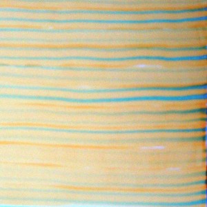
To create the plaid I used a wide Copic marker.  I then touched a darker sketch marker to the wide tip in 2 spots, holding it there to transfer color onto the wide tip.  (this does not ruin the tips!  Copics are great this way!)

05

I then pulled the wide marker across the page once or twice.   I added the darker color onto the wide marker again and then pulled a few more times.  I continued the process until I had completed the area I wanted to cover going horizontally.

07

 I repeated the entire process going perpendicularly over the original set of lines.  The example I have uses a different color going into the vertical lines.

09

In my layout I used the plaid as a base for my layout.  The pictures were not spectacular but very representative of our quiet birthdays, so the plaid added a little pizzaz!  I LOVE the plaid variations in the article check them out HERE

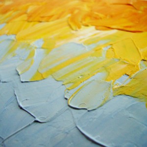
A week from today I have the second class in my Mixed Media series starting.  We are getting painty!  We will be looking at 4 famous painters and using their techniques to learn painting styles we can use on our mixed media crafting projects.  Here is a peek!

e01

f01

Happy Thursday!

Posted on

Hybrid Layout

OK, so if you know me and know me well you know that technology and I are not the best of friends.  But I have to say that I have now ventured twice into hybrid scrapbooking and it could become addictive!  I love the aspect of  the HUGE range of materials and kits that are seemingly mass produced regularly add to that the versatility of changing sizes on everything and now my new cutter that can scan anything and cut it out for me and I might be on to something.

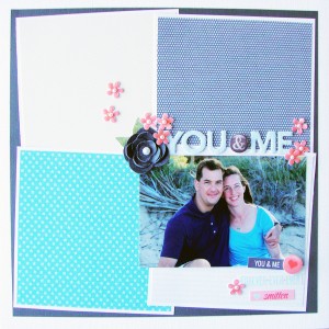
This month I was honored to get to play with a kit and papers from One Little Bird.  You can find her at The Lily Pad which is an AMAZING digital site housing some truly gifted artists.  Several of us on the Creative Team at Get It Scrapped used a single kit to really play and see what each of us could come up with.  The only rule was that the layout must truly be hybrid, which means a combined paper and digital layout.   Combining the best of both worlds.  I always love to see a challenge where a group of artists all use the same set of supplies it is so fun to see the huge range of techniques and ideas that all come from a single source.   Here is what I came up with:

Hybrid


You and Me by Michelle Houghton | Supplies: cardstock and chipboard letters; American Crafts, pearls; Queen and Co, ink; Copic, patterned papers, flowers labels and flair digital kit by One Little Bird

I did 3 things specifically with my digital elements. 1 – All the patterned paper you see is from the digital kit.  I printed it out in large sheets and then trimmed it to the size I needed specifically the squares that base my layout.  2 – I printed 6 of the black flower and then cut it out along the lines creating increasingly smaller flowers.  I stacked these and curled the edges to make it truly lift off the page.  3 – I used the small pink flowers and the flair, these I cut and used glossy accents on to again give them dimension.  I added pearls to the pink flowers to link them in a little better with the black flower.  Finally I added the three small labels.  These I just printed and cut.   I added chipboard letters that I colored, the pearls and really that was it, the rest came from the amazing digital kit.  SO FUN!

I took a very simple route but the team went crazy with wonderful ideas so if you have time check it out HERE!

Happy Tuesday!

Posted on

Haiku

Over at Get It Scrapped we have done several monthly challenges in the forums with photographing day to day lives being the central theme.  We were all a little overwhelmed in November so we decided to keep it a little simpler and only try for 4 photos but to add some thought we added the challenge or writing a Haiku poem to go with each.  Doris gave us lots of links to help us get started in the forums and then Debbie upped the anti by throwing out the challenge of getting a few on layouts.

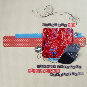
I have to say the beauty of all of the Creative Team members work shines through!  Each is stunningly beautiful and heartfelt even the silly ones.  It is a challenge worth taking yourself! Here is my contribution, you might recognize the photo and Haiku from an earlier post!

Haiku


Glorious Red by Michelle Houghton | Supplies: card stock; Bazzill Swiss Dots, patterned paper and chipboard; Farmhouse Paper Company, leaves; Prima, sticker letters; October Afternoon and My Minds Eye, Washi tape and wire; unknown

I had wonderful time keeping this layout as simple as possible and really wanted to pick just the right accents.  The photo is the star and I wanted it to remain that way so a lot of white space and then colors that are similar to the photo itself.  The contrast of the red leaves against the bright blue sky are a perfect match so why not continue it in small doses?!  I did run into an issue with my sticker letters.  I wanted to write the entire Haiku in the small letters but none of my sets had enough “e”s Even when I decided to split to red and black.  So as usual I cheated!  In the red there are upside down 3’s creating the “e”s and in the black there are at least 2 “E”s that used to be “F”s I have learned the I can scratch into sticker letters to create extra arms and pieces to letters.  The base of the sticker is white so if I am careful I can make new letters. 🙂

Make sure to look at the other Haiku inspiration HERE!

Happy Tuesday!


Posted on 2 Comments

CHA Copic

So this is the last I will say on CHA at least for now 🙂  I did get to see several very wonderful friends including the team from Copic of course that is what I did not get photos of BOOOO!  How did I manage that?! I did say hello to Dina Wakely, Emily Pitts and Taylor of Taylored Expressions.  I had a blast wandering the show floor and seeing some of the new products coming out.  I made a few fun make and takes and rely did love the classes that I took.  Remember if you are looking for more CHA goodness check out the article at Get It Scrapped for an excellent round up of info! HERE

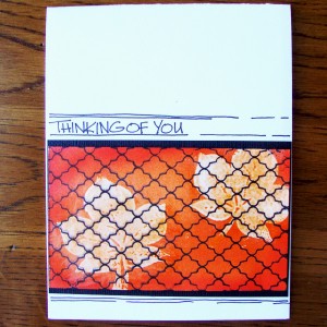
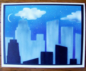
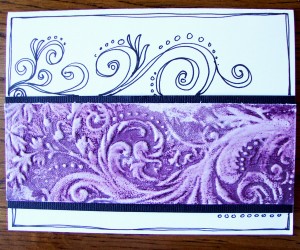
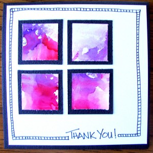
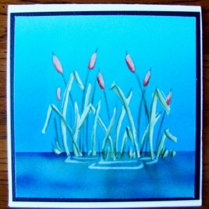
I have shared the Ranger classes and the Kuretake class but figured I better show you what I learned from Copic as well.  I took the airbrush class from Colleen and made 5 wonderful cards.  All 5 use the Copic airbrush system and were a lot of fun to create!2014-01-25 12.27.56

2014-01-25 12.27.36

2014-01-25 12.27.44

2014-01-25 12.27.28

2014-01-25 12.27.21I also got to see the first 2/3rds of Marianne’s new class Tracing Memories.  The concept is taking a photograph, turning it into a digital black and white image and adding color with your Copics.  The effect is amazing!  I started my first image and then watched the other students continue on theirs.  Both beginners and advanced Copic artist would enjoy this.  It is very soothing!  No guess work on darks and lights.  You have the original beside you and the black and white image shows you the way!

Of course in the midst of all of this I was blessed to see my beautiful Sister in-law and her wonderful husband.  It was truly a joy to see both of them and spend an entire day just being with them in California.

We’ll see what happens next year!

Happy Monday!