Posted on 18 Comments

Day 3 Kraftin’ Kimmie June Release!

It’s our FINAL day of 

June Krafty Peeks
at Kraftin’ Kimmie Stamps!!
Are you READY for more summer FUN?!

Everything you’ve seen us share this week will be released this afternoon (Saturday) after our LIVE online party!
All the new goodies will be available at 3pm EST!

We are closing out the festivities with a brand new adorable stamp set from artist Becky Pearce called….

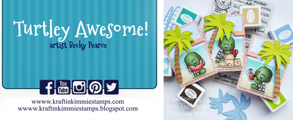
TURTLEY AWESOME! 

OH my gosh, how cute are these TURTLES!?!  I ask you?  These little sweeties are having fun at the beach!  There are four main turtles, little accessory stamps for all the seaside fun plus a cute little ducky pal!  And don’t forget all the incredible coordinating sentiments!

Of course, today is also Challenge Day and as always, during release week the theme is Anything Goes!  So create a card, scrapbook page, altered item…..with a Kraftin’ Kimmie Stamp!  Use any sketch, design, colour scheme you want!

We can’t wait to see your creations and you have until June 19th to play along!  Feel free to link up your submission at the bottom of this post and/or by uploading your pic to the folder in our Krafty Friends facebook group!  You could WIN a $25 gift voucher to the krafty shop!

We’ve also got a sketch for you!  If you’re needing a little inspiration, feel free to use this awesome sketch anytime this month!

You’ll get to see all sorts of sweet creations featuring TURTLEY AWESOME! as you hop around the Krafty Team blogs today!  PLUS you’ll see some of the other goodies in action….like our new stencils, new ink and new Krafty Dots!

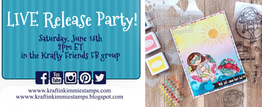
Everything will be released at our LIVE Online Release Party in the Krafty Friends facebook group 

this afternoon at 2pm EST!
For now, hop around and check out some incredible designs from our Krafty Team!!

AND MAKE SURE YOU COMMENT ON EVERY BLOG
from all the peek days this week

for a chance to win Krafty $$$ in the shop!

See you back here tomorrow for our
Krafty Release Celebration HOP!

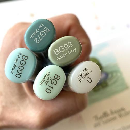
Here is a close up of the Copic colors I used on my turtle tucked into his inner tube!
And here are the Copics that I used on the water. Putting him floating in the water was an afterthought. Normally I would keep the part under water quite a bit lighter from the get go!
And here he is all tucked into a card. Keeping it simple as always.
And a close up of him so you can see the water effect a little better. You can also see my mistakes 😉.

As always thanks so much for stopping by!

Have a Happy Colorful Day!
You are invited to the Inlinkz link party!

Click here to enter


Posted on

Getting back to it!

I am finally getting back to doing some filming and Copic coloring! I know I will be on and off this summer but feels super good to be back on-line sharing even a little.

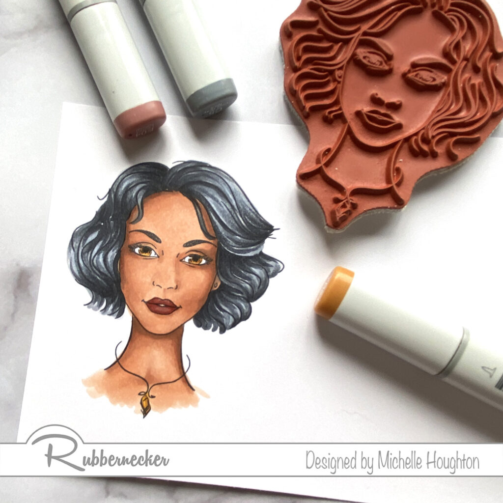
I am coloring up a wonderful image from Rubbernecker Stamps, Nala. The team at Rubbernecker asked if I would continue sharing some tips soon coloring darker skin tones so over the next few months I will share a few videos with medium to darker skin tones. If you have favorite color combinations I would love to hear those and I will share a few oof my go to combos.

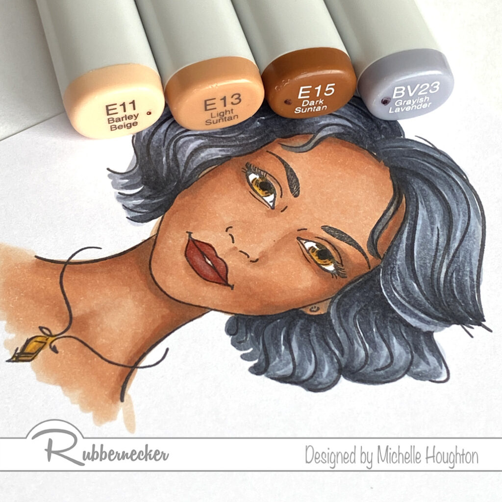
I usually start with the skin on images, especially if I know I am going to go with darker tones because they tend to be a little trickier and if I mess up and need to start over I would rather not have spent oodles of time on other areas of the image first.

  • Base the skin in an Earth tone. (E11)
  • Use a mid-tone to map out the shape of the face creating the contours. (E13)
  • Use a shade darker in lesser amounts in all the same areas. (E15)
  • Work in reverse through your markers to blend the layers smooth. (E13, E11)
  • Use a blue violet to push the deepest shadow areas further back, in some cases I need to blend this color n a little in others it can sit right on top, in this case a LITTLE softening with 2 Earth tones was needed. (BV23, E15, E13)
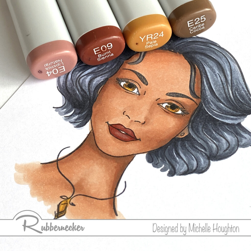
  • Finish up the lips with two Earth tones. (E04, E09)
  • Use two colors on the eyes. I used them on the necklace as well. (YR24, E25)
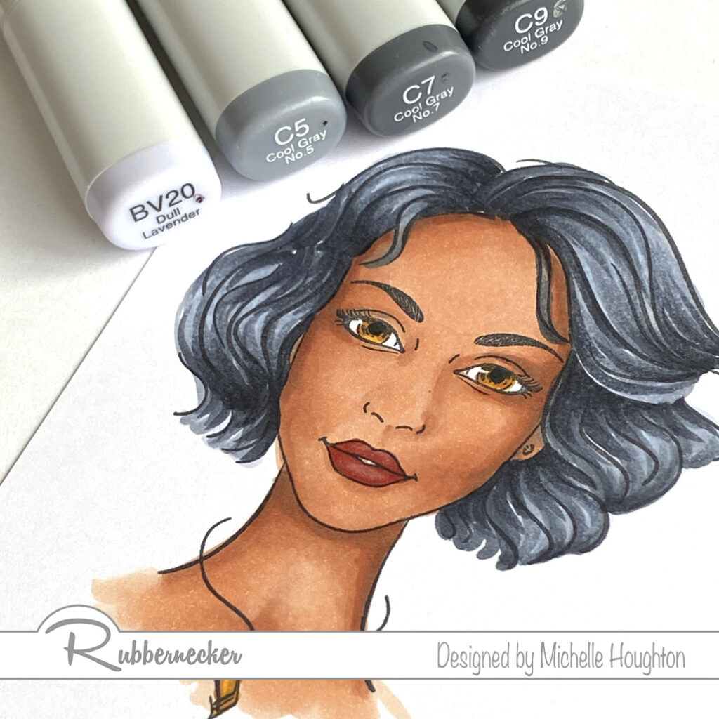
  • Finish the image off by coloring her hair. Put a light blue violet on the highlight areas. On waves hair look for the areas that wave out away from her head. (BV20)
  • Start with a dark cool gray and use varying lengths of flicks starting in the deepest areas and flicking out along the curves the artist has already on the image. (C9)
  • Use two more cool grays and flick more into the highlight areas vary the lengths of the flicks so you do not end up with bands of color. (C7, C5)
  • Go back and use any of the three gray tones to create the waves and texture that you like. Make sure to add in small amounts at a time and pause in-between layers to let the ink move and watch results. If you rush this step you can overwork the hair and end up with a muddled mess. (C9, C7, C5)
  • To finish the hair use the light blue violet to lightly work back into the highlight areas. (BV20)

I also have a video recording of this process and the video is over at the Copic In The Craft Room YouTube channel.

Thank you for stopping by today! I will do my best to keep the coloring and creativity coming!

Have a Happy Colorful Day!

Posted on

Papa Bear and New Normal

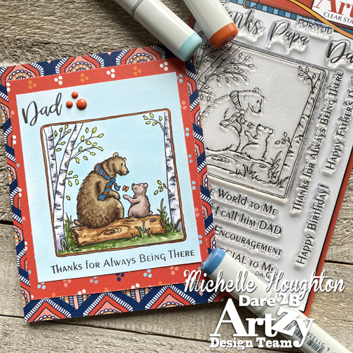
Hello friends I am checking in this am with a little D2BA inspiration to start your day. I am coloring on the Papa Bear Stamp Set and I discovered as I pulled out my Copics and started that I am coloring a little different these days.

Artists go through phases in their lives like most of us we have favorites that come and go they have techniques that come and go or colors or mediums. I think I am in a “phase” of little to no blending in my Copic coloring. I find myself loving the artistic brush strokes of the markers, the texture that results and the quick and easy simplicity of the coloring.

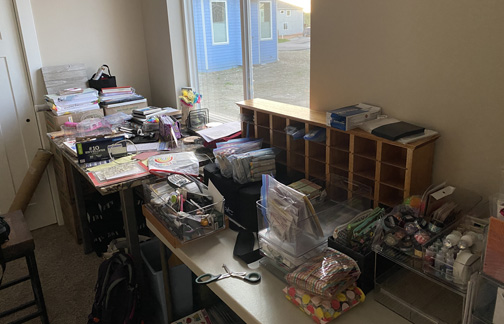
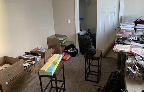
This might have to do with the “phase” of my life right now! Most of you may be aware at this point that I have moved for the summer and my craft room is split in two. Half sits in boxes in an apartment my oldest daughter and I will return to in the fall in Des Moines. While the other half is exploding out of boxes onto the floor and one table top in my new office in Alaska! So please forgive me this summer as the cards will be SIMPLE. I am a simple card maker on the best of days but now that I am missing several of my larger tools and half of my stash (not sure which half yet) the card designs will be basic layering with a few details here and there. Of course the Copics came so the coloring will be there 😉.

Here is the current look of my crafty space:

This image has an empty alt attribute; its file name is IMG_2911-1.jpg


This image has an empty alt attribute; its file name is IMG_2912.jpg


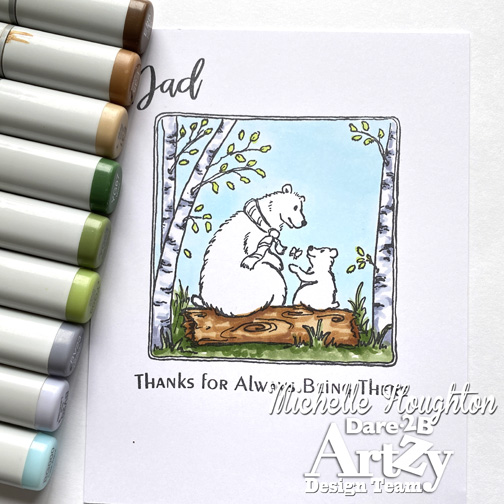
I look at these photos and I am a little overwhelmed ha ha! BUT I did get a little coloring done for you today so let’s switch over to that! I started with the background this time, not my normal but wanted to save the bears for last.
 
This image has an empty alt attribute; its file name is D2BA-June-2a.jpg
 
 
Sky – BG000 Trees – YG03, BV20, BV23 Ground – YG63, YG67 Log – E31, E35, E25
 
This image has an empty alt attribute; its file name is D2BA-June-2a.jpg


Next the bears, I used earth tones here and changed from the papa bear to the cub:

Papa – E43, E44, E47 Cub – E70, E71, E74

All that is left is the small details Papa bear’s scarf and a butterfly. I chose my D2BA papers first and then matched these last pieces on the image to my papers.

Scarf – YR18, B97 Butterfly – YR18, Y21 Trim – YR18

I put it all together after coloring the area around the frame with the sky color, BG000. Simple but complete.

Thank you as always for stopping by today! Make sure to stop by the Dare 2B Artzy hope to check out the newest products and doings! And don’t forget to tune in to the challenge each month for your chance at a little Dare 2B Artzy prize.

Have a Happy Colorful Day!

Thanks for stopping by today! And make sure to check out some of the products I’ve used here in the D2BA store!

Posted on

Bright and Cheery!

Hello crafty friends! I am bringing you a little Dare 2B Artzy inspiration for today! As you read this I will be loading up my car and headed toward the Alaskan highway up north in Canada so I am keeping this post sweet and simple! I do hope all of you are staying safe and healthy, and tucked away doing crafty things if home bound or if you are able to work being productive and safe.

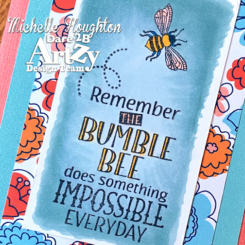
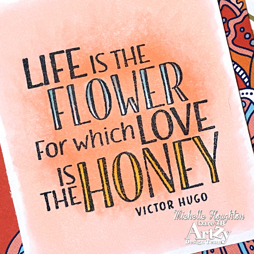
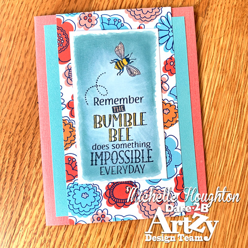
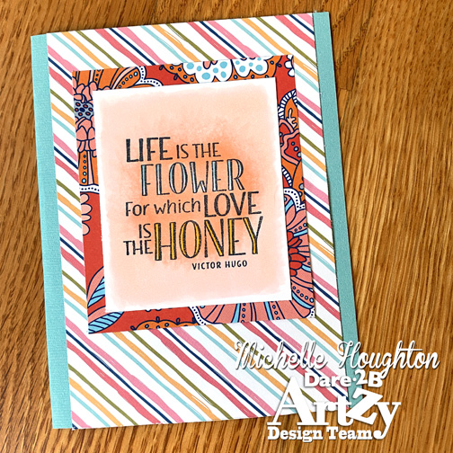
I used two quotes from the BEE*utiful  stamp set to feature on some bright and cheery cards for you today! I used some Copics to give a wash to the backgrounds and also fill in the open lettering.

Then found some gorgeous D2BA patterned papers for the backdrops! Keeping it simple sometimes gives you the most lovely results!

Thank you so much for peeking in today! Hop over to the D2BA shop, there are a few new things coming out soon!

Have a Happy Colorful Day!

Thanks for stopping by today! And make sure to check out some of the products I’ve used here in the D2BA store!

Posted on

Dare 2B Artzy Papa Bear

Good Morning, Good Morning, Sun Beams will soon smile through, good morning good morning to you and you and you and you!

Yes I am perky this am probably due to a little lack of sleep! BUT I am here with the early birds to bring you a little Dare 2B Artzy inspiration!

I am in a quick and easy mode these days. (I know I am a lot of the time in particular in my card making.) I am just enjoying creating, not agonizing over the little stuff. I am even doing some art just for creating sake which I have not done in WAY TOO LONG and it feels amazing. MY plate is full at the moment, but taking even an hour or two a week to just create with friends on-line has done amazing good for my soul!

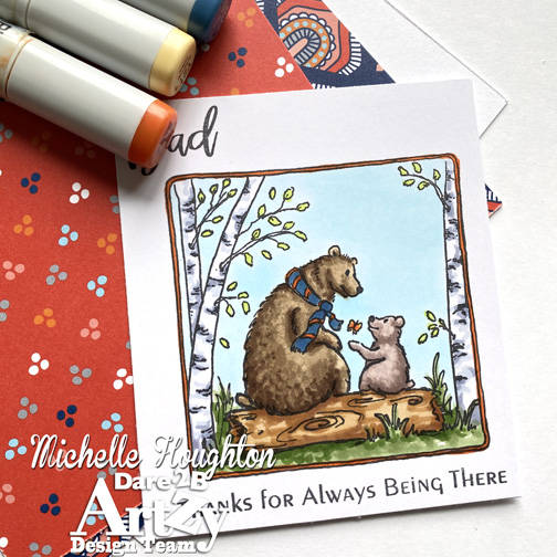
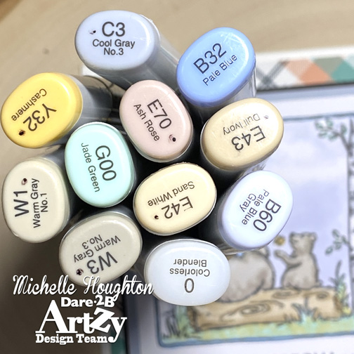
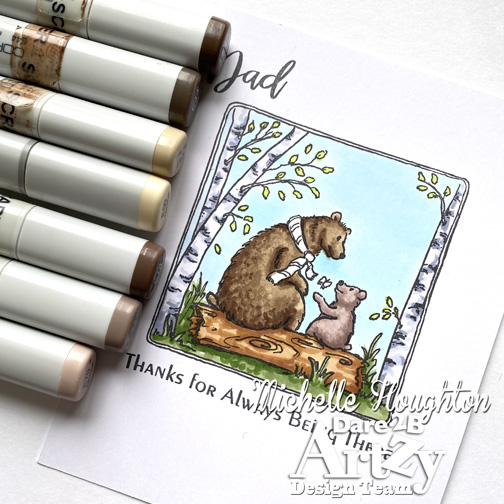
So the card I am sharing today is in that venue in that I just wanted easy, simple and peaceful. I know Copics are known for their brilliant, vibrant color, but they can be soft and subtle as well. I chose a very simple color palette to work with on this new D2BA image and did several areas with just one color instead of layering and blending.

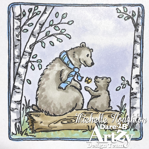
Here is what the image looks like:

I love the sweet image of papa bear and cub. Then I added one of the new D2BA patterned papers. Now my colors on the image do not match the paper perfectly, but the tones were close. To have them sitting well together I found a cardstock that matches the sky color I used on the image and then separated that with a very thin edge of black cardstock  that creates a beautiful outline.

I am pretty pleased with the end result and it came together uber quick since I kept it light and airy.

Thank you so much for stopping by today! I hope you will take a little time to drop by both the D2BA shop to see all the fun products, but also scroll through the blog. Look for the latest challenge and play along! Hey take a little time to “get Artzy” today!

Have a Happy Colorful Day!
Thanks for stopping by today! And make sure to check out some of the products I’ve used here in the D2BA store!