Posted on 1 Comment

Hopping Along with Kraftin’ Kimmie

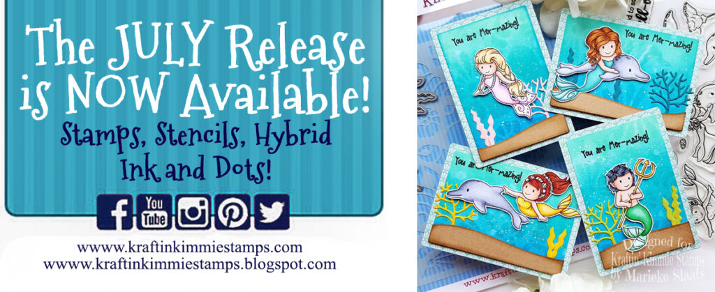
Woot! Woot!Today we are celebrating all the wonderful new ‘trendy’ things in our JULY Release that are NOW AVAILABLE
in the Kraftin’ Kimmie Stamps Shop!

All FOUR of our new stamp sets along with two new stencils, our stunning new hybrid ink colour, Fresh Fields and sweet new summer krafty dots were released yesterday and we’re excited to share everything with you in a fabulous blog hop!

So let’s check everything out in action as we hop around the Krafty Design Team’s blogs today! Grab a nice hot (or cold) beverage, sit back and relax while we take you on this krafty tour!First up we have these fabulous sets by artist Neda Sadreddin for customizing your people creations and they are called…

TRENDY TEES and TRENDY TEES ICONS! Next is a gorgeous underwater set from artist Sabrina van Vloten called…..
BE A MERMAID! Lastly is a hilariously sweet stamp set from artist Melissa Baker-Nguyen called….
LONG IN THE TOOTH! Available now is our stunning new Krafty Kolours hybrid ink colour in the large ink pad, the mini cube and ink refill called…
FRESH FIELDS!!We have two new stencils that coordinate perfectly with our lovely new stamp sets and they are….PATTERN PARADE & SHE SELLS SEASHELLS!And lastly we have the perfect finishing touch for your summertime creations with our new Krafty Dots called…
SUMMER DOTS! All these new items are available individually however if you HAVE to have it all, we’ve got our JULY GIMME KIMMIES KIT which contains everything AND at a discount! But remember this is for a limited time and only while supplies last!Now head on out on today’s celebration blog hop and check out all the new products in action as the Krafty Team shares their incredible creations! Then jump on over to the Kraftin’ Kimmie Stamps SHOP and grab some goodies for yourself! Happy kraftin’!

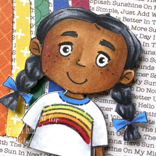
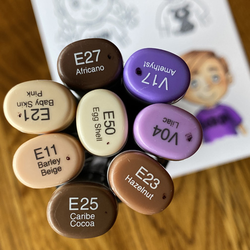
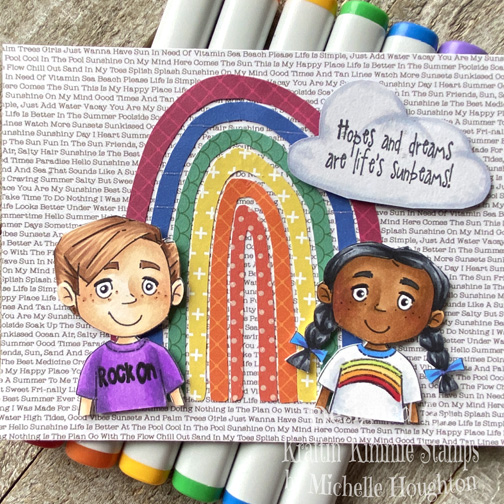
I chose to play along with the Trendy Tees set and the Trendy Tees Icons. I stamped the two kiddos up and decorated their T-Shirts with my Copic Markers.
They turned out pretty cute. Here is a close up of the two of them.

As usual I kept the card making pretty simple. I used several patterned papers to create a paper rainbow and then popped up the kids on top. I also cut out a simple cloud shape and used a sentiment from the “Here Comes The Sun” set a few months ago to finish off the design.
I know the hop is full of creativity from the design team I hope you will go peak at some more of the amazing work! Thank you so much for stopping by!

Have a Happy Colorful Day!
You are invited to the Inlinkz link party!

Click here to enter


Posted on

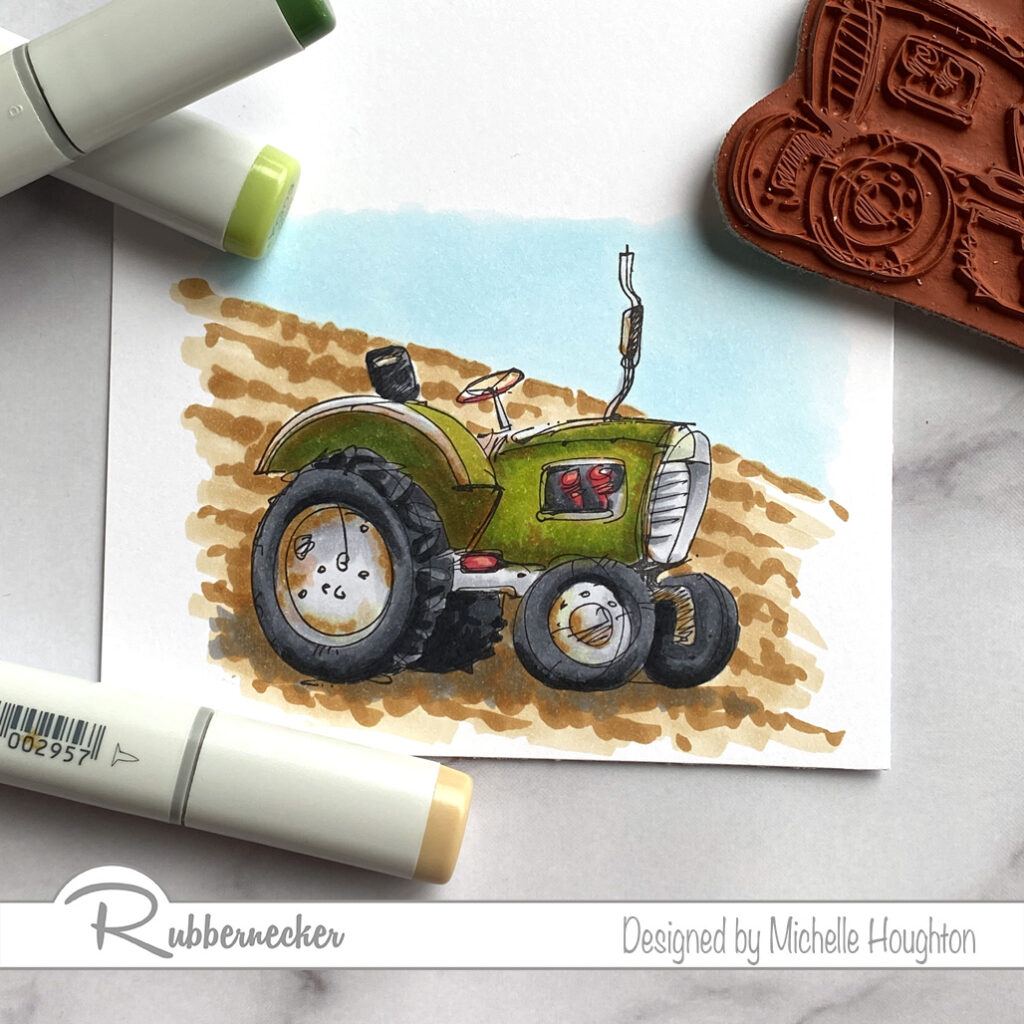
Rusty Tractor

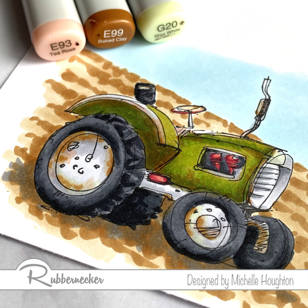
Good morning, afternoon, evening depending on your location! You are catching me coloring up a tractor from Rubbernecker Stamps today. You might have noted I am not making a lot of cards (or any) right now. I left behind many of my card making TOOLS in Iowa. I am gathering some basics so you will see a few in the upcoming weeks but they will be even more simple than normal Ha Ha!

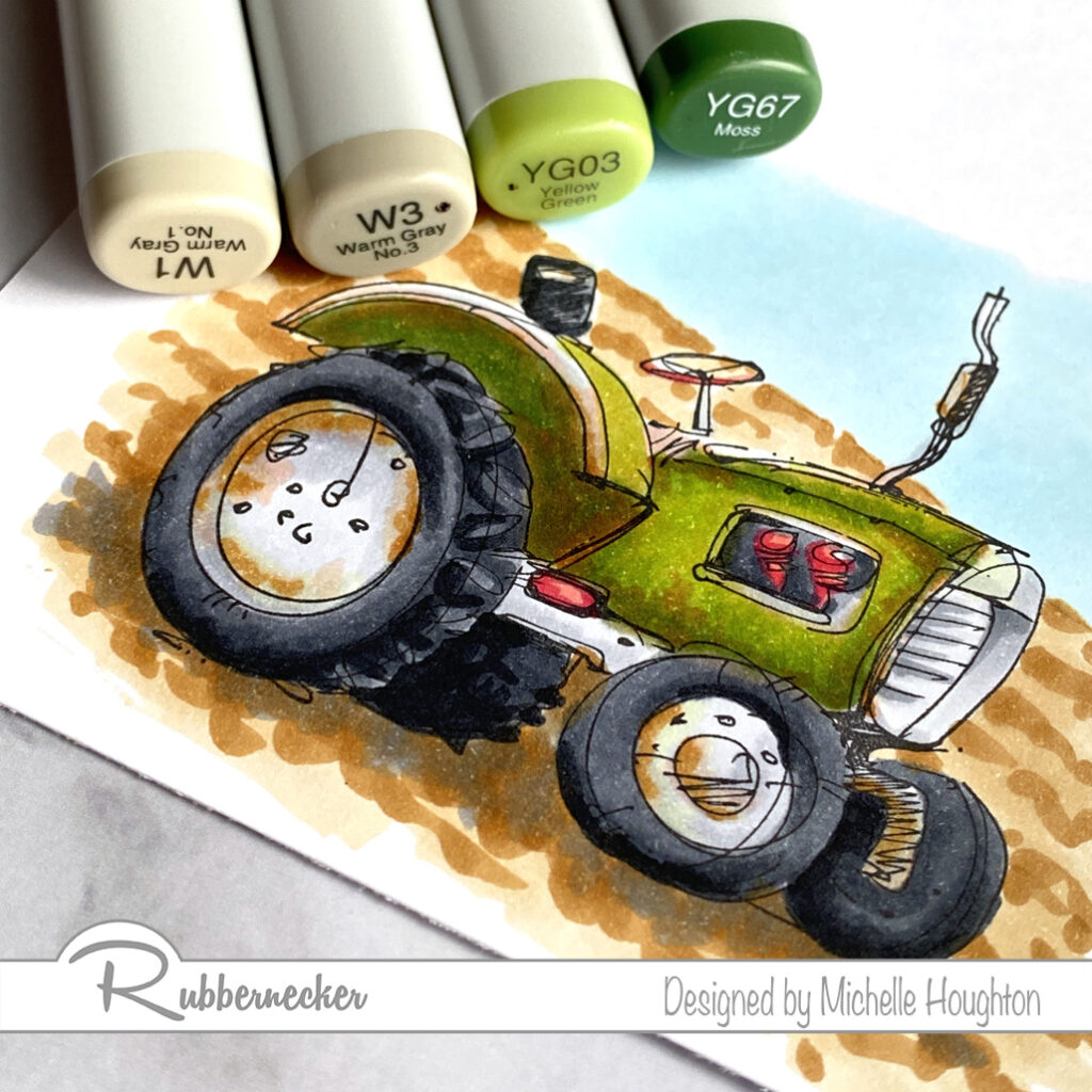
So Copic coloring is the name of the game right now or at least what you are seeing from me 😁. Here are the steps I took coloring up this tractor. There are lots of colors to get that old working machine look, and this tractor is still looking in pretty good shape your could take this further.

  • Start with the base of the tractor, use W1 and W3 to creat shape on all the soon to be green areas of the tractor.
  • Without blending move onto the YG03 and YG67 right on top of the warm grays. YG03 will cover all areas that have the gray and the YG67 will go in the darker gray areas.
  • Work into the green areas creating areas of rust and dirt. I focused on edges and under the fender.
  • Use the E93 over large areas.
  • Follow that with the E99 in specific rusty, dirty areas.
  • Go over the rust/dirt areas with the G20 this not only will soften the areas and bleach out some areas for wear.
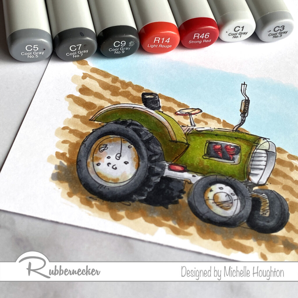
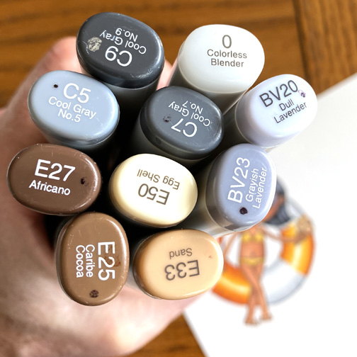
  • Now all the rest of the details. C5, C7, C9 on the tires.
  • small details of the gears, steering wheel and step with R14 and R46.
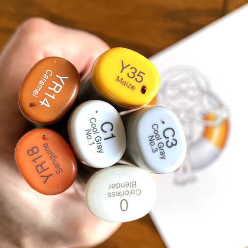
  • Lighter metal areas with C1, C3 and a little C5.
  • Add a little mud and rust on the wheels and edges with E93 and E99.
  • Go over the dirt and rust with the G20 to soften and bleach some areas.
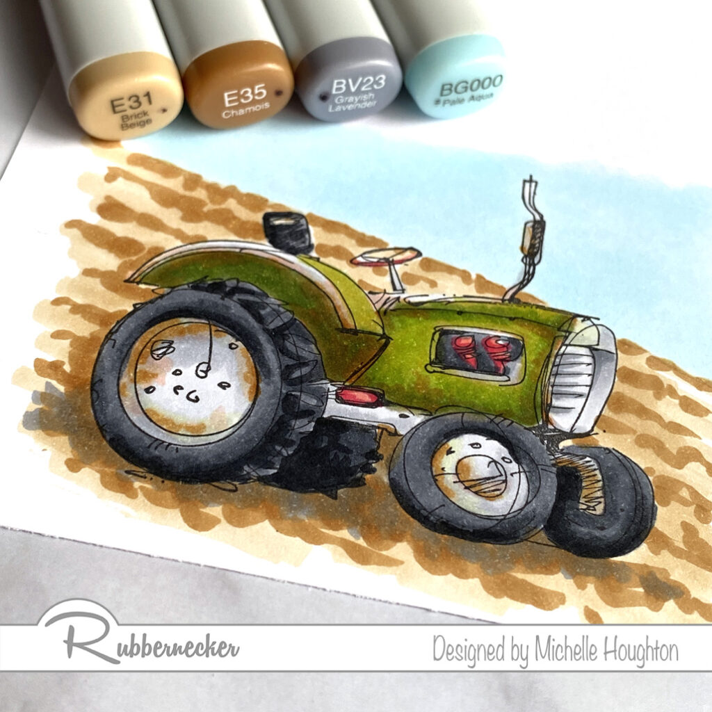
  • Finish up the background creating rows in the field with a wash of E31 and scribbles of E35.
  • Add extra E35 under the tractor for a cast shadow.
  • Use BV23 in the cast shadow to cool the area and ground the image more firmly.

All done and ready to go! Thank you so much for stopping by today. There will be a video next Wednesday with a real time coloring of this full image. You will find it on the Copic In The Craft Room YouTube channel. Below you will find a link to the images I colored up today!

Have a Happy Colorful Day!

Posted on

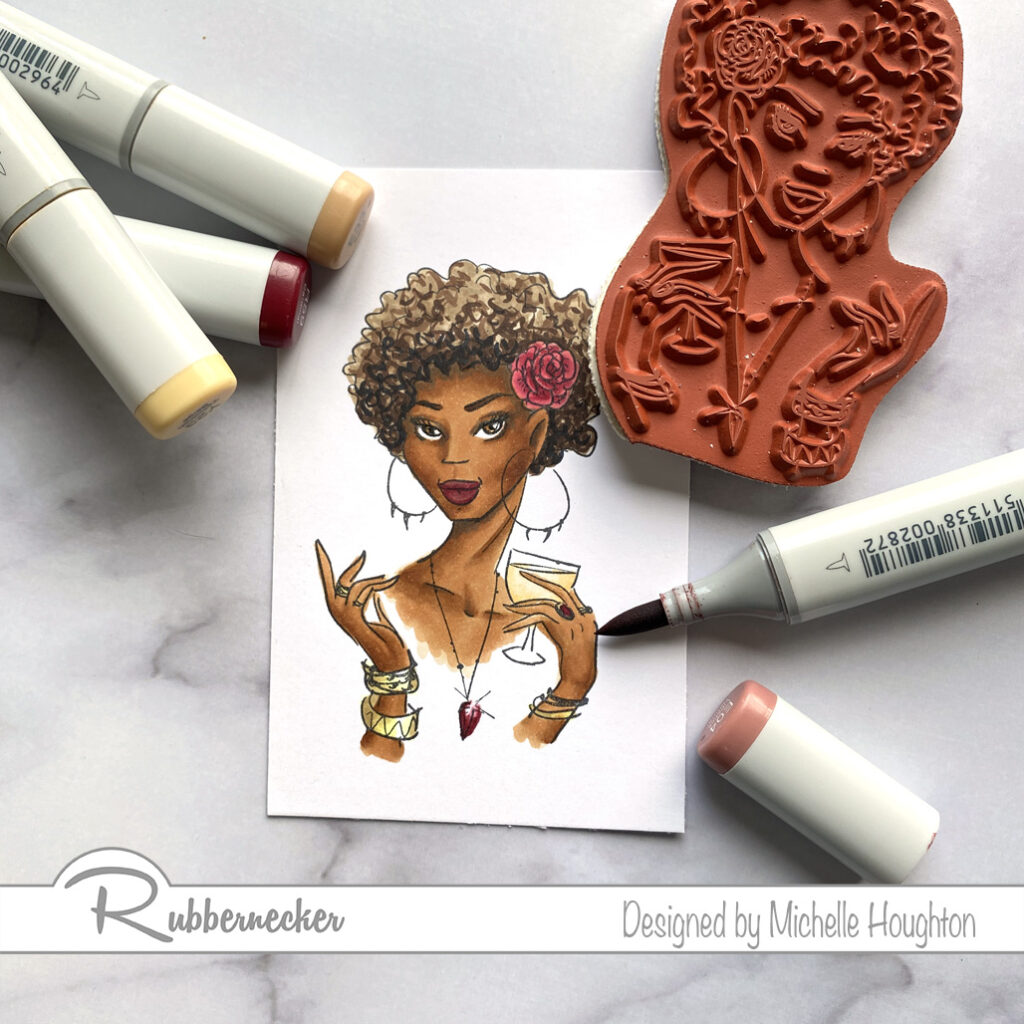
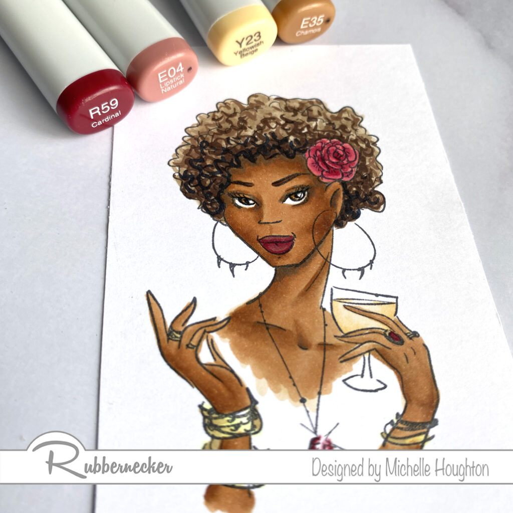
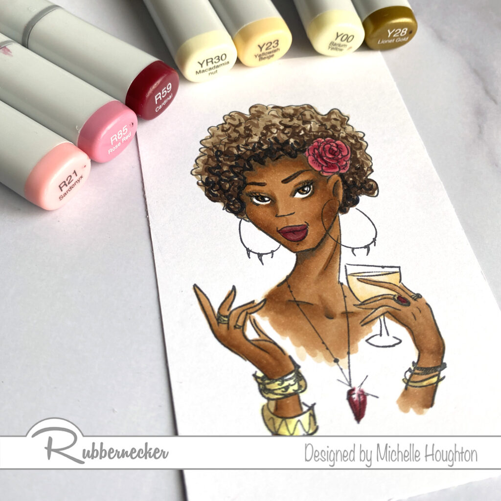
Another Copic Dark Skin Combo with Rubbernecker

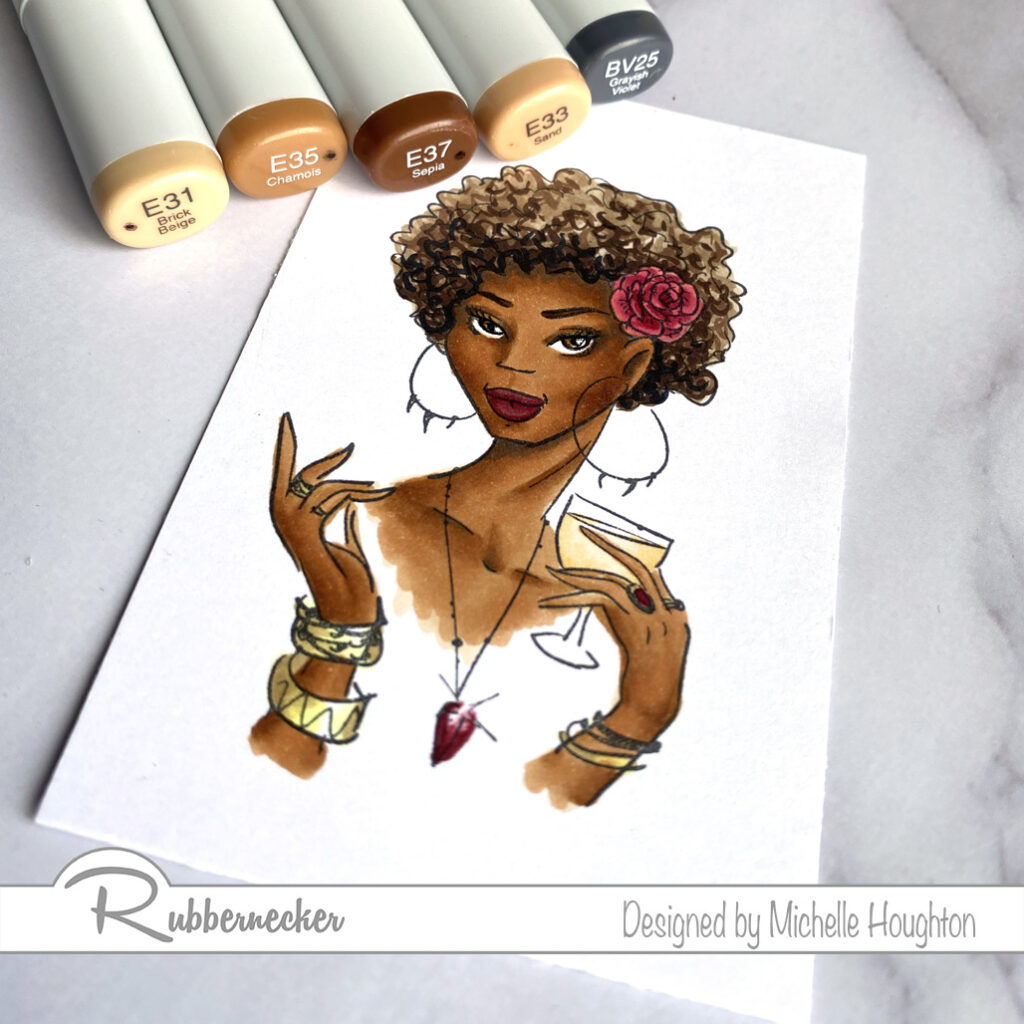
Another Copic dark skin combination. Sometimes you really can keep is simple and just run through a series of Earth tones. In this case I ran through the E30’s The trick is getting them smooth with the darker skin tones on smaller images. So pay special attention to the order of the colors used and the steps. If you would like to see the coloring in action I will be posting a video on Wednesday, June 24th with the start to finish Copic coloring.

  • Start by basing all the skin in a lighter Earth tone. (E31)
  • Skip your second color and move to\o the third in your series. With this color map out the contours of the face. I used short flicks in most areas from the edges inward where possible. (E35)
  • Use the fourth Earth tone in your series and goo into all the same areas you mapped out just in less amounts, or shorter flicks. (E37)
  • Go back to the third in your series and blend the edges of this darker color smooth. This may pull into the light area a little Moore (E35)
  • Now go back to the color you skipped and first soften the edge of the darker tones. Next work all the way across the lighter skin. (E33)
  • As an optional step use a darker blue violet to create one more level of depth and some cast shadows.
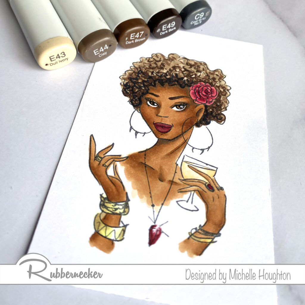
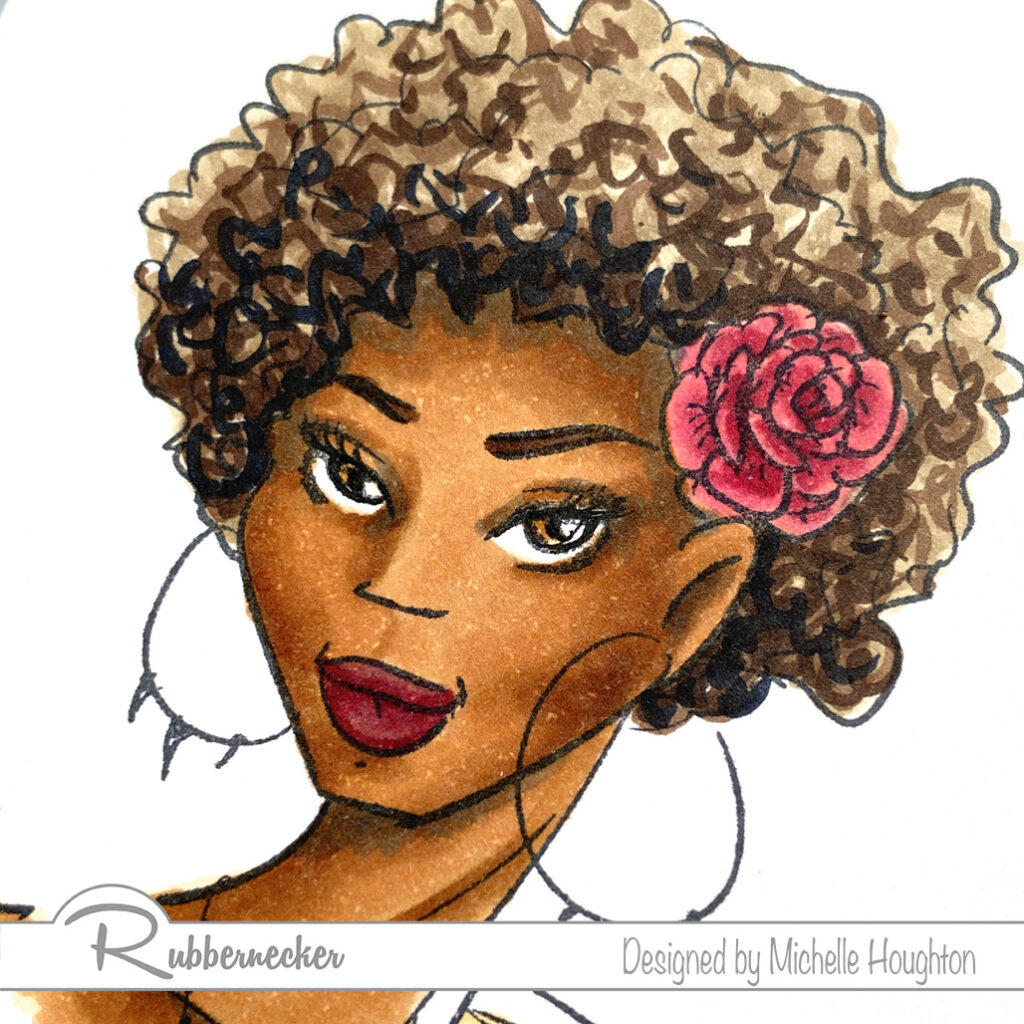
  • Base all of the hair in a mid-tone Earth tone. (E43)
  • Use the next Earth tone in the series and create very small squiggles all over the hair area. (E44)
  • Use a third and fourth Earth tone each in less amounts. With these two colors you will still be squiggling but focusing the color into areas to create shape. Also use one of these colors to fill in the brows on the face. (E47, E49)
  • Finish with a dark cool gray to push the depth and cool down the warm tones. (C9)
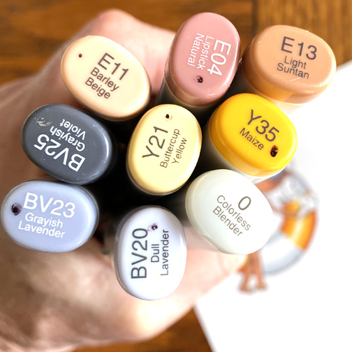
  • Finish the lips with an earth tone and a red. (E04, R59)
  • Finish the eyes with a yellow and Earth tone. (Y23, E35)
  • Use a Copic Multiliner to depend the black on the lash line and the pupil if needed. (.03)
  • Color the rose and jewelry with a series of reds. (R21, R85, R59)
  • Color the bangles with two yellows (Y00, Y28)
  • My girl is drinking sparkling cider and I used a yellow red and yellow to color it. (YR30, Y23)

Here is a closer look at all the skin and hair. I hope this inspires you to get coloring and try some darker tones. So many of us settle into one set of two or three colors for every face and there are so many variations out there in this great big world! Try a few new combinations. Make sure to check the Copic In The Craft Room YouTube channel next week for the video tutorial and I will keep these coming 😉.

Have a Happy Colorful Day!

Posted on

Dare 2B Artzy on Kraft and White


Good morning friends! I have a little Tuesday morning inspiration from Dare 2B Artzy today. I decided to play with a little Kraft colored cardstock along side of my white cardstock today. It is always nice to see direct comparisons to me so you can really see the differences!

This image has an empty alt attribute; its file name is D2BA-June-1d.jpg
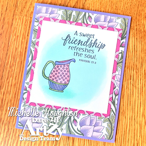
Here is the image on one of my go to Copic white cardstocks. Simple coloring small amounts of shading on the vase, but very minimal.
This image has an empty alt attribute; its file name is D2BA-June.jpg
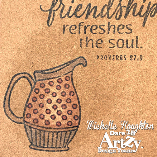
And here is the image on Kraft paper. Believe it or not the same colors were used on this copy of the image, Because Copic ink is transparent the Kraft paper shines through and significantly changes the look of the colors. Another major difference when working with Kraft paper is the softness. Kraft paper tends to be significantly softer then a smooth white cardstock so the advantage is blending basically takes care of itself. Colors melt into each other. The disadvantage is the bleeding. The colors are moving fast and far, great for blending harder to keep inside the lines. Just something too be aware of when experimenting with Kraft.
This image has an empty alt attribute; its file name is D2BA-June-1a.jpg
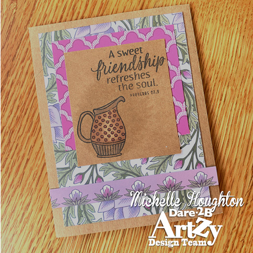
Both images went on to beautiful D2BA papers.
This image has an empty alt attribute; its file name is D2BA-June-1b.jpg
I used the same patterned papers on the second card in a little different design, but love how the Kraft really changes the feel and look.
This image has an empty alt attribute; its file name is D2BA-June-1c.jpg
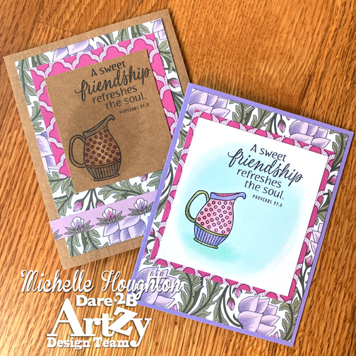
One last peek side by side.

Thank you so much for stopping by today! below is a quick look at the D2BA products I used on the two cards above. You can click on the images to find them in the store.

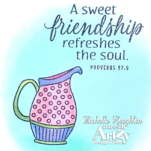
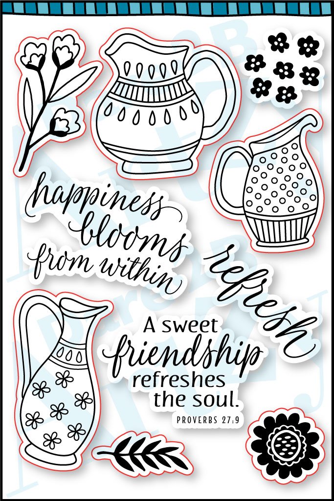
This image has an empty alt attribute; its file name is 18263P_RefreshTheSoulWEB_2048x.jpg
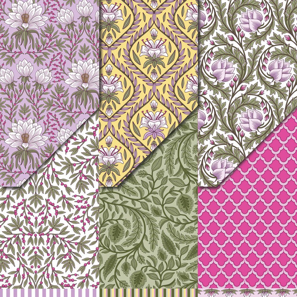
This image has an empty alt attribute; its file name is PPV1091_BREEZE_Vrty3_WEB_dc13c7b7-d9c9-406e-a260-be4600765815_2048x-1024x1024.jpg

Have a Happy Colorful Day!

Thanks for stopping by today! And make sure to check out some of the products I’ve used here in the D2BA store!

Posted on 3 Comments

Happy Hoppin’ Day With Kraftin’ Kimmie

Woot!  Woot!

Today we are celebrating all the wonderful new summertime things in our  JUNE Release that are NOW AVAILABLE
in the Kraftin’ Kimmie Stamps Shop!

All THREE of our new stamp sets along with two new stencils, our stunning new hybrid ink colour, Sandy Shores and sweet new krafty dots were released yesterday and we’re
excited to share everything with you in a fabulous blog hop!

So let’s check everything out in action as we hop around the Krafty Design Team’s blogs today!  Grab a nice hot (or cold) beverage, sit back and relax while we take you on this krafty tour!

First up is fabulous girly set by artist Neda Sadreddin called
WHAT’S THE SCOOP?


Next is a fun set from artist Cheryl Grant featuring our fave kiddos called UNDERWATER FUN!


Lastly is an ADORABLY sweet stamp set from artist Becky Pearce called 

TURTLEY AWESOME!


Available now is our stunning new Krafty Kolours hybrid ink colour in the large ink pad, the mini cube and ink refill called

SANDY SHORES!


We have two new stencils that coordinate perfectly with our lovely new stamp sets and they are….
NAUTICAL NETTING and KRAFTY SCENERY 3!


And lastly we have the perfect finishing touch for your summertime creations with our new Krafty Dots called…
SEASHORE DOTS!


All these new items are available individually however if you HAVE to have it all, we’ve got our JUNE GIMME KIMMIES KIT which contains everything AND at a discount!  But remember this is for a limited time and only while supplies last!


Now head on out on today’s celebration blog hop and check out all the new products in action as the Krafty Team shares their incredible creations!  Then jump on over to the Kraftin’ Kimmie Stamps SHOP and grab some goodies for yourself!

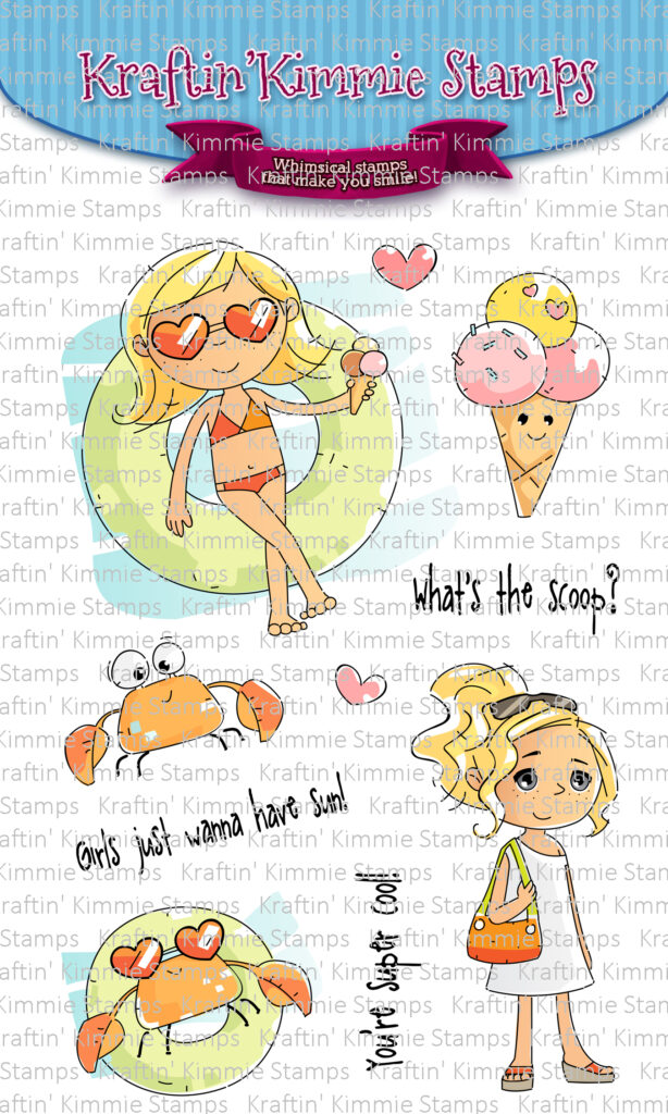
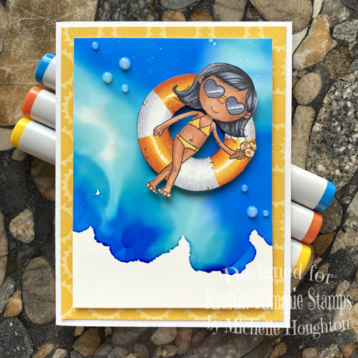
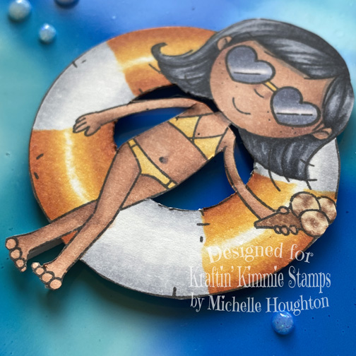
I am playing with the “What’s the Scoop” set today. I had a little trouble picking which image to play with as I like them all but while still unpacking and running girls about smartly I had time for one so here you go!

I started with the inner tube instead of the girl today, super fun to add a pattern or break it into bands!
Skin was next, this young lady is lucky and has skin can get a healthy tan! I also colored up her tiny weeny bikini and sunglasses!
Hair and ice cream cone last…ice cream yummmm!
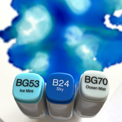
Next I decided on an ink background, three Copic Various Inks and some Yupo paper, easy peasy just drip drip drip.
Little fussy cutting and away she floats! I think I would like to be her today, peacefully floating and ice cream in hand.
Close up so you can see the coloring, amazing what I realize I am missing as I start making cards. My x-acto is hiding in a box still or back in Iowa ha ha!

I hope you are enjoying some sunshine where ever you are this fine day! Thank you for hopping by!

Have a Happy Colorful Day!
You are invited to the Inlinkz link party!

Click here to enter