Posted on

Copic Coloring With Rubbernecker

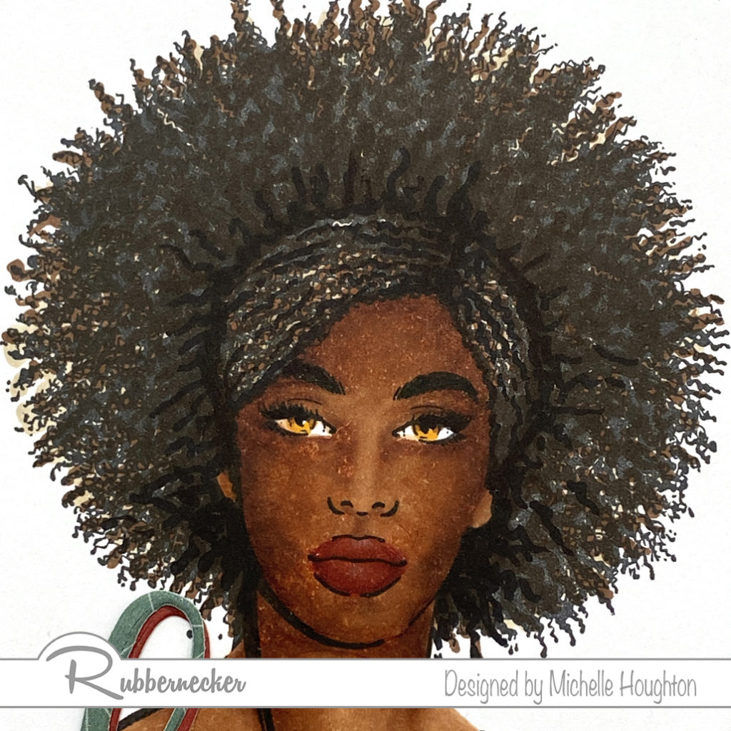
Hello my Copic coloring friends! little coloring today on a fun image from Rubbernecker. Murray with Catch is from the “Old Characters” collection. There is a whole team of these silly characters and wonderful phrases and statements to go along with them!

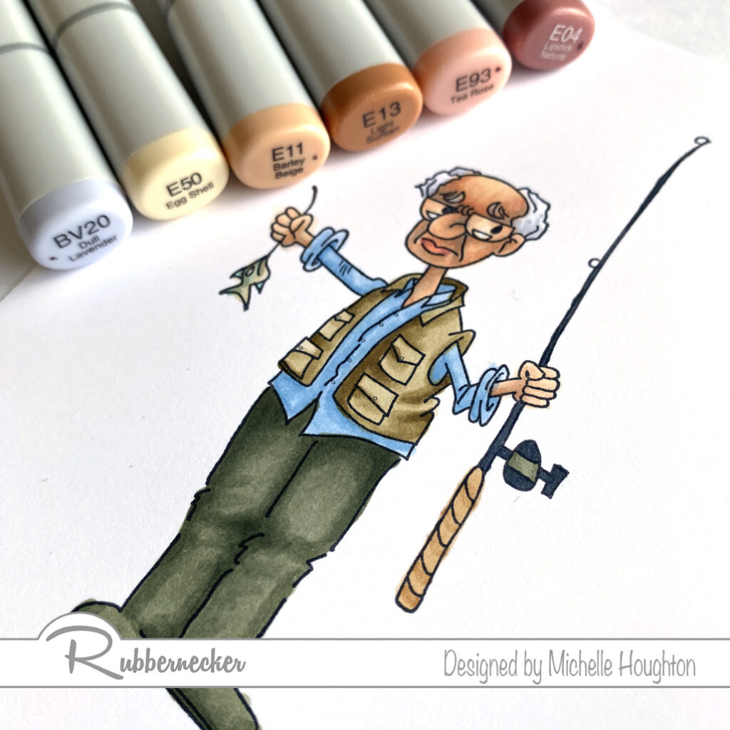
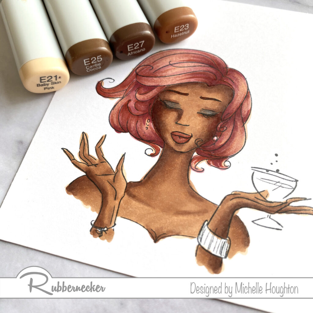
  • Starting with the skin use a blue violet to under-paint the deeper areas of the skin. This will also gray down the skin tones to age Murray a bit. (BV20)
  • Use a light earth tone over all of the skin. (E50)
  • Use a midtown to add shape to the face and arms. (E11)
  • Use a third earth tone in smaller amounts to deepen the shadow areas. (E13)
  • Blend the skin smooth working in reverse through the colors. (E11, E50)
  • Add a touch of color to the lips with a peachy earth tone and a darker rosy earth tone at the corners. (E93, E04)
  • Behind the glasses use the lightest earth tone and the midtone only. (E50, E11)
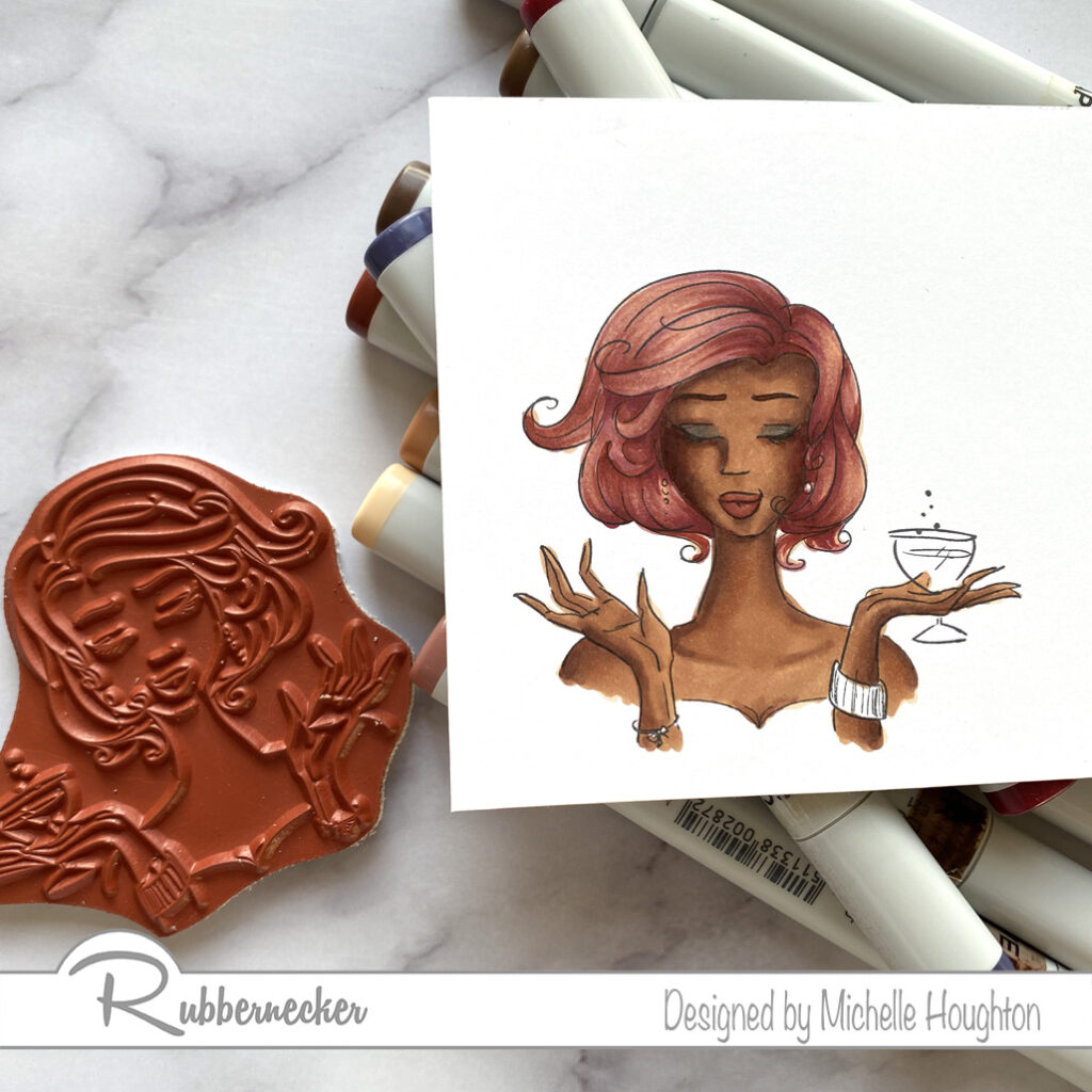
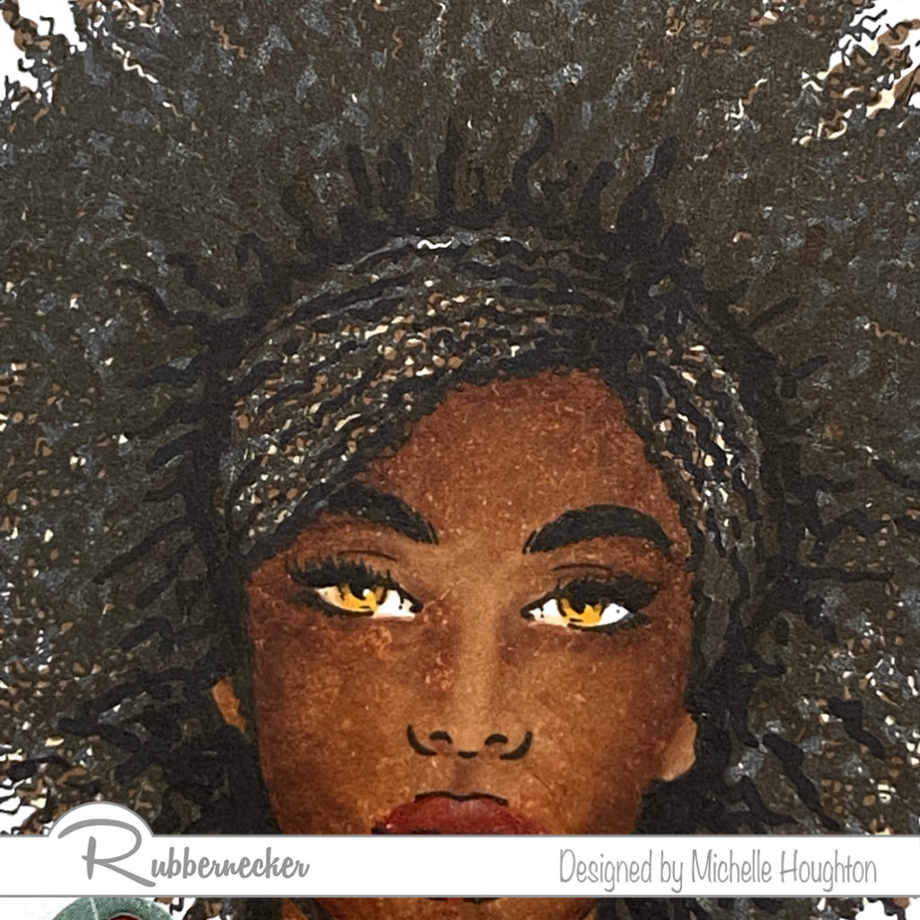
  • You can see a closer view in the next photo.
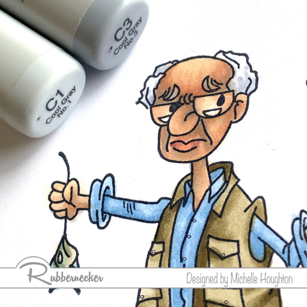
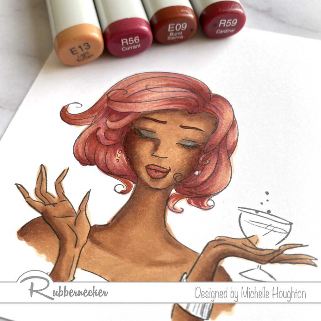
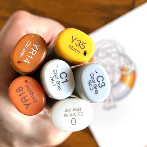
  • Use small dots of two cool grays to add texture to the hair. (C1, C3)
  • Use the darker of the two on the eyebrows. (C3)
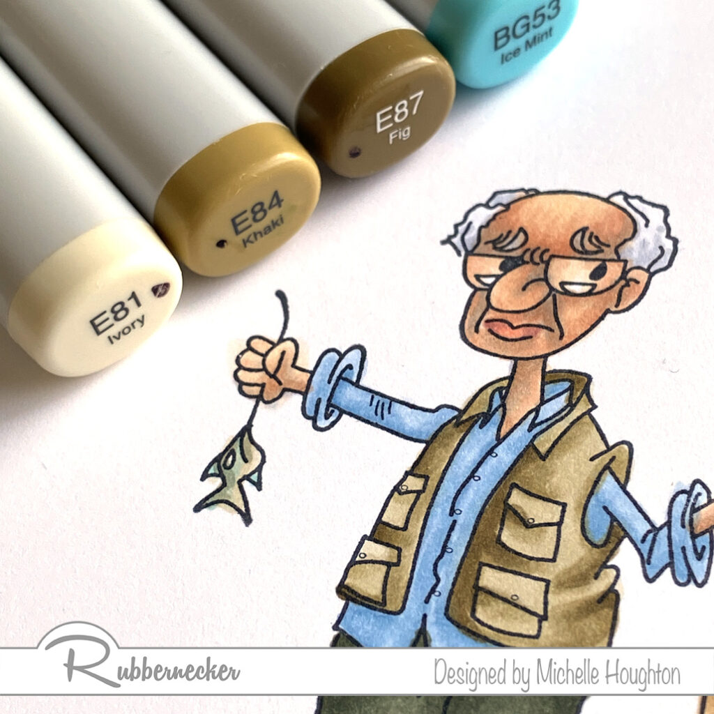
  • Fishing vest and part of the fish is next. Start with basing the vest and fish with a light earth tone. (E81) Note the E 8’s have a very mossy green to them!
  • Use a midtone earth tone to add shape to the vest. (E84)
  • Use a darker earth tone in smaller amounts to deepen the shadow areas. (E87)
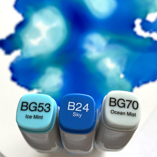
  • Add a touch of color to the back of the fish with a brighter blue green. (BG53)
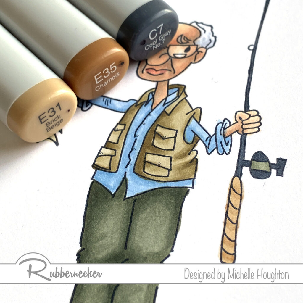
  • Quick coloring on the fishing pole. Fill the rod and parts o the reel with a dark gray. (C7)
  • On the handle use two earth tones. (E31, E35)
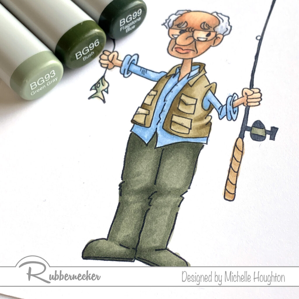
  • Last, but not least his waders and the last section of the rod. Base the waders and the center band on the reel with a lighter blue green. (BG93) I used this same color across the back of the fish to tone down the other blue green.
  • Use a midtone and darker blue green to add shape to the waders and use the midtone on the reel as well. (BG96, BG99)
  • Blend the layers together going in reverse through the colors. (BG96, BG93)

As always thank you for stopping by today! You will find the links to the Rubbernecker products I used below. I will have a video tutorial of this image next Wednesday over at Copic In The Craft Room on YouTube as well as the Rubbernecker YouTube channel. If you have not done so yet, please subscribe to my newsletter over on the right hand side of my blog. Super important right now if you are interested in any of my teaching, live and possibly in the near future, on-line options!

Have a Happy Colorful Day!

Posted on

More Skin and Hair with Rubbernecker

I have a final tutorial with darker skin tones (at least for now). Using one of the beautiful images from Rubbernecker Stamps. You will find the steps and colors I used below and then next Wednesday there will be a video tutorial posted on both the Copic In The Craft Room YouTube channel as well as the Rubbernecked YouTube channel.

  • Starting with the skin base all of the skin areas with E21.
  • Use a darker mid-tone to map out the shading on the skin areas, E25.
  • Use a darker tone in smaller amounts to deepen the shadow areas, E27.
  • Blend the skin smooth working back through the darker mid-tone and then covering the light base color with a light mid-tone, E25, E23.
  • Add a deep red earth tone to add color to her cheeks and blend it in with the skin tones, E09.
  • Base all of the hair with a light earth tone, E13.
  • Use a series of red and earth tones to create texture and volume to the hair with small thin flicks, R56, E09, R59.
  • Work with the 4 hair colors to smooth and enhance texture to your personal desired effect, E13, R56, E09, R59.
  • For lips use two earth tones to create shape and color, E09, E04.
  • Use a rich color to add a touch of color to the lids, V28.

Thank you so much for stopping by and checking in on my art. If you have not done so take a second and subscribe to my newsletter up to the right on my blog. I only send a few notes out a year and there will be news about Copic College and live events coming out in the next week!

Have a Happy Colorful Day!

Posted on 3 Comments

Happy Hoppin’ Day With Kraftin’ Kimmie

Woot!  Woot!

Today we are celebrating all the wonderful new summertime things in our  JUNE Release that are NOW AVAILABLE
in the Kraftin’ Kimmie Stamps Shop!

All THREE of our new stamp sets along with two new stencils, our stunning new hybrid ink colour, Sandy Shores and sweet new krafty dots were released yesterday and we’re
excited to share everything with you in a fabulous blog hop!

So let’s check everything out in action as we hop around the Krafty Design Team’s blogs today!  Grab a nice hot (or cold) beverage, sit back and relax while we take you on this krafty tour!

First up is fabulous girly set by artist Neda Sadreddin called
WHAT’S THE SCOOP?


Next is a fun set from artist Cheryl Grant featuring our fave kiddos called UNDERWATER FUN!


Lastly is an ADORABLY sweet stamp set from artist Becky Pearce called 

TURTLEY AWESOME!


Available now is our stunning new Krafty Kolours hybrid ink colour in the large ink pad, the mini cube and ink refill called

SANDY SHORES!


We have two new stencils that coordinate perfectly with our lovely new stamp sets and they are….
NAUTICAL NETTING and KRAFTY SCENERY 3!


And lastly we have the perfect finishing touch for your summertime creations with our new Krafty Dots called…
SEASHORE DOTS!


All these new items are available individually however if you HAVE to have it all, we’ve got our JUNE GIMME KIMMIES KIT which contains everything AND at a discount!  But remember this is for a limited time and only while supplies last!


Now head on out on today’s celebration blog hop and check out all the new products in action as the Krafty Team shares their incredible creations!  Then jump on over to the Kraftin’ Kimmie Stamps SHOP and grab some goodies for yourself!

I am playing with the “What’s the Scoop” set today. I had a little trouble picking which image to play with as I like them all but while still unpacking and running girls about smartly I had time for one so here you go!

I started with the inner tube instead of the girl today, super fun to add a pattern or break it into bands!
Skin was next, this young lady is lucky and has skin can get a healthy tan! I also colored up her tiny weeny bikini and sunglasses!
Hair and ice cream cone last…ice cream yummmm!
Next I decided on an ink background, three Copic Various Inks and some Yupo paper, easy peasy just drip drip drip.
Little fussy cutting and away she floats! I think I would like to be her today, peacefully floating and ice cream in hand.
Close up so you can see the coloring, amazing what I realize I am missing as I start making cards. My x-acto is hiding in a box still or back in Iowa ha ha!

I hope you are enjoying some sunshine where ever you are this fine day! Thank you for hopping by!

Have a Happy Colorful Day!

You are invited to the Inlinkz link party!

Click here to enter


Posted on

Copic Coloring Darker Skin Tones Part 2

Good morning all, I have my second installment featuring darker skin tones on another beautiful image by Rubbernecker Stamps. This image is considerably darker than the first. I am OK with how the skin turned out, I have used this combo before with better results, but I LOVE how her hair turned out so I am sharing!

  • Base the entire skin area with E21
  • Using a series of three more Earth Tones add shape to the face, E23, E25, E27
  • Blend the colors together going in reverse, E25, E23
  • After blending the edge of the E25 with the E23 slightly wash over the rest of the skin with E23
  • If needed bring back highlights with the E21
  • Use E04 and E09 to add fullness to the lips
  • Use YR24 and E23 to add a golden color to the pupils
  • Use a series of Copics in long squiggly lines to emphasize the direction and shape of the hair, this will also warm up and separate the solid black from the stamp E43, E47, E49, C9

Here is a closer look at the hair:

  • Stamp the background image in a light gray ink
  • Color the rock wall with a variety of Copic natural tones adding texture as you go
  • Use a sentiment die cut to create 2 layers of a simple greeting
  • Use square nesting die cuts to frame the face and one size larger on patterned paper
  • Use rectangle nesting die cuts to cut the rock wall paper and a second patterned paper
  • Attach the largest patterned paper to a card base
  • Use foam tape to pop up the rock wall paper onto the base
  • Attach both the square patterned paper and image onto the base
  • Using a liquid glue attach the 2 sentiments together off setting them just a bit
  • Use liquid glue to attach the sentiment to the card

Thank you for stopping by for today’s post! I have at least one more in this series and then I hope to get a video done with darker skin tones as well. Below you will find links to the Rubbernecker products used on today’s card.

Have a Happy Colorful Day!

Posted on

Copic Coloring Dark Skin Part 1

Coloring darker skin tones takes a little more time and patience than lighter variations, typically there are more layers of ink, they are heavier by nature not as much alcohol solution in the mix. So it takes a little more practice and a lot more mistakes to get images where you would like them to go. You know me I am always up for a good challenge! So when Rubbernecker asked if some of the design team members would help showcase the new images featuring women and men of color I said sure I’ll give it a go!

  • Base the skin in an Earth tone E11
  • Use a mid-tone and shadow to add shape and depth to the face E13 and E15
  • Blend the colors together going in reverse, E13 and E11
  • Add small touches of a blue violet into the deepest shadow areas BV23
  • Fill the lips with E04 and small touches of E09 for shape
  • Color the head wrap and top in a series of reds R81, R83, R85
  • Add squiggled lines over the hair area of the image with darker colors E47, E49, C9 * note you could leave the hair alone the stamp actually stamps the hair black, I always feel like it needs a little more texture and richness. It is very subtle but effective.
  • Fill the pupil of the eye with a warm Earth tone, E35
  • Use a layer of E50 to fill the background and then go over the entire area with W1, this helped match the background to the patterned papers I have chosen

Here are the steps to create the card:

  • Trim a light piece of patterned paper to 4.25 x 5.5 and attach it to a card base
  • Use a scalloped rectangle die to cut a large rectangle from a blog patterned paper and stamp the lower corner with the “Live On Your Terms” sentiment stamp
  • Using the nesting circle dies cut two circles from coordinating patterned papers, attach these together and then use foam tape to pop them up on the card base
  • trim the image using an oval from the nesting die set and use foam tape to pop it up in the center of the circles

Thank you so much for stopping by today! below you will find links to all the Rubbernecker products I am using on this card.

Have a Happy Colorful Day!