Posted on 4 Comments

Colorful Copic & Art Squares Blog Hop

Welcome to the Colorful Copic & ART SQUARES blog hop!

You are in for treat today as Copic pairs up with the ever popular Art Squares by Inchie Arts. There are so many things to love about this pairing!

Did you know:
Art Squares are the perfect canvas for creating small-format art!
They come in 6 sizes (1 inch, 1.5 inch, 2 inch, 3 inch, 4 inch, and ATC).
Art Squares come in 7 colors (black, dark gray, light gray, kraft, dark cream, light cream and white).
They are perfect for wet or dry mediums.
Copic markers and inks look amazingly vibrant and deliciously rich on Art Squares!
Copic multiliners glide smoothly across the surface.
Work on the “top” or toothy side for the best results.
You can mix and match your mediums! No warping, bending or curling.

You can find more information about both Copic products and Inchie Art Squares at the links below.

Copic Website

COPIC Main Logo

All In An Inch – Inchie Arts Blog

Inchie_ArtSq_Logo_light

Our teaching and design teams have been challenged to put marker (or ink) to these precision-cut matboard surfaces and see what happens! (You are not going to BELIEVE these samples… trust me – they rock!)

I have 3 cards to share with you today.  I had way too much fun with my squares and can’t pick just one to highlight.  In addition to the 3 below I am going to post my other creations with my Inchie Art Squares and Copic over the next few days.  I am starting with 3″ Kraft colored squares.  Tomorrow I will be sharing 2″ white squares and Sunday will highlight 3″ white squares and a few more Kraft squares as well!

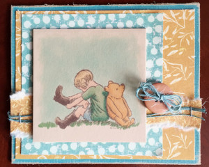
This fist card uses very traditional color techniques with Copics.  I stamped the image with a Memento, Rich Cocoa stamp pad and then used the following colors; Y35, Y38, Y28, B91, B95, G20, G24, G28, E43, E43, E47, Y21, Y28, YR00. E93, YG63, YG66, B00, BG000, 0.  Notice in the color selection a lot of my lighter colors are not present, the Kraft be did effect my color choices here.  Blending was extremely easy and happened mostly as I was coloring making it un-necessary to go back and blend layers.

Inchie hop 2


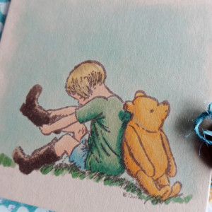
Other supplies:  cardstock; Core’dinations, patterned paper; Prima, twine; American Crafts, tiny attacher; Ranger, button; Unknown.  Here is a close up of the image.

Pooh and Cristopher close-up


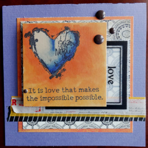
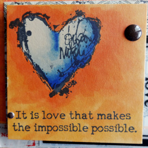
This next card is using stamps by Dina Wakley and Ranger.  I used a much looser coloring technique,after stamping with Memento Tuxedo Black, lots of scribbling, overlapping and no back blending. I used B60, B63, B66, B69, Y38, YR04, YR07.

Big heart 1


Other supplies used:  cardstock; American Crafts, patterned paper; Basic Grey, journal card; Maya Road, Washi tape; Freckled Fawn, Target office supplies and unknown, dots; My Minds Eye. Here is the close up:

Big heart 1 close-up


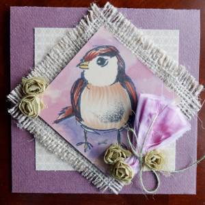
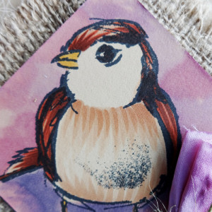
The last card I am sharing today is again featuring a Dina Wakley stamp (The extra black on the bird’s belly is poor stamping on my part, not part of the stamp, sorry Dina!).  The colors used on the bird are Y17, E02, E04, E09, E29.  On the bird I used the marker loosely to show the texture of the bird.  For the background I used my Various Ink Refills in RV66, V04, V17, And used them with a brush and colorless blender like watercolor paints.  It created the beautiful mottled background for my birdie.

Bird 1


Here is the close up of my coloring.  I also Copic died the silk that is tied into the pink flower.  Other supplies: cardstock, twine and flower trim; American Crafts, patterned paper, Basic Grey, burlap; Canvas Home Basics.bird 1 close-up
Hop along with these talented designers as they show you some more interesting and exciting ways to pair up two great products!

Elizabeth Allan & Jill Foster

Michele Boyer

Lori Craig

Sharon Harnist

Michelle Houghton << You are here

Dina Kowal

Cindy Lawrence

Lisa Lee

Debbie Olson

Colleen Schaan

Sherrie Siemens

Marianne Walker

Happy Coloring! And come back both Saturday and Sunday to see more Copic and Inchie Art inspiration!
Posted on 3 Comments

RubberMoon and Copic Background

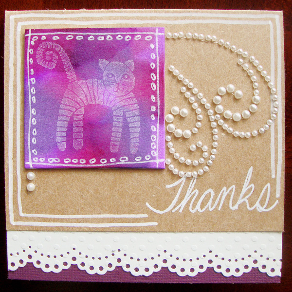
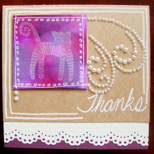
Hello RubberMoon fans!  Welcome to my blog!  As promised I have a second tutorial using Gretchen Ehrsam’s  Striped Cat  I created another card but this time wanted a completely different look to show you the versatility of one stamp and a fun different technique with Copic Various Inks (the refills).  The supplies I used are:

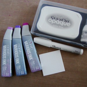
Striped Cat stamp by Gretchen Ehrsam, a white Sharpie paint pen, Copic Various ink in V04, V17 and RV66, a 2″ Art Square, and StazOn opaque white ink.

RMb1

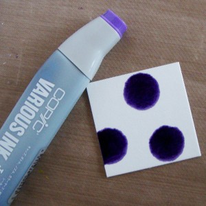
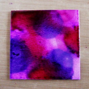
Step #1 – Drip Copic Ink directly onto the art square.  The colors will bleed quite a bit so you will only need 3 or 4 drops of 3 colors.

RMb2

RMb3

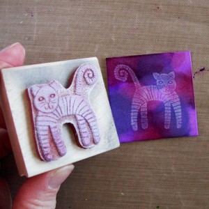
Step #2 – After the ink is completely dry, use StazOn opaque white ink to stamp your image onto your square.

RMb4

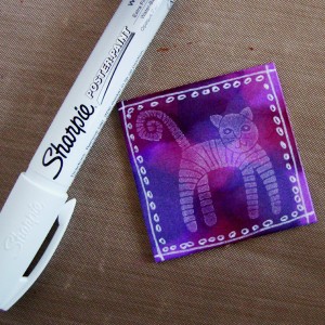
Step #3 – Use an opaque white pen to add doodles onto your square, my FAVORITE white marker is a Sharpie poster paint pen.

RMb5

Step #4 – Add your square onto your card base, I used a wine colored card stock and white Swiss Dot Cardstock from Bazzill and a small piece of Kraft card stock, I added pearls and more doodling with my Sharpie.

RMb6

Thank you so much for stopping by today to take a peek at my RubberMoon creation.  Make sure to stop by the RubberMoon blog as well if you have not had a chance to this week!  Nancy posted an amazing inky tutorial there Monday!

Happy Wednesday!


Posted on 1 Comment

Bokeh Pattern and Calvinball update.

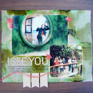
I completed a fun assignment that had me getting inky for Get It Scrapped.  The Creative Team was asked to use patterned paper with a Bokeh pattern on it.  I decided to create my own paper and used tracing and Copic Ink to create the effect.

BokaI See You by Michelle Houghton | Supplies: cardstock; Kraft, patterned paper, twine and sticker letters; American Crafts, burlap elements; Little Yellow Bicycle, ink; Copic and Sharpie, Washi tape; Scotch, other; tracing paper

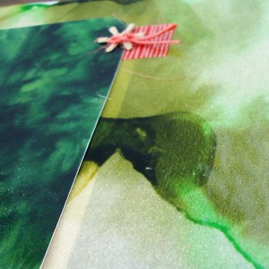
The process was extremely easy to create the Bokeh print.  I dripped 3 colors of Copic ink from the various ink refill bottles onto the tracing paper.  As the ink bled it ran into the drips next to it, blending and filling the page.  To finish I added a few drops of colorless blender solution which pushed the ink away from where it dropped and added some nice white areas.

Here is a close-up of the effect

blog 1 for boka

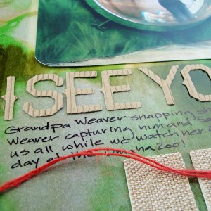
When I added my photos they blended in with the paper so well that I was loosing the edges a little.  I decided to matte them but the mattes were too distinct and took away from the beautiful Bokeh paper so I slid the mattes under the Bokeh tracing paper and then sat the photos on top of them over the Bokeh paper.  The effect is subtle and effective.  I added some small touches of red Washi tape and twine to add contrast and highlight the red and orange that my Dad and Sara are wearing in the photos.  I also used burlap banners and corrugated cardboard letters to add to the feel of the jungle page.   Just a touch of journaling under the title finishes the layout off.

blog 2 for boka

To see more of the wonderful layouts and inspiration by the Creative Team make sure to check out the article HERE

Now what I am sure you really tuned in for is an update on my Calvinball game 🙂  I am currently at 12.5 points.  ( I have been awarding myself 1/2 points for my crafty endeavors.  It is NEVER to late to join in the fun of a Calvinball match so come join us HERE!

Happy hump day all!

Posted on 2 Comments

Not Pretty!


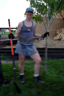
So yeah, this is me. Sara took this photo so excuse the unsteady hand but someone had to get this shot. This is me after I had single-handedly re planted three Maple trees. Dug 3 new holes 20″deep and 36″ wide, pulled up 3 trees that had been planted 2 days earlier (yes by me if you are asking), refilled 3 holes and replanted the 3 trees. Needless to say heavy work on a hot day. the moisture you see is sweat, not a hose down. Then on Saturday I went to an all day Turbo Kick training for aerobics so you can imagine every inch of me is hurting! Boy do I need a vacation!