Posted on

Coffee Lovers Hop

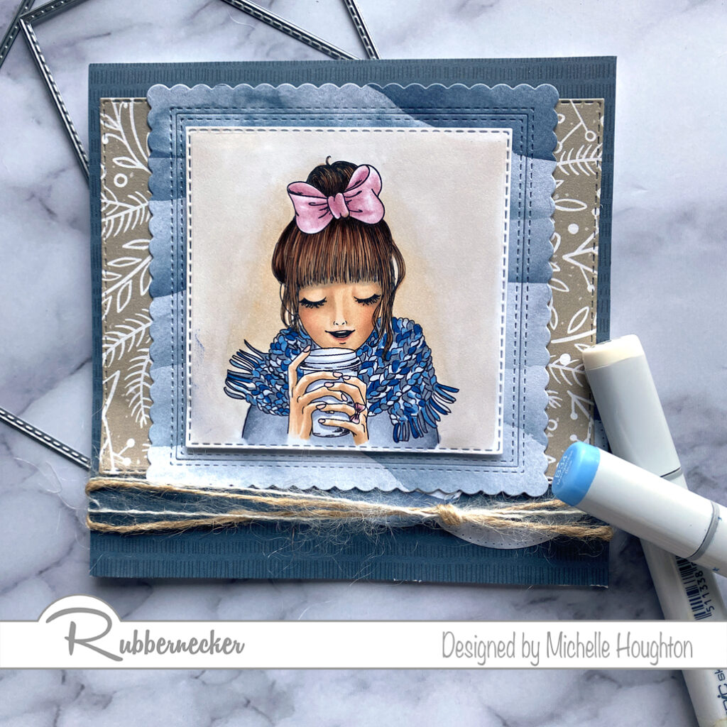
Hey Crafty friends. I am hopping along with Rubbernecker Stamps for the Coffee Lovers Blog Hop today. I am a little late getting my post up so I will miss a few that hopped through early, but will catch a few of you later in the day and into the week 😉. I am sharing a new image from Rubbernecker stamps!
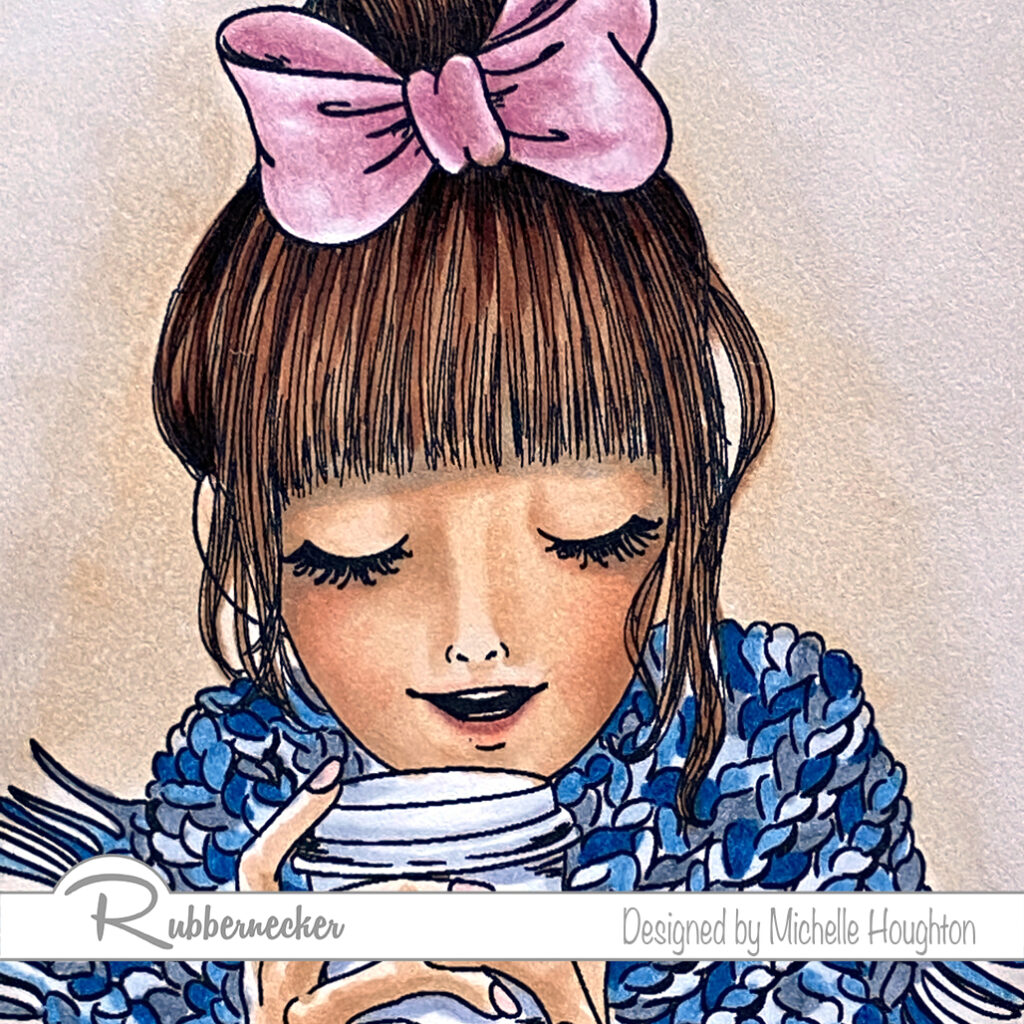
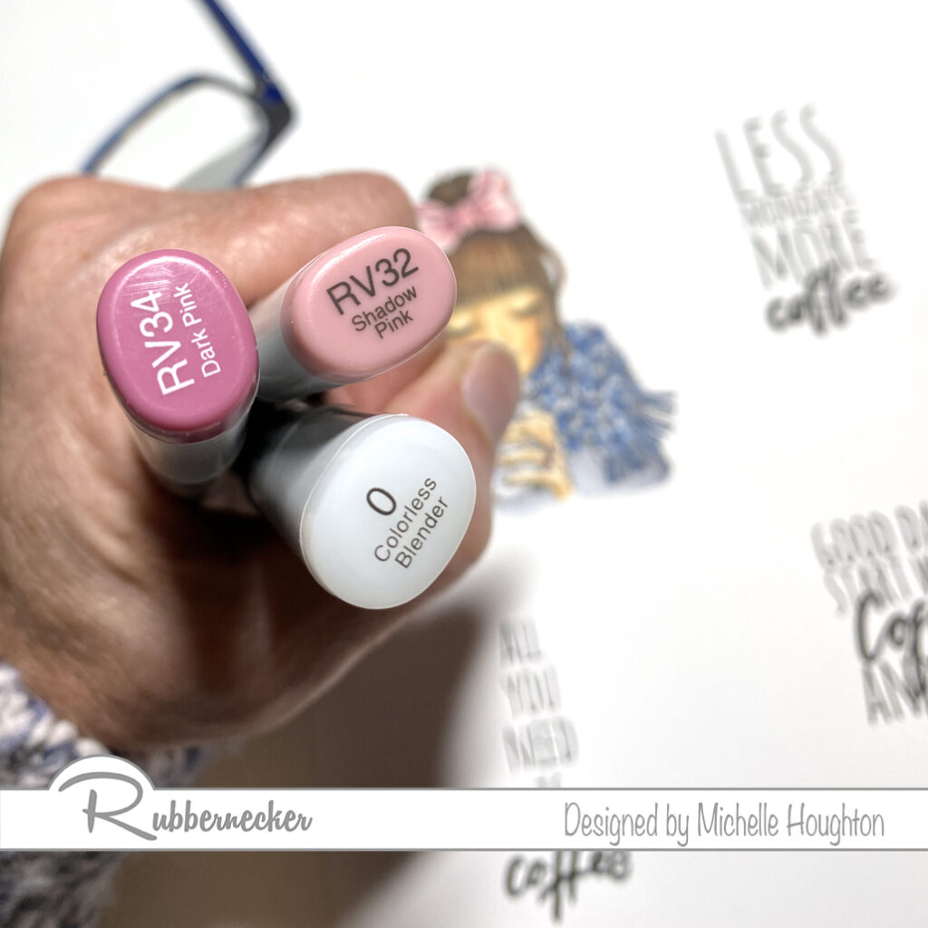
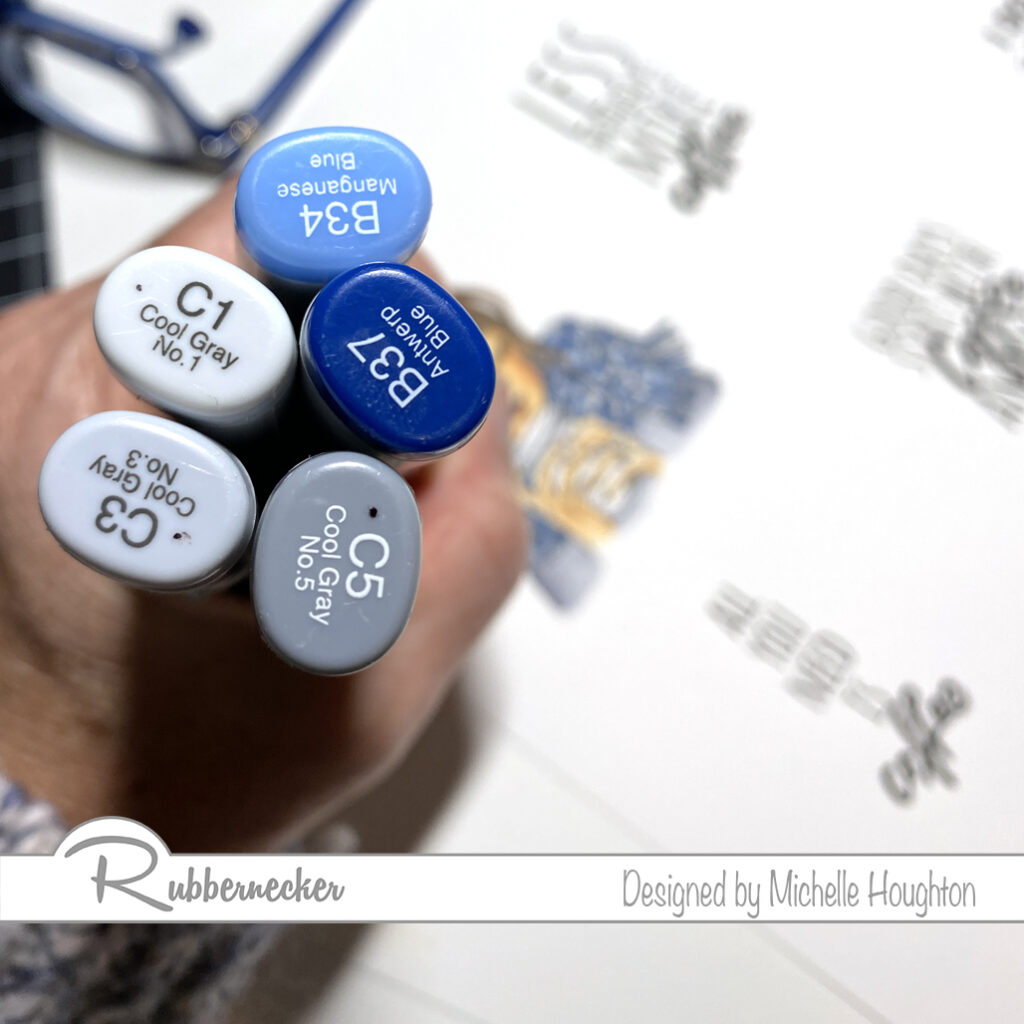
I have colored her up with Copics and below is a list of what I used and where.
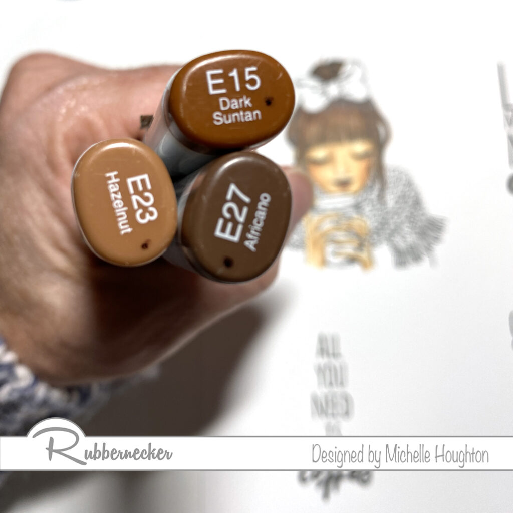
Skin and Hair
Sweater and Scarf
Bow

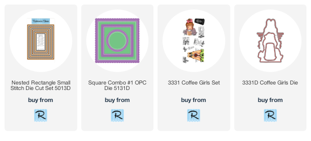
Then I created a few layers using patterned paper, cardstock and dies from Rubbernecker.
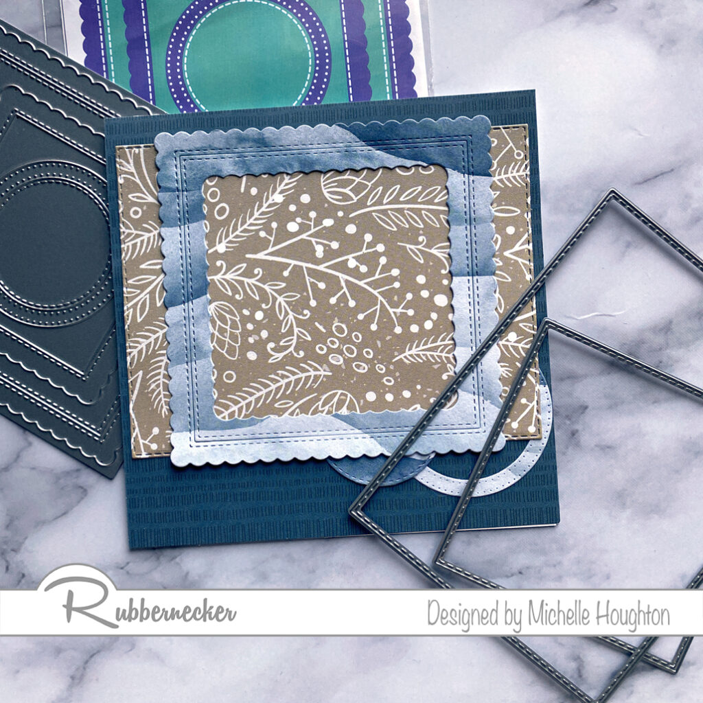
Putting it all together was just a matter of adhering all the layers.

  • 5.5 x 5.5 card base
  • Dark blue patterned paper card front
  • Light blue patterned paper circle and ring from stacked die set
  • Earth tone patterned paper rectangle nested die
  • Light blue square frame (or square) from stacked die set
  • Tie soft twine in one or two colors near the bottom on the light blue square
  • Lastly pop up the image with foam tape
Thank you so much for stopping by! Make sure to check out some of the other designers from Rubbernecker as well as the Design Teams from the many sponsors of the Coffee Lovers Hop!

Have a Happy Colorful Day!

Posted on 3 Comments

Kraftin’ Kimmie Release Hop!

Woot! Woot!

Today we are celebrating all the wonderful new holiday things in our September Release that are NOW AVAILABLEin the Kraftin’ Kimmie Stamps Shop! All THREE of our new stamp sets along with two new stencils, our stunning new hybrid ink colour, Precious Pink and sweet new Christmas Dots were released yesterday and we’re excited to share everything with you in a fabulous blog hop!

So let’s check everything out in action as we hop around the Krafty Design Team’s blogs today! Grab a nice hot (or cold) beverage, sit back and relax while we take you on this krafty tour!

First up we have this sweet Christmas set by artist Neda Sadreddin and we’re so excited about it!! It’s called…O HOLY NIGHT!

Next up we have the most amazing scene building stamp set from artist Sabrina van Vloten called…..SANTA’S RIDE!

And our last stamp set is another fabulous new one from artist, Neda called….A CRACKIN’ HOLIDAY!

Available now is our stunning new Krafty Kolours hybrid ink colour in the large ink pad, the mini cube and ink refill called…PRECIOUS PINK!!

We have two new stencils that coordinate perfectly with our lovely new stamp sets and they are….TWINKLE LITTLE STARS andHOLIDAY LIGHTS! And lastly we have the perfect finishing touch for your festive creations with our new Krafty Dots called…CHRISTMAS DOTS!

Now head on out on today’s celebration blog hop and check out all the new products in action as the Krafty Team shares their incredible creations! Then jump on over to the Kraftin’ Kimmie Stamps SHOP and grab some goodies for yourself!

Happy kraftin’!

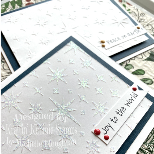
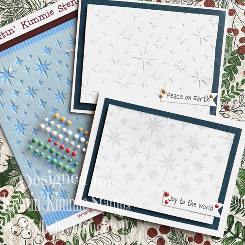
I decided to play with one of the beautiful stencils and the Krafty dots today to complete two simple cards. I used the stencil with Nuvo glimmer paste and as an embossing plate on white cardstock.

Make sure to stop by all the Krafty design team blogs there is some amazing creativity going on out there!

Have a Happy Colorful Day!

You are invited to the Inlinkz link party!

Click here to enter

Posted on

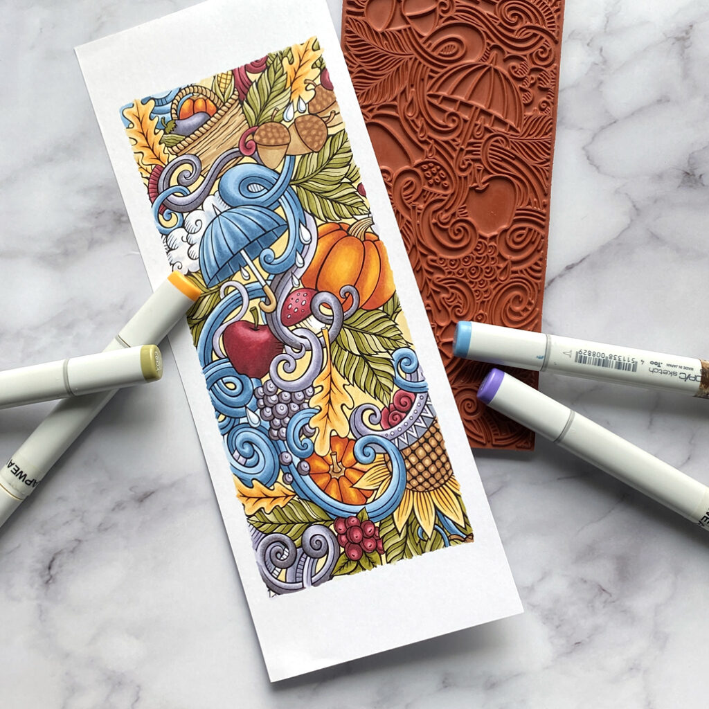
Copic Coloring Fall Slimline Stamp

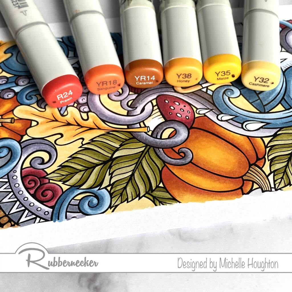
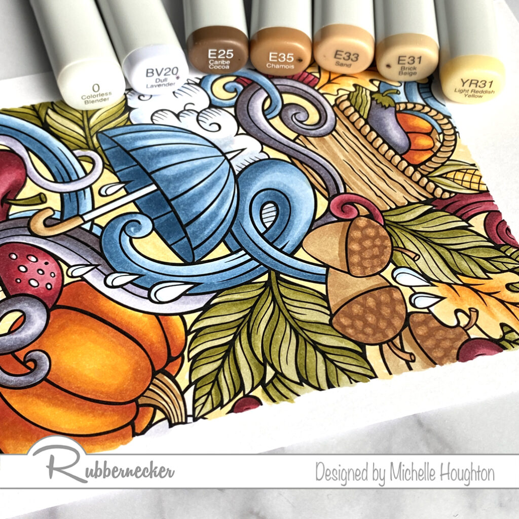
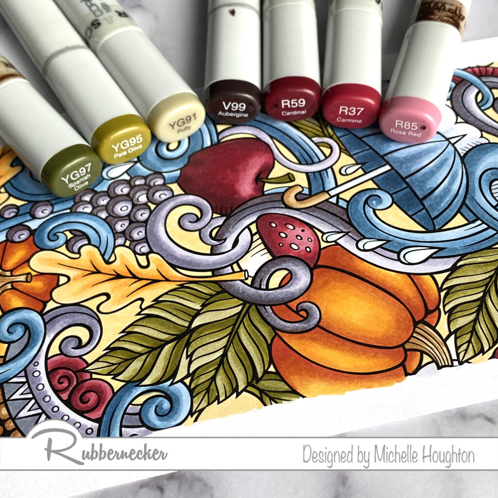
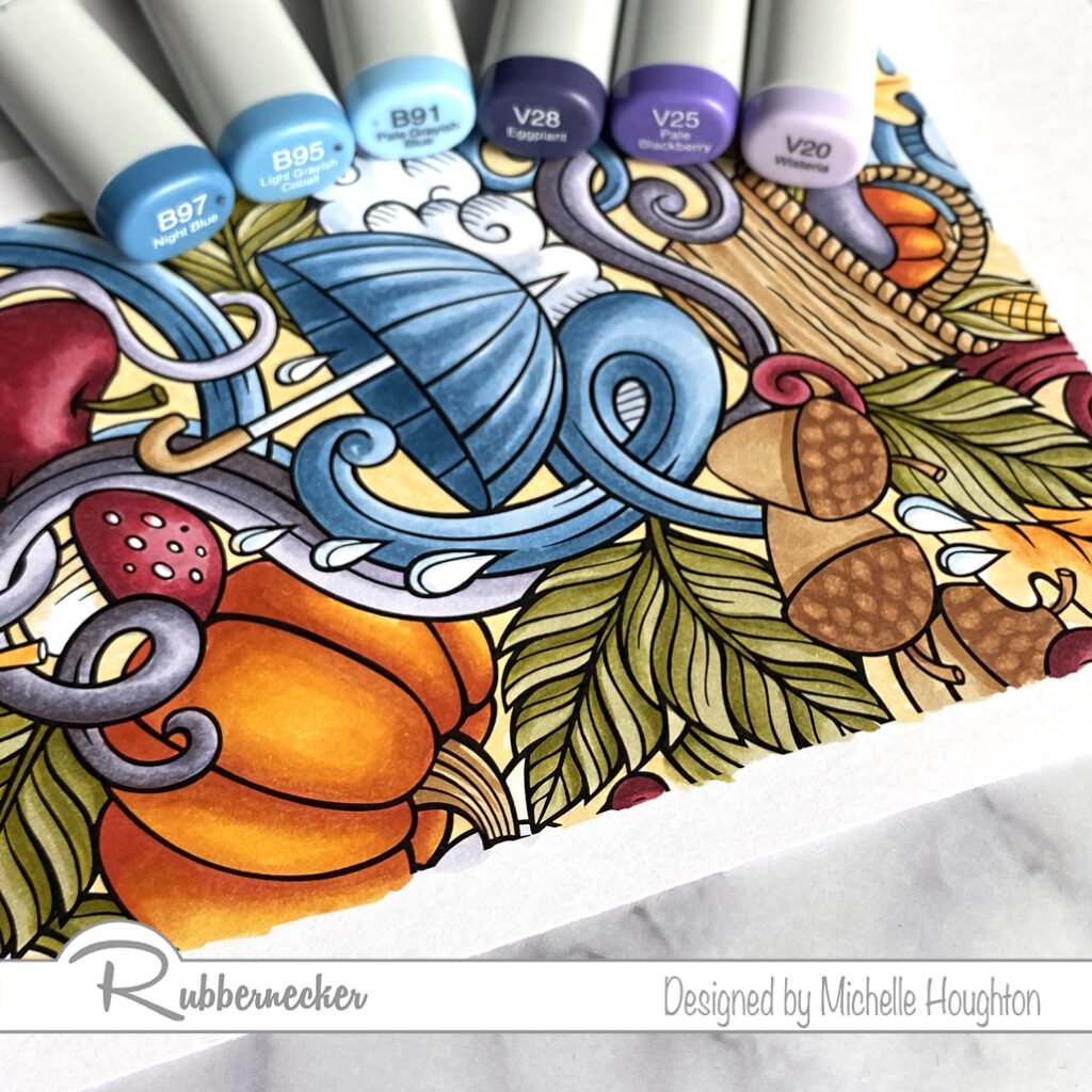
Welcome back I am coloring up a second of the Rubbernecker Slimline stamps. This one features all things fall. Next week there will be a video of the coloring process again at a faster speed so we can get through the full thing in a reasonable amount of time. Here are the colors used on the different sections of the image.

  • On the areas that are orange work from dark to light with a range of a red, two yellow reds and a yellow. (R24, YR18, YR14, Y35)
  • For the golden yellow areas work from dark to light with a series of three yellows. (Y38, Y35, Y32)
  • Areas that are brown use a series of four earth tones. (E31, E33, E35, E25)
  • For areas that are light gray like the clouds and umbrella use a blue violet and the Colorless Blender. (BV20, Colorless Blender)
  • After the sections are all colored use a light yellow red to fill all the background areas. (YR31)
  • Green areas are colored with a desaturated set of yellow greens. Work from dark to light on these areas. (YG97, YG95, YG91)
  • All the red areas get colored dark to light with a series of three reds and a dark desaturated violet. (V99, R59, R37, R85)
  • Violet areas are colored dark to light with a series of three violets. (V28, V25, V20)
  • Use a series of blue working from dark to light in the blue areas. (B97, B95, B91)

Love how this image turned out! You’ll notice that most of the colors are desaturated. that means that they are colors that have some gray added into them. You can know which Copic Markers are desaturated by the first number on the end. The number right after the letter represents the saturation level of the marker. The higher the number is the more desaturated, or in other words the more gray that has been added.

Have a Happy Colorful Day!

Posted on 12 Comments

Kraftin’ Kimmie Day 1 of the September Release

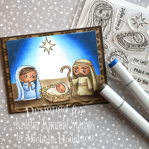
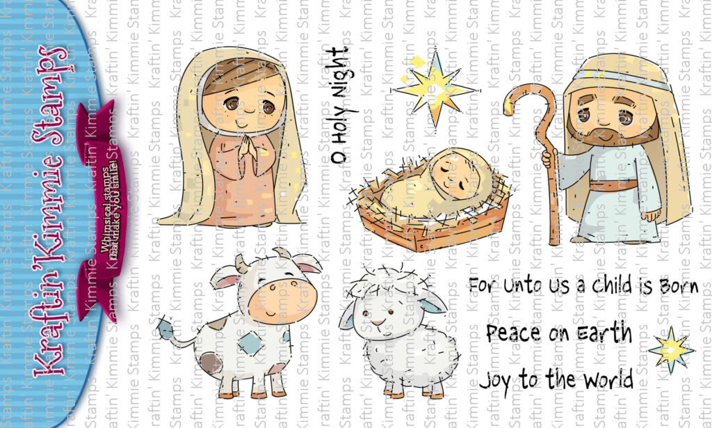
Eeeeee!! Are you ready, are you ready?It is time to begin the September Krafty Peeksat Kraftin’ Kimmie Stamps!!Our Christmas Krafty Peeks begin today and you’re not going to believe the fabulous goodies we have in store for you this month! As you may know our September release is always focused on the HOLIDAYS!!Today is Day One and you *may* have spotted this precious stamp set over the retreat weekend because it was the focus of Krafty Girl, Paula’s pencil colouring class!!This sweet new set is from artist Neda Sadreddin and it’s called…O HOLY NIGHT!!

The perfect set for Christmas includes the holy family….Mary, Joseph, the baby Jesus and some adorable, fluffy animals!! This set also includes 4 perfect sentiments and the coordinating stars!As you hop around the Krafty Team’s blogs today you will see the O HOLY NIGHT stamp set in action in combination with our all of our other awesome new September Kraftin’ Kimmie products!You will spot our newest addition to the Krafty Kolours Hybrid Ink rainbow! It’s a soft new blush colour namedPRECIOUS PINK!As always it will be available in full sized ink pads, mini cubes and ink refills!We’ve got TWO brand new Krafty Stencils for this month’s release to help accessorize your creations! They are called….
TWINKLE LITTLE STARS and
HOLIDAY LIGHTS!One perfect for all your spooky cards and the other a fabulous must have pattern for any occasion!And of course, we are adding the perfect new coordinating Krafty Dots for this release! The package includes mini enamel dots in varying sizes in 6 different colours!These ones are calledCHRISTMAS DOTS!You’ll get to see all of our brand new goodies in action over the next few days of September Krafty Peeks and everything will be released at our LIVE Online Release Party in the Krafty Friends facebook group on Saturday, September 19th at 1 pm EST!For now, hop around and check out some incredible designs from our Krafty Team!! Be sure to leave some love on EACH stop on the hop because I’m going to be giving away some krafty $$ to the shop!! PLUS our designers are AMAZING and you should tell them so!  Come on back tomorrow for moreChristmas krafty goodness!See you then!

I colored up a few scenes with my Copics. I did different combinations of the images and each of the cards has a similar look. Here are the first two the third will debut with a video tutorial next Wednesday!

Here is the collection of markers I used for all three images. It went fairly quickly since the combination was the same on each card front. This is the card front I have created a video for. (Next Wednesday)

Make sure to keep hopping through the team! The crafty cards and creations this month will have you inspired to create!

Have a Happy Colorful Day!
Posted on

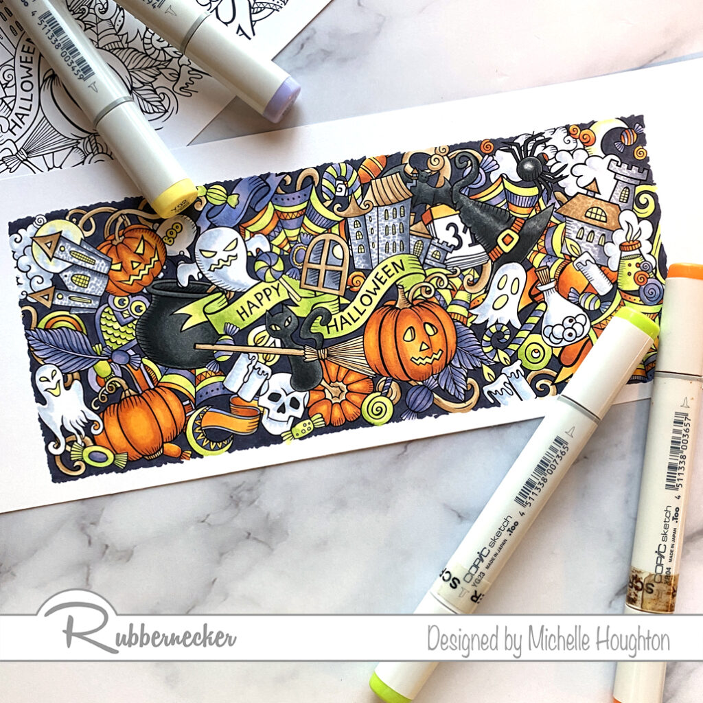
New Background Stamps

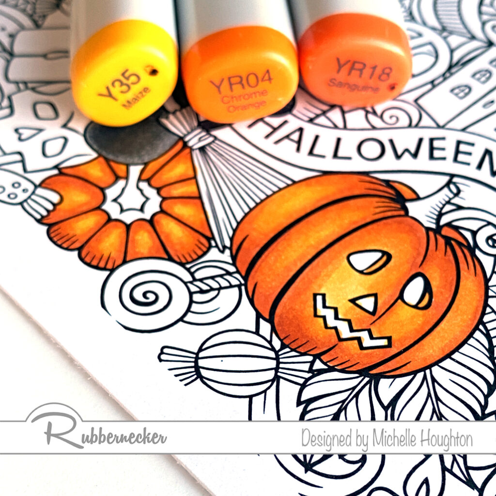
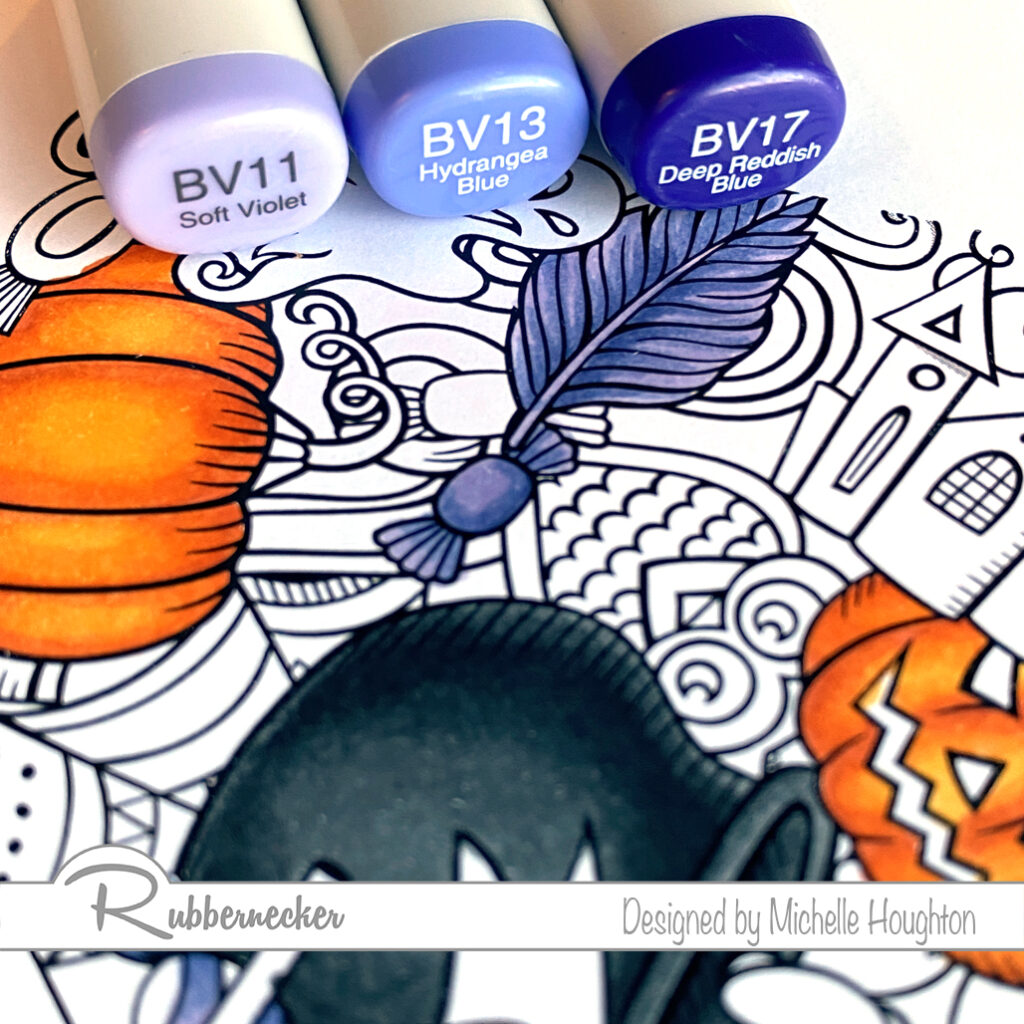
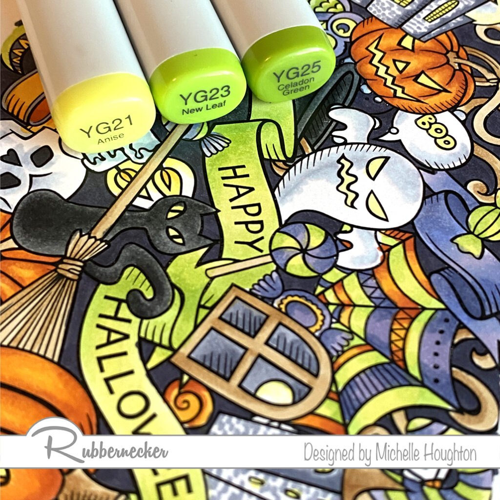
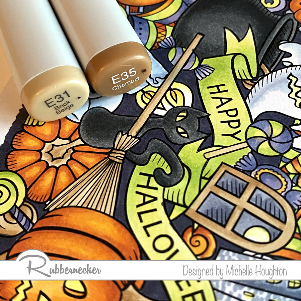
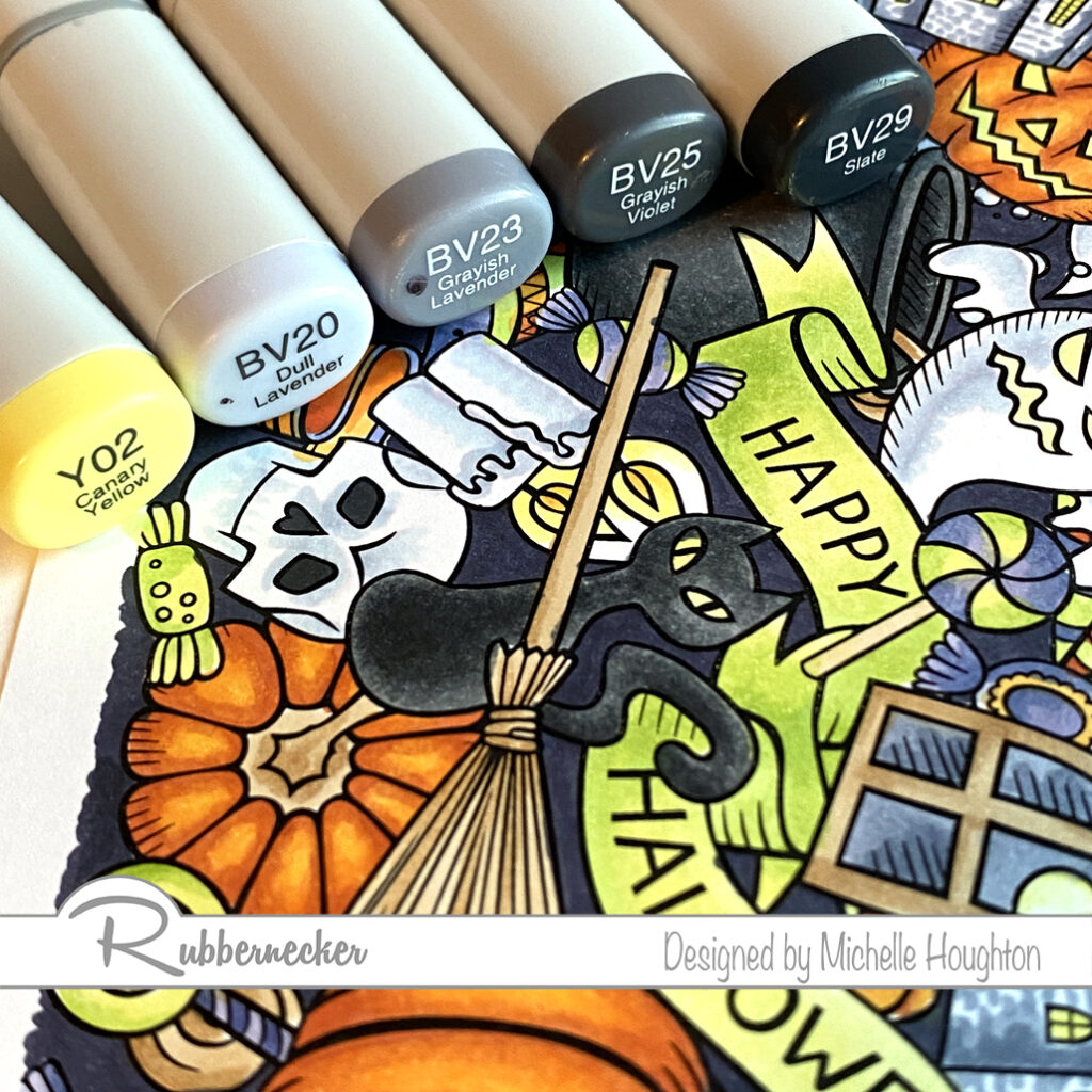
I hope your coloring fingers are ready! Rubbernecker Stamps has come out with 4 beautiful new background stamps for slimline cards and oh what a treat! Colorers hold on to your markers, pencils and brushes. You are in for a real treat! I colored one of the four in my Copics and have the colors I used below. I will actually have a video next week as well but fare warning, this will not be real time. These take a little longer with all their glorious detail.

I tackled one color group at a time and worked my through the full image. I missed spots and went back once I had gone through each of the color groups I chose. So the step outs here will look a little different.

  • Start with a series that will color all the orange portions of your image. Working on one or two sections at a time use the darkest of the series and find the deepest shadow areas. (YR18)
  • Use a midtone yellow red, overlap the darker color and work further into the white area. (YR04)
  • Use a midtone hello to fill the white area that will be the highlight and been into the midtone yellow red. (Y35)
  • Work your way through the image coloring all the orange areas you can find at first pass.
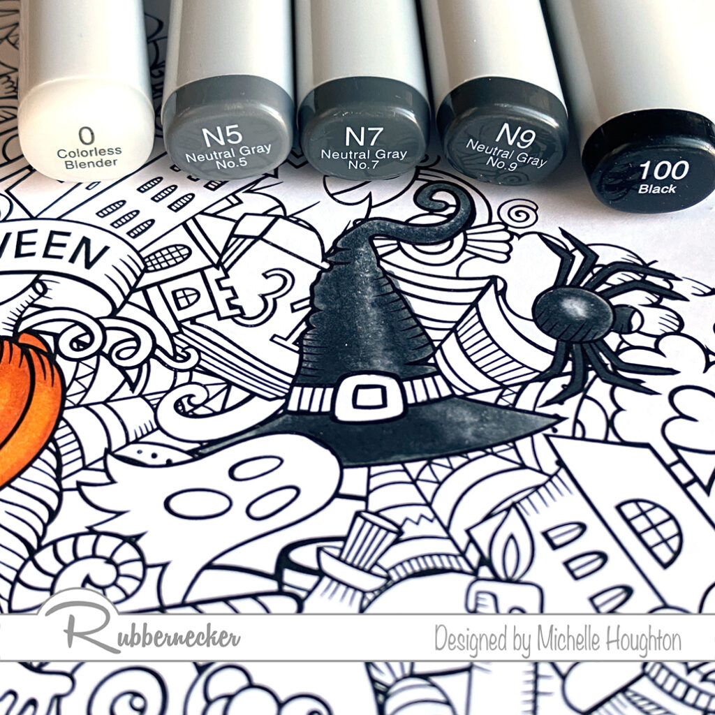
  • Choose a set of dark grays and a black if you have it and use the darkest in the deepest shadows of one or two black objects in the scene. (100)
  • Use a gray to overlap the black or dark gray and pull into the white area. (N9)
  • Use two midtone grays to work into the white area. Overlap from the darker into the lighter area with each color. (N7, N5)
  • Use a Colorless Blender to soften the edge of the lightest gray or lighten the highlight depending on the object. (Colorless Blender 0) * If an object is shiny leave a bright white highlight, if it is dull leave less contrast.
  • Work your way through the image coloring all the black areas you can find at first pass.
  • Violets or blue violets are next start with your darkest and find the deepest shadows of one or two objects that will be violet. (BV17)
  • Use a midtone blue violet to overlap the darker color and work into the white area. (BV13)
  • Use a light blue violet and fill the white area on the objects blending into the midtone area. (BV11)
  • Work your way through the image coloring all the violet/blue violet areas you can find at first pass.
  • Bright yellow greens are next. Choose a midtone yellow green and work it into the darkest areas on one or two objects in the image. (YG25)
  • Use a lighter yellow green to overlap the darker color and work into the white areas on the objects. (YG23)
  • Use your lightest yellow green to fill the remaining white are and blend it into the midtone area. (YG21) * This would be an opportunity to use a fluorescent Copic if you have one. I think they would work wonderfully here!
  • Work your way through the image coloring all the yellow green areas you can find at first pass.
  • Choose a simple two color combination for areas that could be wood or similar coloring. Use the lighter of the two to fill one or two of the areas. (E31)
  • Use the darker of the two colors to define edges, add texture and depth. (E35)
  • You may or may not need to blend this darker color back in with the lighter of the two. (Ee31)
  • Work your way through the image coloring all the brown areas you can find at first pass.
  • Use small touches of a light yellow to eyes and flames with the midtone yellow used earlier. (Y02, Y35)
  • For white areas use a light blue violet. (BV20)
  • Use the colorless Blender to fade the blue violet into white. (Colorless Blender 0)
  • Use the midtone and darker blue violet in the same series for other objects with light gray and white tones. (BV23, BV25)
  • My favorite objects with these darker blue violets are the buildings or castles. I created a small brick pattern with rows of dots across the buildings.
  • Use the darkest of the blue violets to fill the back spaces in-between the objects on the scene. (BV29)

Here is the finished image. It can go straight onto a slimline card or be used with other slimline elements. You could even choose to break apart the image onto smaller cards. Thank you as always for stopping by!

Have a Happy Colorful Day!