Posted on

More Slimline Stamps!

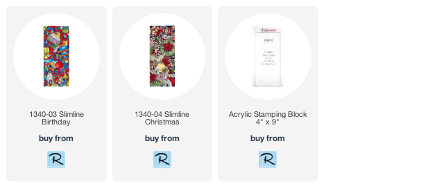
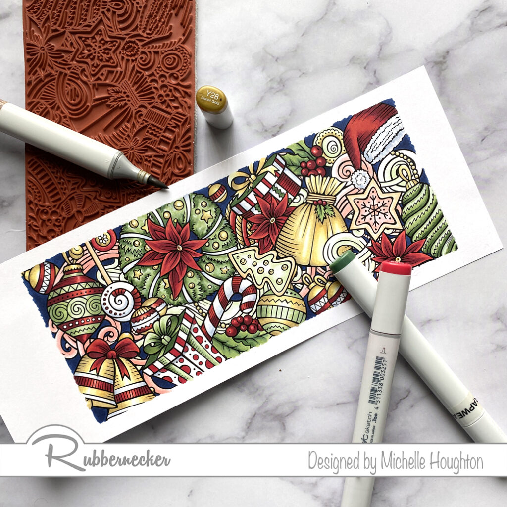
Rubbernecker Stamps has more slimline stamps and I want to make sure you see them all! Today I have a quick run through of the Copic Colors I used on the Christmas and the Birthday Slimline stamps. I think you will love both of these. Let’s start with the Christmas stamp.

Work through the full image with one color family at a time. You will find other small areas to come back to with each color group at the end, but this system helps me keep a more complex image like this balanced.

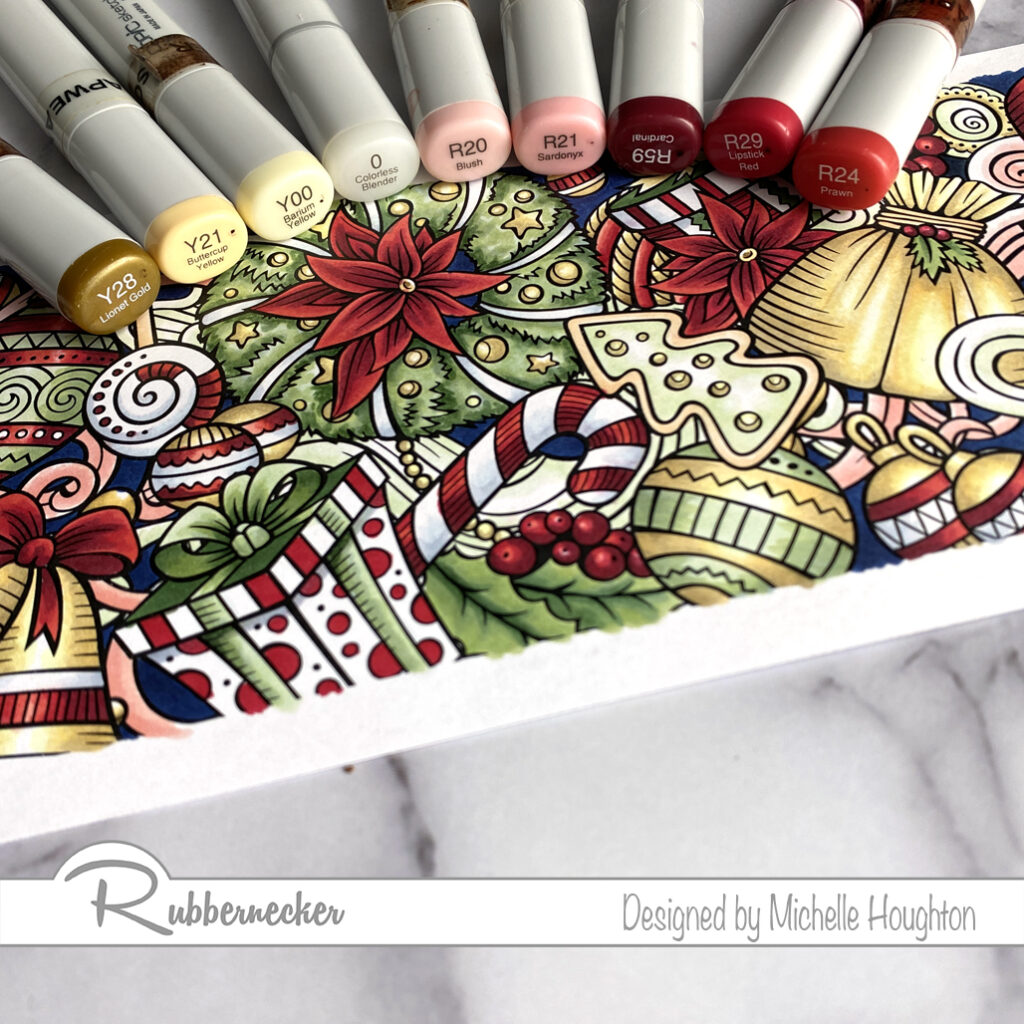
  • The darker red Copic group I used for this image consists of 3 reds that I used from dark too light. R59, R29, R24
  • The lighter red group I used consists of 2 reds and the Colorless Blender. R20, R21, 0
  • The yellow/gold group also uses the Colorless Blender with 3 yellows. Y28, Y21, Y00, 0
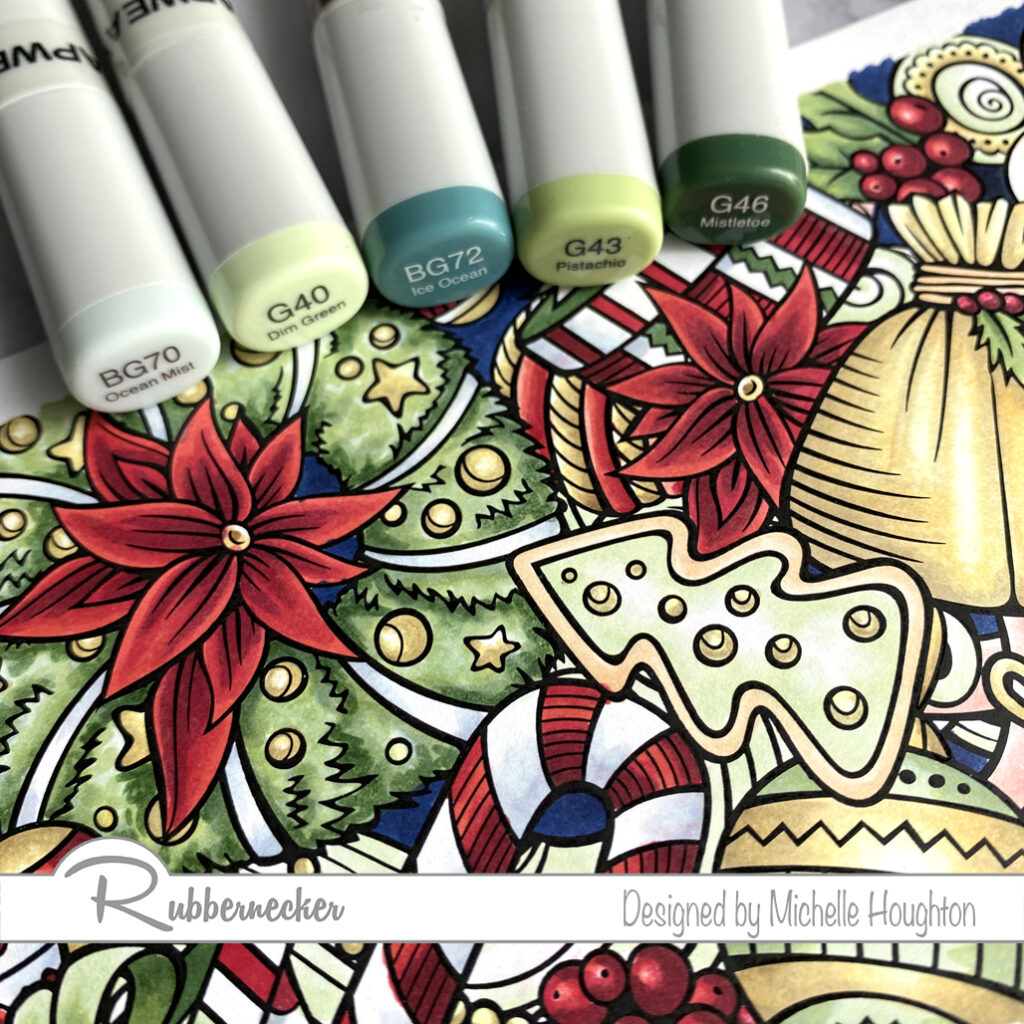
  • On both the lighter and darker green areas I used a combination of blue green and green colors to get the evergreen feel to the image.
  • For the lighter green areas I used a blue green and green as well as the Colorless Blender. BG70, G40, 0
  • The darker green areas use 2 blue greens and 3 greens. BG70, G40, BG72, G43, G46
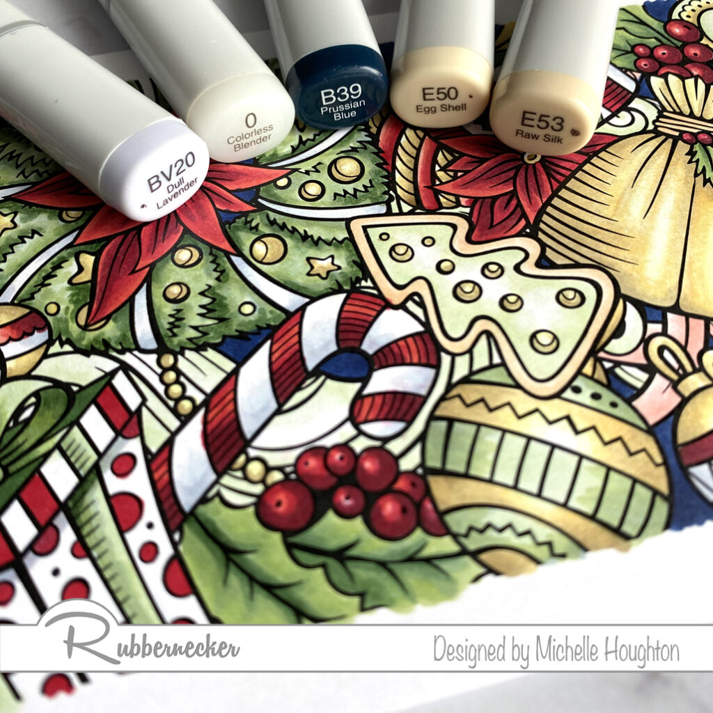
  • The white areas use a light blue violet and the Colorless Blender. BV20, 0
  • The background areas are filled in with a dark blue. B39
  • There are a few light brown areas including the cookie edges and twine, these areas got two light earth tones. E50, E53

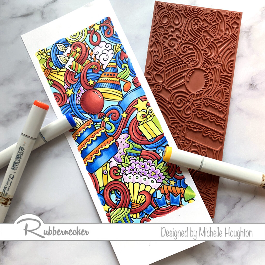
Then I colored up the Birthday Slimline. I used the same technique working through the entire images one color family at a time. Some I colored light to dark and others dark to light. I will list them in the order that I used them. I also switched gears to bright primary and secondary colors for this image.

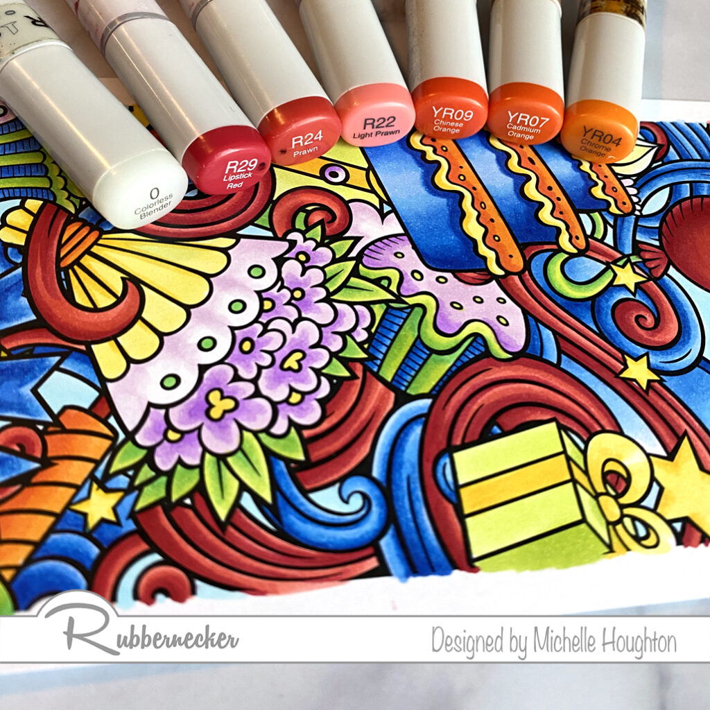
  • Starting with the reds I used a very common 3 color natural blending group for the red sections. R29, R24, R22
  • I used a set of 3 yellow reds for the orange sections that I colored. YR09, YR07, YR04
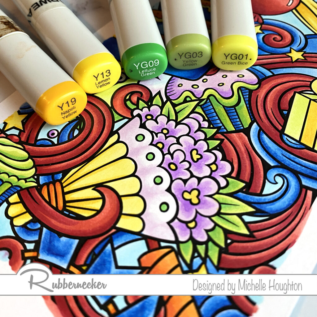
  • The bright yellow sections I kept simple with two yellow Copics. Y19, Y13
  • I wanted the greens to stay bright and cheery so I used 3 yellow greens. YG09, YG03, YG01
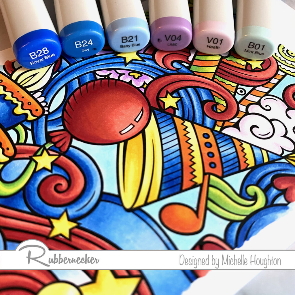
  • Bright blue sections have a group of 3 blues. B28, B24, B21
  • I kept the purple sections lighter with two lighter violets. I also used the lighter color and the Colorless Blender in the white areas. V04, V01, 0
  • I used a light blue and the Colorless Blender in all the background sections to keep this image bright and cheerful. B01, 0

Thank you as always for stopping by and checking out what I am up to! Below you will find links to the Rubbernecker Stamp site where you can find all the RN products I used on the two card fronts above.

Have a Happy Colorful Day!


Posted on

Slimline cards with Color Burst and new Slimline dies

Good morning! A couple SIMPLE new cards today using Color Burst and a couple new dies from Rubbermoon! I am new to both Color Burst as well as slimline cards so fun fun! I started with a couple backgrounds withColor Burst and watercolor paper, then used some dies to create some simple layers. Check out the steps I used below:

  • Sprinkle Color Burst Cerulean Blue and Gamboge on Neenah Felt Ultra White paper.
  • Spritz the paper with water.
  • Let paper dry.
  • Split the paper in half lengthwise.
  • Attach the watercolor paper onto a slimline card base leaving a quarter inch border.
  • Use the cloud slimline die to cut 2 or 3 cloud layers out of vellum.
  • Trim a sheet of white cardstock to be a silhouette of mountain tops (there is a die for this as well, I just don’t have this one😉).
  • Attach the clouds directly to the Color Burst background .
  • Pop up the mountains on top with foam tape.
  • Same start for this card, use two sheets of the Neenah Felt Ultra White Paper and sprinkle Color Burst Cerulean Blue and Gamboge on both.
  • Mist the paper with water.
  • Let the papers dry.
  • Trim the two sheets so they fill a slimline card base leaving a quarter inch border.
  • Use the new OPC Geo Squares die on a rice paper then used the OPC Wavy die on a patterned paper.
  • Trim the waves out of the Wavy die cut so only the frame is left.
  • Attach the patterned paper frame to the edge of the rice paper.
  • Use foam tape to pop up the rice paper and frame above the Color Burst background.

Hope you enjoyed seeing a little of my creative process! Sometimes it is more about making messes and playing with fun colorful materials. This was one of those creations for certain! Thanks for stopping by, all of the Rubbernecker products I used can be found with the links below!

Have a Happy Colorful Day!


Posted on

Happy Halloween from Rubbernecker

We are celebrating Halloween for 13 days over on the Rubbernecker blog and I am up for day #1! I decided to play with Fall/Halloween colors. I have not had the opportunity to play with Color Burst before and decided this would be a super fun day to do it. I created three cards with Color Burst backgrounds, beautiful silhouette stamps from as well as dies and Neenah Felt Ultra White Paper all from Rubbernecker. Let’s take a look.

I tried three different techniques with the ColorBurst so let’s look at each card.

  • Wet a sheet of Neenah Felt Ultra White paper with water. You can do this with a mister or paint brush.
  • Shake small amounts of Color Burst onto the wet surface.
  • Set the page aside to dry.
  • Once dry, use a background stamp and silhouette stamp in black to create a dramatic image.
  • Use nesting rectangle dies to create a black frame out of cardstock.
  • Layer the card front, frame and a few black sequins or dots on a card front to finish.
  • Shake Color Burst directly onto a sheet of Neenah Felt Ultra White paper.
  • Use a mister to spray water on top of the dry Color Burst.
  • Set the sheet aside to dry.
  • Once the page is dry use a silhouette stamp and black ink for a dramatic effect.
  • Use rectangle nesting dies to trim down the Color Burst page and create a black cardstock frame.
  • Layer a black card base, Color Burst background, black frame and black sequins or dots to finish the card.
  • Sprinkle dry Color Burst onto a sheet of Neenah Felt Ultra White paper.
  • Use a wet paintbrush to lightly run over the Color Burst creating a watercolor background.
  • Set the sheet aside to dry.
  • Once the paper is dry use a stamp with a lower quote or a detailed background through the watercolor.
  • Use a mountain die and cut a thin mountain outline by running it through your die cut machine twice.
  • Use nested rectangle dies to trim the watercolor background and cut a black frame out of cardstock.
  • Layer a black card base, the watercolor background, the slim mountain silhouette and a black frame.

Thank you so much for stopping by today and make sure to keep watching Rubbernecker for the next 12 days to see heaps of Halloween inspiration!

Have a Happy Colorful Day!

Posted on

New Background Stamps

I hope your coloring fingers are ready! Rubbernecker Stamps has come out with 4 beautiful new background stamps for slimline cards and oh what a treat! Colorers hold on to your markers, pencils and brushes. You are in for a real treat! I colored one of the four in my Copics and have the colors I used below. I will actually have a video next week as well but fare warning, this will not be real time. These take a little longer with all their glorious detail.

I tackled one color group at a time and worked my through the full image. I missed spots and went back once I had gone through each of the color groups I chose. So the step outs here will look a little different.

  • Start with a series that will color all the orange portions of your image. Working on one or two sections at a time use the darkest of the series and find the deepest shadow areas. (YR18)
  • Use a midtone yellow red, overlap the darker color and work further into the white area. (YR04)
  • Use a midtone hello to fill the white area that will be the highlight and been into the midtone yellow red. (Y35)
  • Work your way through the image coloring all the orange areas you can find at first pass.
  • Choose a set of dark grays and a black if you have it and use the darkest in the deepest shadows of one or two black objects in the scene. (100)
  • Use a gray to overlap the black or dark gray and pull into the white area. (N9)
  • Use two midtone grays to work into the white area. Overlap from the darker into the lighter area with each color. (N7, N5)
  • Use a Colorless Blender to soften the edge of the lightest gray or lighten the highlight depending on the object. (Colorless Blender 0) * If an object is shiny leave a bright white highlight, if it is dull leave less contrast.
  • Work your way through the image coloring all the black areas you can find at first pass.
  • Violets or blue violets are next start with your darkest and find the deepest shadows of one or two objects that will be violet. (BV17)
  • Use a midtone blue violet to overlap the darker color and work into the white area. (BV13)
  • Use a light blue violet and fill the white area on the objects blending into the midtone area. (BV11)
  • Work your way through the image coloring all the violet/blue violet areas you can find at first pass.
  • Bright yellow greens are next. Choose a midtone yellow green and work it into the darkest areas on one or two objects in the image. (YG25)
  • Use a lighter yellow green to overlap the darker color and work into the white areas on the objects. (YG23)
  • Use your lightest yellow green to fill the remaining white are and blend it into the midtone area. (YG21) * This would be an opportunity to use a fluorescent Copic if you have one. I think they would work wonderfully here!
  • Work your way through the image coloring all the yellow green areas you can find at first pass.
  • Choose a simple two color combination for areas that could be wood or similar coloring. Use the lighter of the two to fill one or two of the areas. (E31)
  • Use the darker of the two colors to define edges, add texture and depth. (E35)
  • You may or may not need to blend this darker color back in with the lighter of the two. (Ee31)
  • Work your way through the image coloring all the brown areas you can find at first pass.
  • Use small touches of a light yellow to eyes and flames with the midtone yellow used earlier. (Y02, Y35)
  • For white areas use a light blue violet. (BV20)
  • Use the colorless Blender to fade the blue violet into white. (Colorless Blender 0)
  • Use the midtone and darker blue violet in the same series for other objects with light gray and white tones. (BV23, BV25)
  • My favorite objects with these darker blue violets are the buildings or castles. I created a small brick pattern with rows of dots across the buildings.
  • Use the darkest of the blue violets to fill the back spaces in-between the objects on the scene. (BV29)

Here is the finished image. It can go straight onto a slimline card or be used with other slimline elements. You could even choose to break apart the image onto smaller cards. Thank you as always for stopping by!

Have a Happy Colorful Day!

Posted on

Copic Coloring With Rubbernecker

Hello my Copic coloring friends! little coloring today on a fun image from Rubbernecker. Murray with Catch is from the “Old Characters” collection. There is a whole team of these silly characters and wonderful phrases and statements to go along with them!

  • Starting with the skin use a blue violet to under-paint the deeper areas of the skin. This will also gray down the skin tones to age Murray a bit. (BV20)
  • Use a light earth tone over all of the skin. (E50)
  • Use a midtown to add shape to the face and arms. (E11)
  • Use a third earth tone in smaller amounts to deepen the shadow areas. (E13)
  • Blend the skin smooth working in reverse through the colors. (E11, E50)
  • Add a touch of color to the lips with a peachy earth tone and a darker rosy earth tone at the corners. (E93, E04)
  • Behind the glasses use the lightest earth tone and the midtone only. (E50, E11)
  • You can see a closer view in the next photo.
  • Use small dots of two cool grays to add texture to the hair. (C1, C3)
  • Use the darker of the two on the eyebrows. (C3)
  • Fishing vest and part of the fish is next. Start with basing the vest and fish with a light earth tone. (E81) Note the E 8’s have a very mossy green to them!
  • Use a midtone earth tone to add shape to the vest. (E84)
  • Use a darker earth tone in smaller amounts to deepen the shadow areas. (E87)
  • Add a touch of color to the back of the fish with a brighter blue green. (BG53)
  • Quick coloring on the fishing pole. Fill the rod and parts o the reel with a dark gray. (C7)
  • On the handle use two earth tones. (E31, E35)
  • Last, but not least his waders and the last section of the rod. Base the waders and the center band on the reel with a lighter blue green. (BG93) I used this same color across the back of the fish to tone down the other blue green.
  • Use a midtone and darker blue green to add shape to the waders and use the midtone on the reel as well. (BG96, BG99)
  • Blend the layers together going in reverse through the colors. (BG96, BG93)

As always thank you for stopping by today! You will find the links to the Rubbernecker products I used below. I will have a video tutorial of this image next Wednesday over at Copic In The Craft Room on YouTube as well as the Rubbernecker YouTube channel. If you have not done so yet, please subscribe to my newsletter over on the right hand side of my blog. Super important right now if you are interested in any of my teaching, live and possibly in the near future, on-line options!

Have a Happy Colorful Day!