Posted on

New Background Stamps

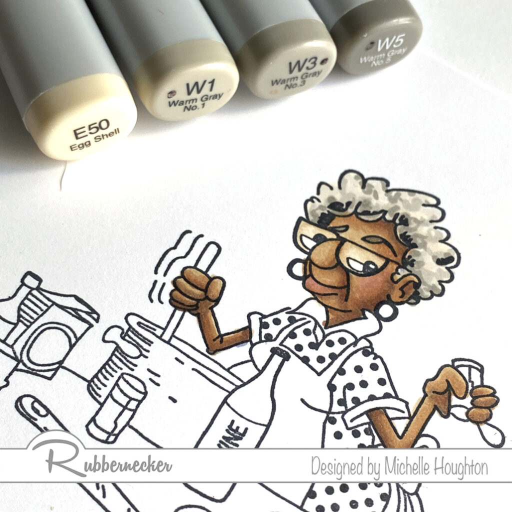
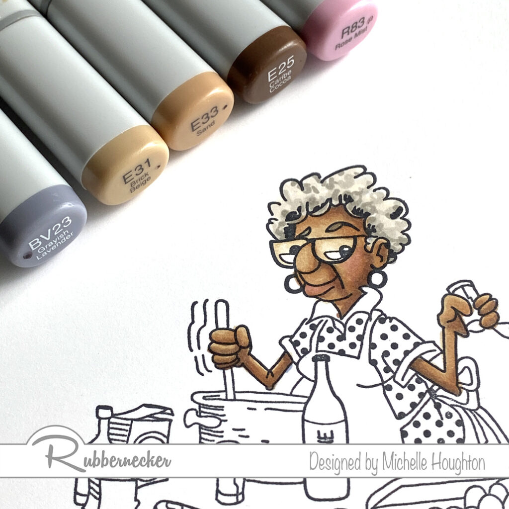
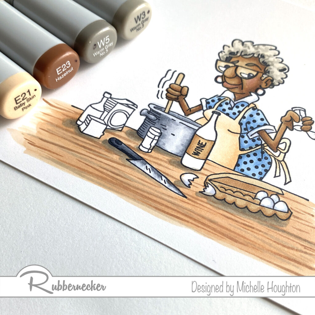
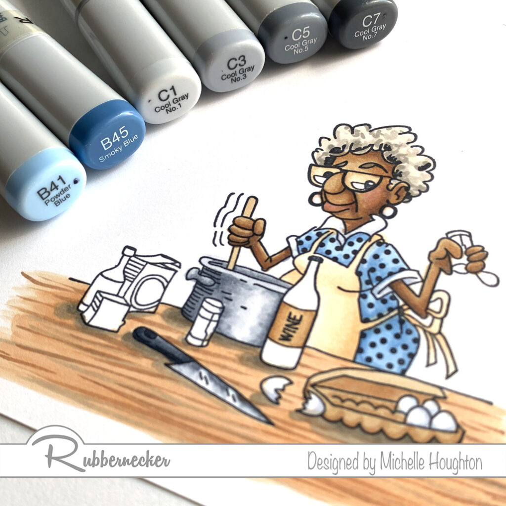
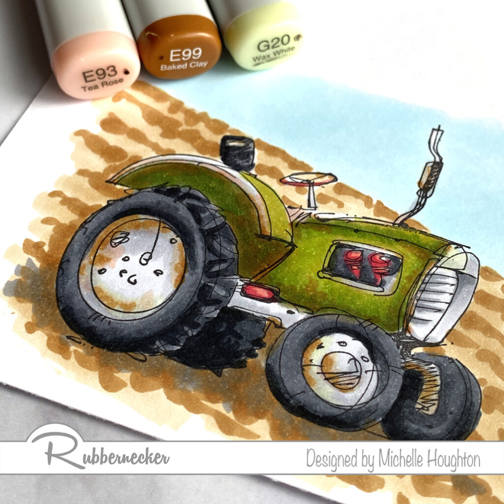
I hope your coloring fingers are ready! Rubbernecker Stamps has come out with 4 beautiful new background stamps for slimline cards and oh what a treat! Colorers hold on to your markers, pencils and brushes. You are in for a real treat! I colored one of the four in my Copics and have the colors I used below. I will actually have a video next week as well but fare warning, this will not be real time. These take a little longer with all their glorious detail.

I tackled one color group at a time and worked my through the full image. I missed spots and went back once I had gone through each of the color groups I chose. So the step outs here will look a little different.

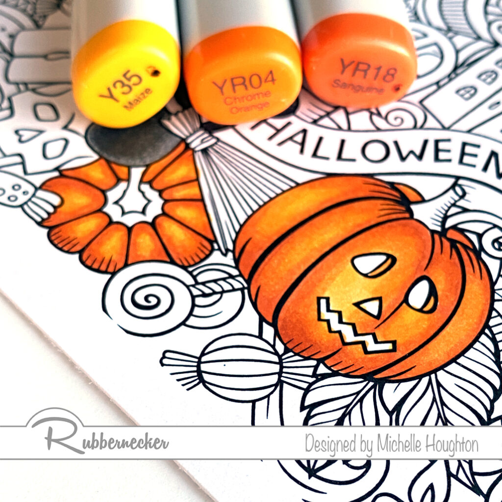
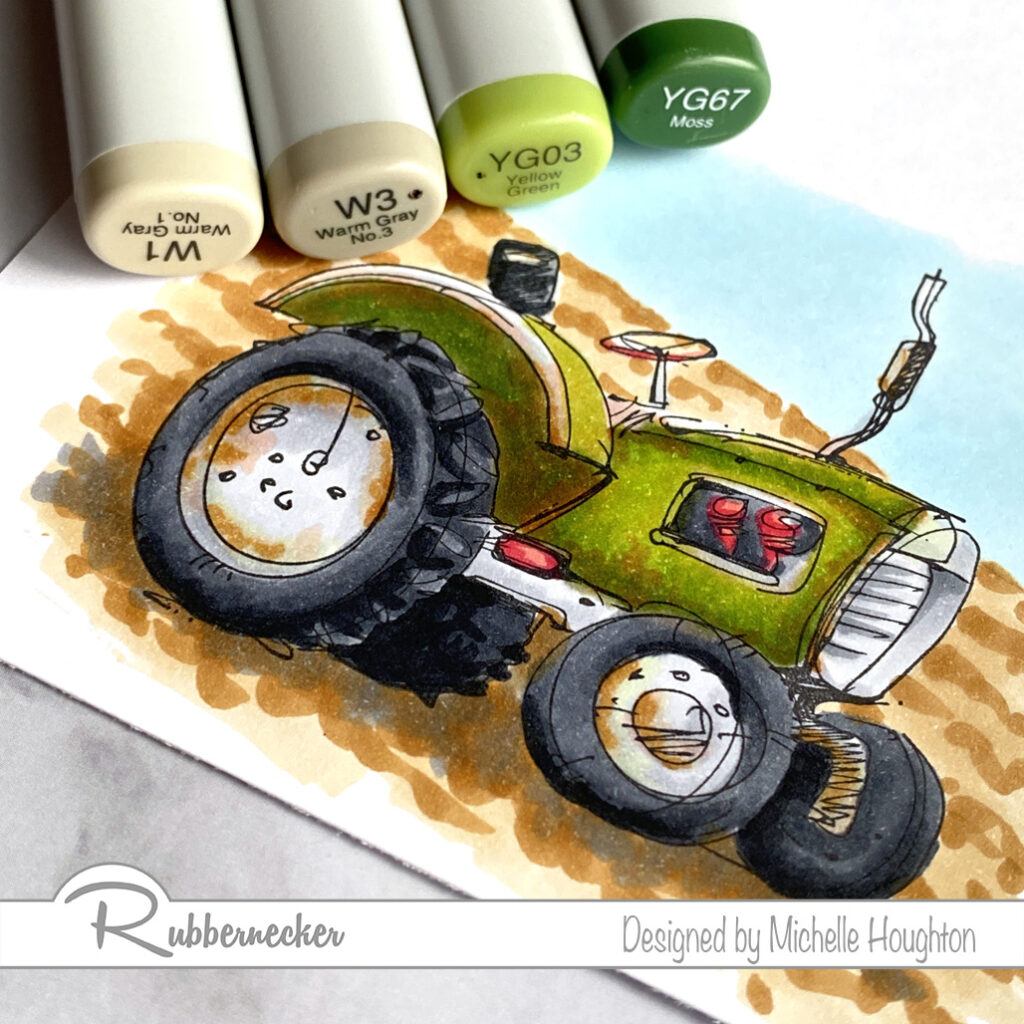
  • Start with a series that will color all the orange portions of your image. Working on one or two sections at a time use the darkest of the series and find the deepest shadow areas. (YR18)
  • Use a midtone yellow red, overlap the darker color and work further into the white area. (YR04)
  • Use a midtone hello to fill the white area that will be the highlight and been into the midtone yellow red. (Y35)
  • Work your way through the image coloring all the orange areas you can find at first pass.
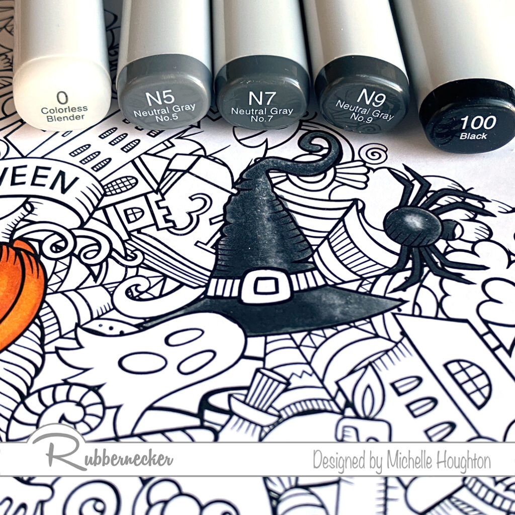
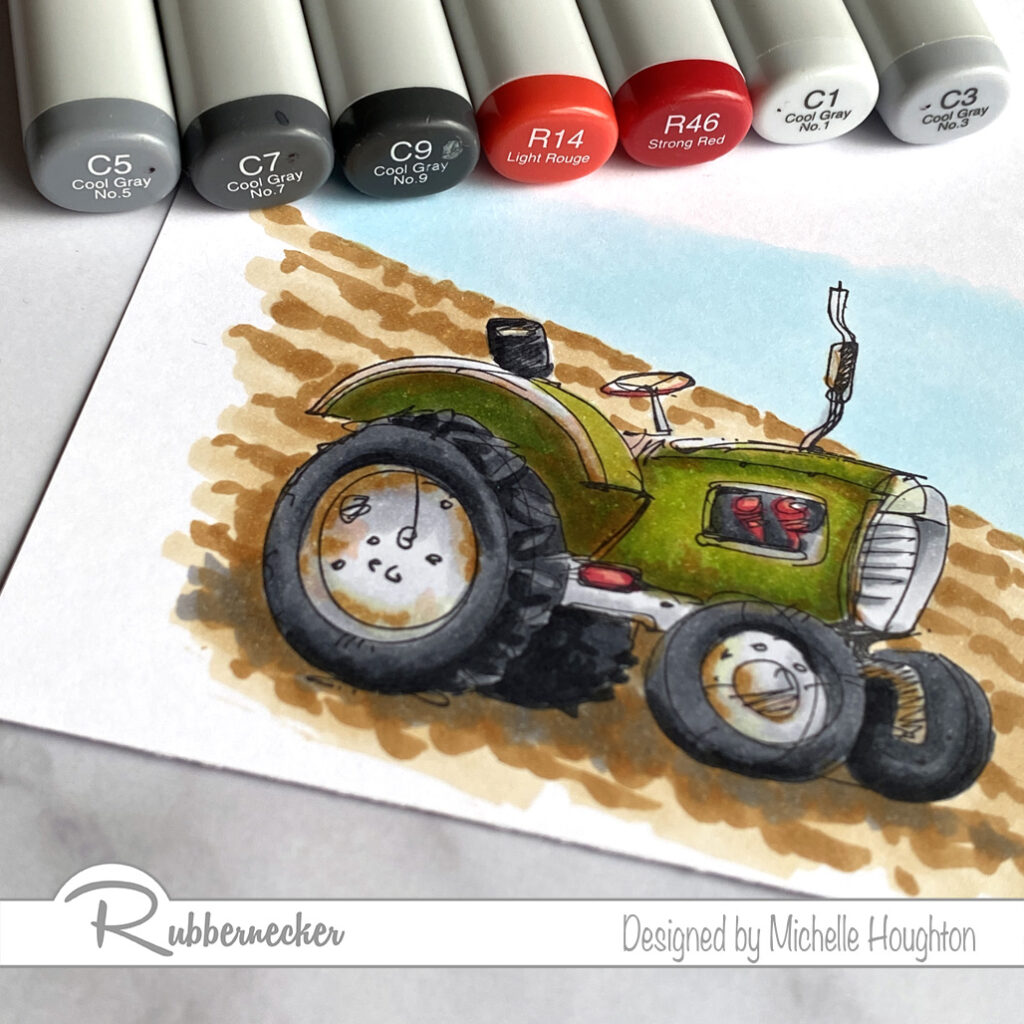
  • Choose a set of dark grays and a black if you have it and use the darkest in the deepest shadows of one or two black objects in the scene. (100)
  • Use a gray to overlap the black or dark gray and pull into the white area. (N9)
  • Use two midtone grays to work into the white area. Overlap from the darker into the lighter area with each color. (N7, N5)
  • Use a Colorless Blender to soften the edge of the lightest gray or lighten the highlight depending on the object. (Colorless Blender 0) * If an object is shiny leave a bright white highlight, if it is dull leave less contrast.
  • Work your way through the image coloring all the black areas you can find at first pass.
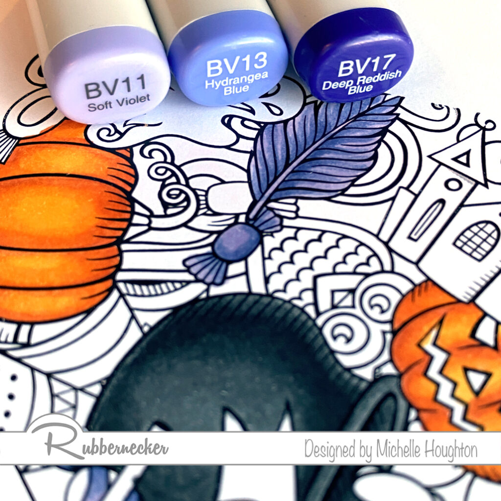
  • Violets or blue violets are next start with your darkest and find the deepest shadows of one or two objects that will be violet. (BV17)
  • Use a midtone blue violet to overlap the darker color and work into the white area. (BV13)
  • Use a light blue violet and fill the white area on the objects blending into the midtone area. (BV11)
  • Work your way through the image coloring all the violet/blue violet areas you can find at first pass.
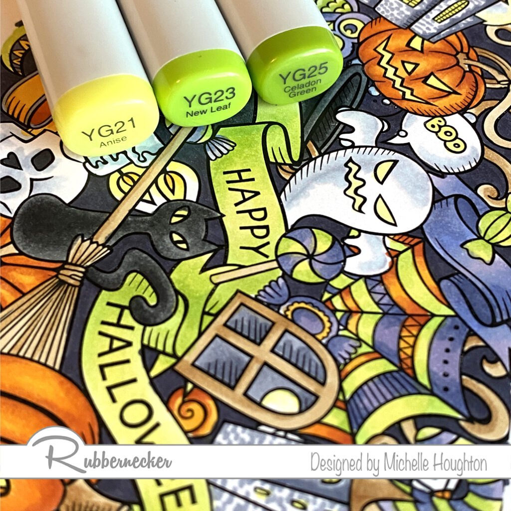
  • Bright yellow greens are next. Choose a midtone yellow green and work it into the darkest areas on one or two objects in the image. (YG25)
  • Use a lighter yellow green to overlap the darker color and work into the white areas on the objects. (YG23)
  • Use your lightest yellow green to fill the remaining white are and blend it into the midtone area. (YG21) * This would be an opportunity to use a fluorescent Copic if you have one. I think they would work wonderfully here!
  • Work your way through the image coloring all the yellow green areas you can find at first pass.
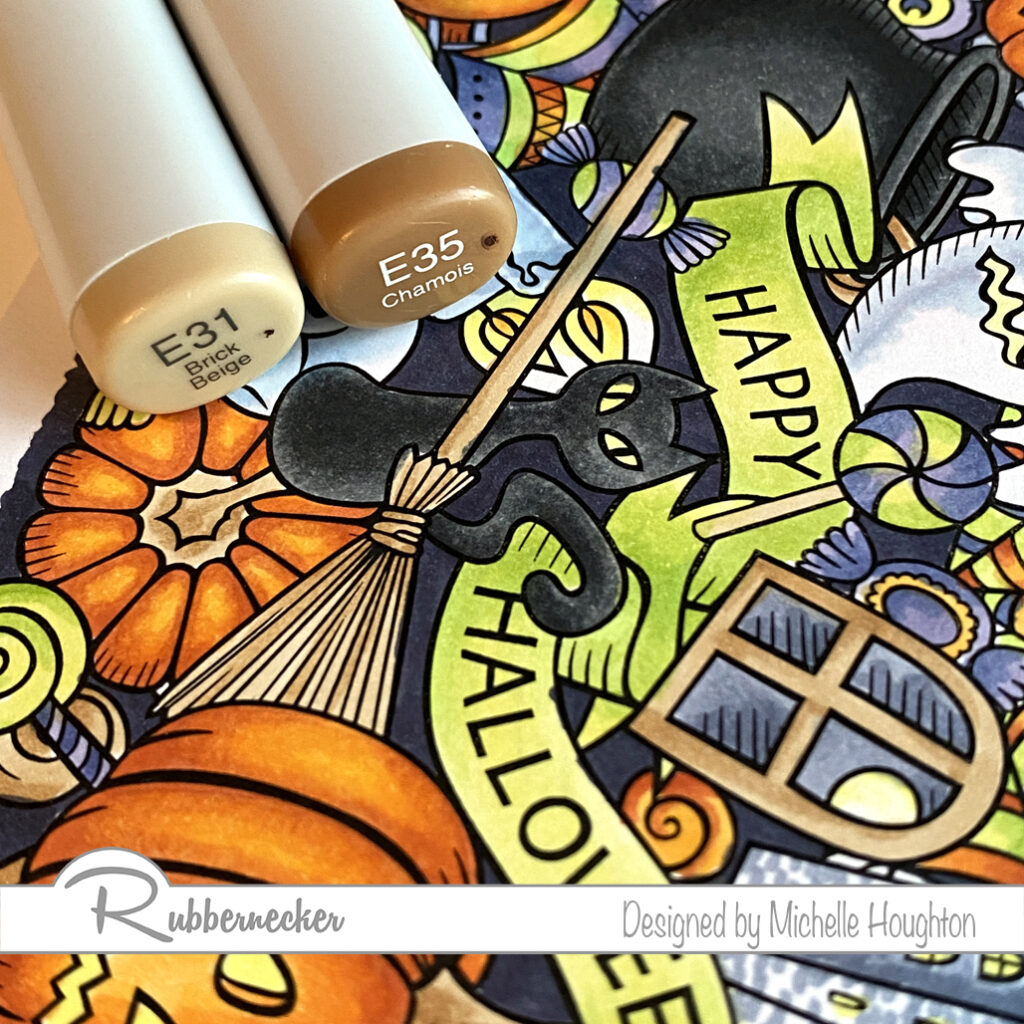
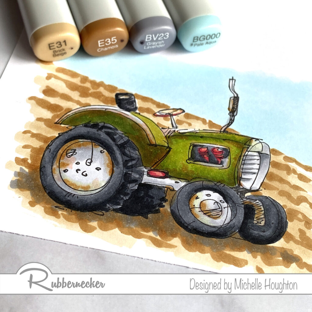
  • Choose a simple two color combination for areas that could be wood or similar coloring. Use the lighter of the two to fill one or two of the areas. (E31)
  • Use the darker of the two colors to define edges, add texture and depth. (E35)
  • You may or may not need to blend this darker color back in with the lighter of the two. (Ee31)
  • Work your way through the image coloring all the brown areas you can find at first pass.
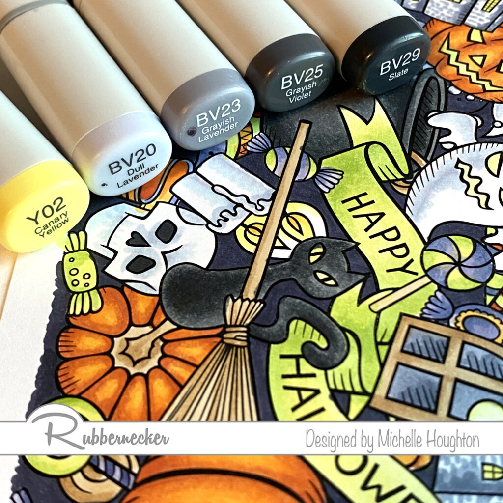
  • Use small touches of a light yellow to eyes and flames with the midtone yellow used earlier. (Y02, Y35)
  • For white areas use a light blue violet. (BV20)
  • Use the colorless Blender to fade the blue violet into white. (Colorless Blender 0)
  • Use the midtone and darker blue violet in the same series for other objects with light gray and white tones. (BV23, BV25)
  • My favorite objects with these darker blue violets are the buildings or castles. I created a small brick pattern with rows of dots across the buildings.
  • Use the darkest of the blue violets to fill the back spaces in-between the objects on the scene. (BV29)

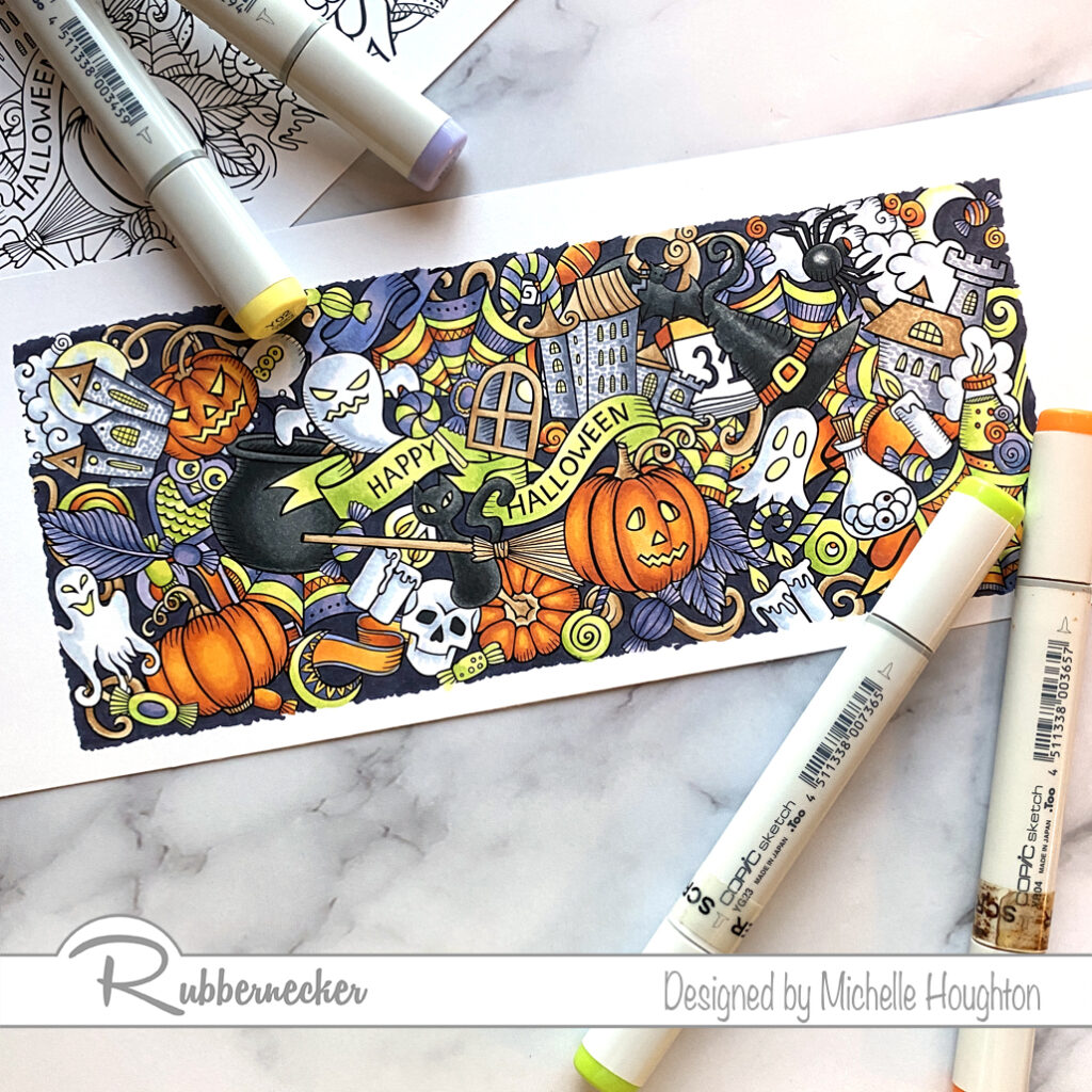
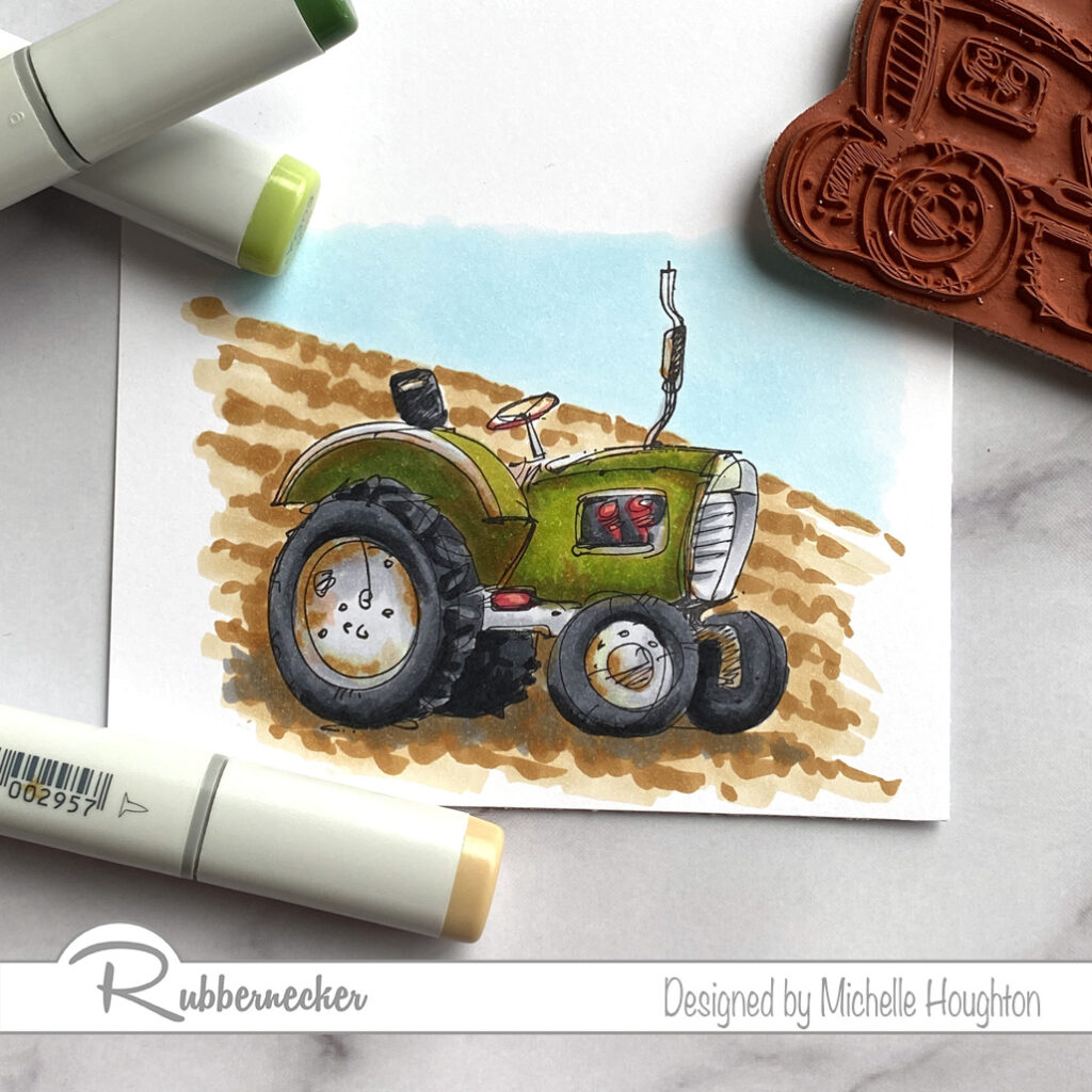
Here is the finished image. It can go straight onto a slimline card or be used with other slimline elements. You could even choose to break apart the image onto smaller cards. Thank you as always for stopping by!

Have a Happy Colorful Day!

Posted on

Copic Coloring – Ethel Cooking

Happy Thursday my crafty friends (and family too.) I am coloring up another Rubbernecker image today. As I settle back into another new routine back in Iowa I will have time to do a lot more coloring and will have all sorts of new images in the line up!

For those of you wondering about Copic College please stay tuned, I am working on how to finish off the year and the possibility of a BIG announcement in the next month! So stay tuned!

On to the coloring! This is “Ethel Cooking” she looks a little feisty to me what do you think?

  • Squiggle a light earth tone into the hair (E50)
  • Use two or three warm grays to dot and squiggle texture and shape into the hair, as you get darker using less of each color. (W1, W3, W5)
  • Under paint the deepest shadow areas with a blue violet. (BV23)
  • Use a lighter earth tone to base all of the skin. (E21)
  • Use two more earth tones to add shape to the skin areas. (E23, E25)
  • Blend the skin smooth going in reverse through the earth tones. (E23. E21)
  • Base the counter in a lighter earth tone, my goal was a butcher block look. (E21)
  • Use a darker earth tone and two warm grays to create wood grain and cast shadows under the objects on the counter. (E21, E23, W5, W3)
  • Base Ethel’s dress in a light blue. (E41)
  • Use a darker blue to add shape to her body. (E45)
  • Use cool grays to add form to the pot, knife and eggs. (C1, C3, C5, C7)
  • Use a light earth tone to base Ethel’s apron. (E50)
  • Use small amounts of two more earth tones to keep Ethel looking plump. (E51, E53)
  • Two different earth tones give the look of cardboard to the egg carton and aged paper to the wine label. (E31, E33)
  • Use a group of Yellow reds, reds and greens to finish off the assortment of ingredients at Ethel’s work station. (YR23, YR24, R59, R37, G85, G94, G99, C5 and Colorless Blender)

For those of you that need to see more of the process there will be a full video posted next Wednesday. Below you will find a link to the stamp. Thanks as always for checking in!

Have Happy Colorful Day!

Posted on

Copic Coloring With Rubbernecker

Hello my Copic coloring friends! little coloring today on a fun image from Rubbernecker. Murray with Catch is from the “Old Characters” collection. There is a whole team of these silly characters and wonderful phrases and statements to go along with them!

  • Starting with the skin use a blue violet to under-paint the deeper areas of the skin. This will also gray down the skin tones to age Murray a bit. (BV20)
  • Use a light earth tone over all of the skin. (E50)
  • Use a midtown to add shape to the face and arms. (E11)
  • Use a third earth tone in smaller amounts to deepen the shadow areas. (E13)
  • Blend the skin smooth working in reverse through the colors. (E11, E50)
  • Add a touch of color to the lips with a peachy earth tone and a darker rosy earth tone at the corners. (E93, E04)
  • Behind the glasses use the lightest earth tone and the midtone only. (E50, E11)
  • You can see a closer view in the next photo.
  • Use small dots of two cool grays to add texture to the hair. (C1, C3)
  • Use the darker of the two on the eyebrows. (C3)
  • Fishing vest and part of the fish is next. Start with basing the vest and fish with a light earth tone. (E81) Note the E 8’s have a very mossy green to them!
  • Use a midtone earth tone to add shape to the vest. (E84)
  • Use a darker earth tone in smaller amounts to deepen the shadow areas. (E87)
  • Add a touch of color to the back of the fish with a brighter blue green. (BG53)
  • Quick coloring on the fishing pole. Fill the rod and parts o the reel with a dark gray. (C7)
  • On the handle use two earth tones. (E31, E35)
  • Last, but not least his waders and the last section of the rod. Base the waders and the center band on the reel with a lighter blue green. (BG93) I used this same color across the back of the fish to tone down the other blue green.
  • Use a midtone and darker blue green to add shape to the waders and use the midtone on the reel as well. (BG96, BG99)
  • Blend the layers together going in reverse through the colors. (BG96, BG93)

As always thank you for stopping by today! You will find the links to the Rubbernecker products I used below. I will have a video tutorial of this image next Wednesday over at Copic In The Craft Room on YouTube as well as the Rubbernecker YouTube channel. If you have not done so yet, please subscribe to my newsletter over on the right hand side of my blog. Super important right now if you are interested in any of my teaching, live and possibly in the near future, on-line options!

Have a Happy Colorful Day!

Posted on

More Skin and Hair with Rubbernecker

I have a final tutorial with darker skin tones (at least for now). Using one of the beautiful images from Rubbernecker Stamps. You will find the steps and colors I used below and then next Wednesday there will be a video tutorial posted on both the Copic In The Craft Room YouTube channel as well as the Rubbernecked YouTube channel.

  • Starting with the skin base all of the skin areas with E21.
  • Use a darker mid-tone to map out the shading on the skin areas, E25.
  • Use a darker tone in smaller amounts to deepen the shadow areas, E27.
  • Blend the skin smooth working back through the darker mid-tone and then covering the light base color with a light mid-tone, E25, E23.
  • Add a deep red earth tone to add color to her cheeks and blend it in with the skin tones, E09.
  • Base all of the hair with a light earth tone, E13.
  • Use a series of red and earth tones to create texture and volume to the hair with small thin flicks, R56, E09, R59.
  • Work with the 4 hair colors to smooth and enhance texture to your personal desired effect, E13, R56, E09, R59.
  • For lips use two earth tones to create shape and color, E09, E04.
  • Use a rich color to add a touch of color to the lids, V28.

Thank you so much for stopping by and checking in on my art. If you have not done so take a second and subscribe to my newsletter up to the right on my blog. I only send a few notes out a year and there will be news about Copic College and live events coming out in the next week!

Have a Happy Colorful Day!

Posted on

Rusty Tractor

Good morning, afternoon, evening depending on your location! You are catching me coloring up a tractor from Rubbernecker Stamps today. You might have noted I am not making a lot of cards (or any) right now. I left behind many of my card making TOOLS in Iowa. I am gathering some basics so you will see a few in the upcoming weeks but they will be even more simple than normal Ha Ha!

So Copic coloring is the name of the game right now or at least what you are seeing from me 😁. Here are the steps I took coloring up this tractor. There are lots of colors to get that old working machine look, and this tractor is still looking in pretty good shape your could take this further.

  • Start with the base of the tractor, use W1 and W3 to creat shape on all the soon to be green areas of the tractor.
  • Without blending move onto the YG03 and YG67 right on top of the warm grays. YG03 will cover all areas that have the gray and the YG67 will go in the darker gray areas.
  • Work into the green areas creating areas of rust and dirt. I focused on edges and under the fender.
  • Use the E93 over large areas.
  • Follow that with the E99 in specific rusty, dirty areas.
  • Go over the rust/dirt areas with the G20 this not only will soften the areas and bleach out some areas for wear.
  • Now all the rest of the details. C5, C7, C9 on the tires.
  • small details of the gears, steering wheel and step with R14 and R46.
  • Lighter metal areas with C1, C3 and a little C5.
  • Add a little mud and rust on the wheels and edges with E93 and E99.
  • Go over the dirt and rust with the G20 to soften and bleach some areas.
  • Finish up the background creating rows in the field with a wash of E31 and scribbles of E35.
  • Add extra E35 under the tractor for a cast shadow.
  • Use BV23 in the cast shadow to cool the area and ground the image more firmly.

All done and ready to go! Thank you so much for stopping by today. There will be a video next Wednesday with a real time coloring of this full image. You will find it on the Copic In The Craft Room YouTube channel. Below you will find a link to the images I colored up today!

Have a Happy Colorful Day!